

It’s time to change paint color! This room has been the same color for years and years, while virtually every other room in our house has been painted different colors… numerous times. Do we have a problem? Maybe ;) Something as simple as paint can change a room so much… We’re living with different colors a little at a time… If you have a great color let me know about it! The brownish wall color is KUBA by Ralph Lauren (no longer made). The new darker color is called Knights Armor by Olympic. We were thinking about a gray… not sure if this is too blue gray for us or not… only time will tell… Note: See bottom for important update ;) from Feb. 7, 2014…

Here it is with the brown cropped out of it… What do you think? We have painted rooms a creamy white… our art work didn’t stand out to us? But we aren’t sure this is THE color… we will most likely go through a few more samples before we find the right one… UPDATE: After living with this for a few days we think that this is too blue and a bit too dark for us… hmmm, not the one… darn it!

Here is the view from the living room (a more updated brown) to the study (the old Kuba color)… so need to pick a color that flows… as well as a color that looks great in a room that gets bright sun…

Gorgeous painting by Ken DeWaard. This is a treasure we will have forever and ever. What an amazing guy, and just so talented. Ugh! It’s pretty inspiring to be around someone who can whip out a brush and literally paint absolutely anything that he sees.
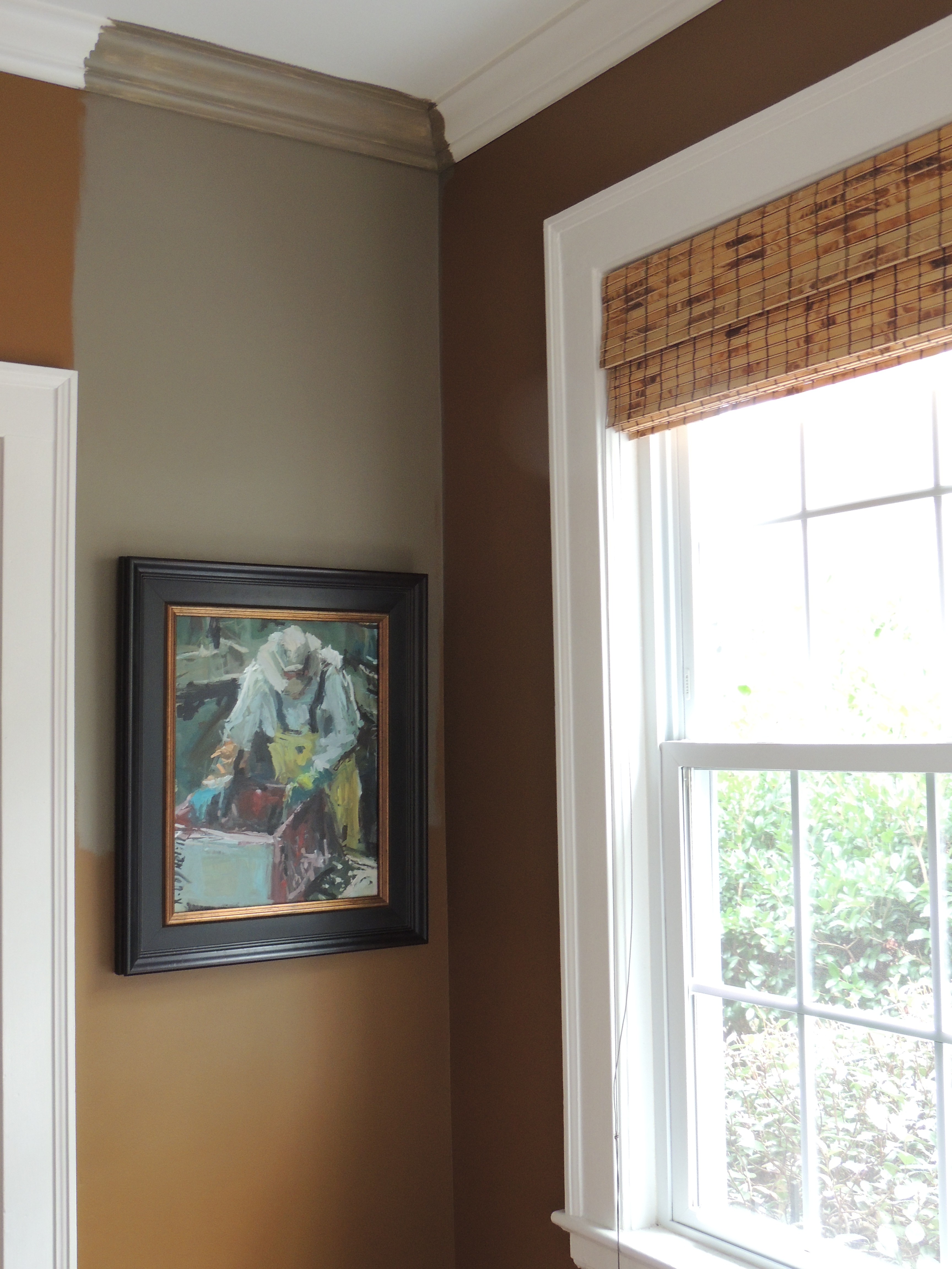
This color (Warm Stone) looks so good in our guest room (which doesn’t get as much light as this room does), but I’m thinking it’s too washed out in this room… and even more so when the sun shines through… but later in the day it looks much nicer…
I think since we still have some walls to cover, we’ll try a few more samples… Maybe something similar to Warm Stone (above) but a wee bit darker… or something totally different like…

Warm Stone/Sherwin Wms (guest room/long pink sticky), davenport tan or whitall brown (the two browns with stickys) or Beacon Hill Damask/Benjamin Moore? (Pink little sticky’s)
PLEASE chime in with any suggestions? What is a happening color that isn’t too cool… we’re not thinking gray any longer… I. Don’t. Think.
Am I fickle? Ugh. Probably… need help!
UPDATE: Feb. 7 (Fri)
Ok… I have gotten some cool comments, and some that have me looking back at my fan deck (that may be the death of me, ha ha)… I am intrigued by the 5th comment… what do you think of these colors? I’m leaning towards the HYDRANGEA FLOWERS (on the left) I think the CORAL ESSENCE may be a bit much for me. Actually, I’m not sure, I’m intrigued… this is not safe territory for me, ha ha… for years its been variations of brown. Let me know what you think!
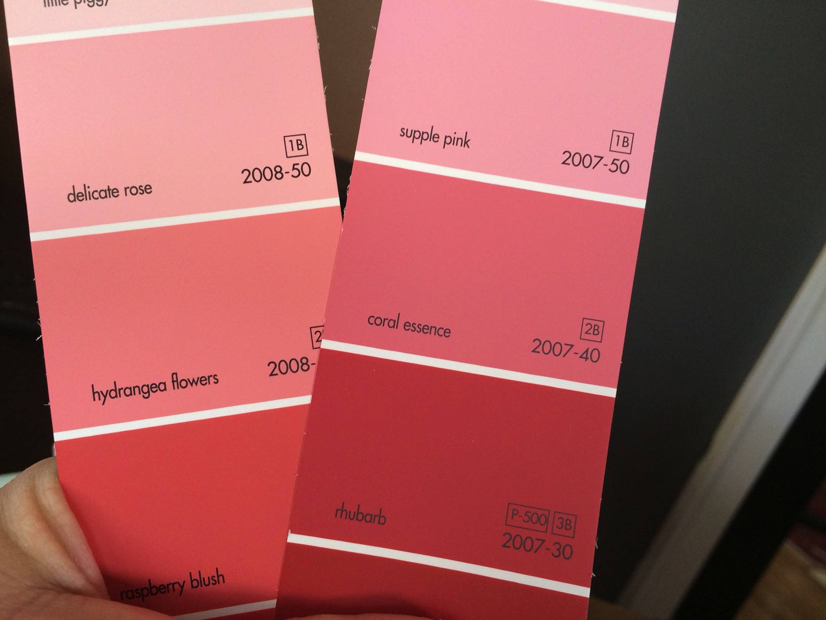
And just for a point of reference… this is the rug in the room we’re wanting to paint… I see bits of Hydrangea Flowers (Benjamin Moore) in the rug!

Ok, today is 2/8… after visiting some friends who just painted their bedroom a dark gray shade… and with a few of the comments, we are now leaning more towards the dark. Just hung a painting with a silver frame and… P. O. P. ! Hmmmm…
I. Remain. Fickle… any suggestions/comments are most welcome!
F L A S H B A C K
O n e Y e a r A g o: Featured Artist… Martha Berkert!
T w o Y e a r s A g o: California Wine Country photo!
T h r e e Y e a r s A g o: Jump in a puddle, go ahead, you know you want to!
Catch you back here tomorrow!
