

It’s time to change paint color! This room has been the same color for years and years, while virtually every other room in our house has been painted different colors… numerous times. Do we have a problem? Maybe ;) Something as simple as paint can change a room so much… We’re living with different colors a little at a time… If you have a great color let me know about it! The brownish wall color is KUBA by Ralph Lauren (no longer made). The new darker color is called Knights Armor by Olympic. We were thinking about a gray… not sure if this is too blue gray for us or not… only time will tell… Note: See bottom for important update ;) from Feb. 7, 2014…

Here it is with the brown cropped out of it… What do you think? We have painted rooms a creamy white… our art work didn’t stand out to us? But we aren’t sure this is THE color… we will most likely go through a few more samples before we find the right one… UPDATE: After living with this for a few days we think that this is too blue and a bit too dark for us… hmmm, not the one… darn it!

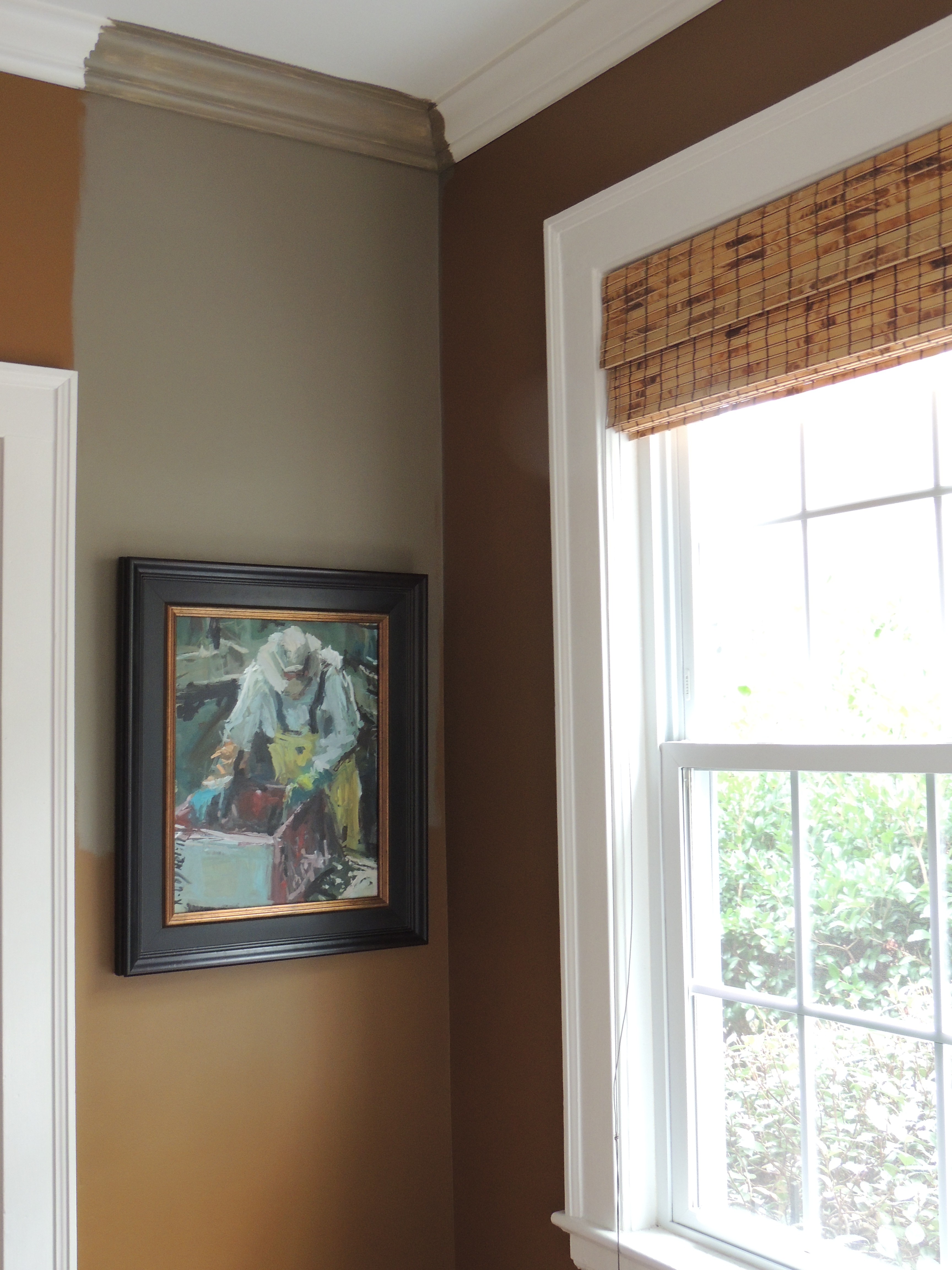
Here is the view from the living room (a more updated brown) to the study (the old Kuba color)… so need to pick a color that flows… as well as a color that looks great in a room that gets bright sun…

Gorgeous painting by Ken DeWaard. This is a treasure we will have forever and ever. What an amazing guy, and just so talented. Ugh! It’s pretty inspiring to be around someone who can whip out a brush and literally paint absolutely anything that he sees.
This color (Warm Stone) looks so good in our guest room (which doesn’t get as much light as this room does), but I’m thinking it’s too washed out in this room… and even more so when the sun shines through… but later in the day it looks much nicer…
I think since we still have some walls to cover, we’ll try a few more samples… Maybe something similar to Warm Stone (above) but a wee bit darker… or something totally different like…

Warm Stone/Sherwin Wms (guest room/long pink sticky), davenport tan or whitall brown (the two browns with stickys) or Beacon Hill Damask/Benjamin Moore? (Pink little sticky’s)
PLEASE chime in with any suggestions? What is a happening color that isn’t too cool… we’re not thinking gray any longer… I. Don’t. Think.
Am I fickle? Ugh. Probably… need help!
UPDATE: Feb. 7 (Fri)
Ok… I have gotten some cool comments, and some that have me looking back at my fan deck (that may be the death of me, ha ha)… I am intrigued by the 5th comment… what do you think of these colors? I’m leaning towards the HYDRANGEA FLOWERS (on the left) I think the CORAL ESSENCE may be a bit much for me. Actually, I’m not sure, I’m intrigued… this is not safe territory for me, ha ha… for years its been variations of brown. Let me know what you think!
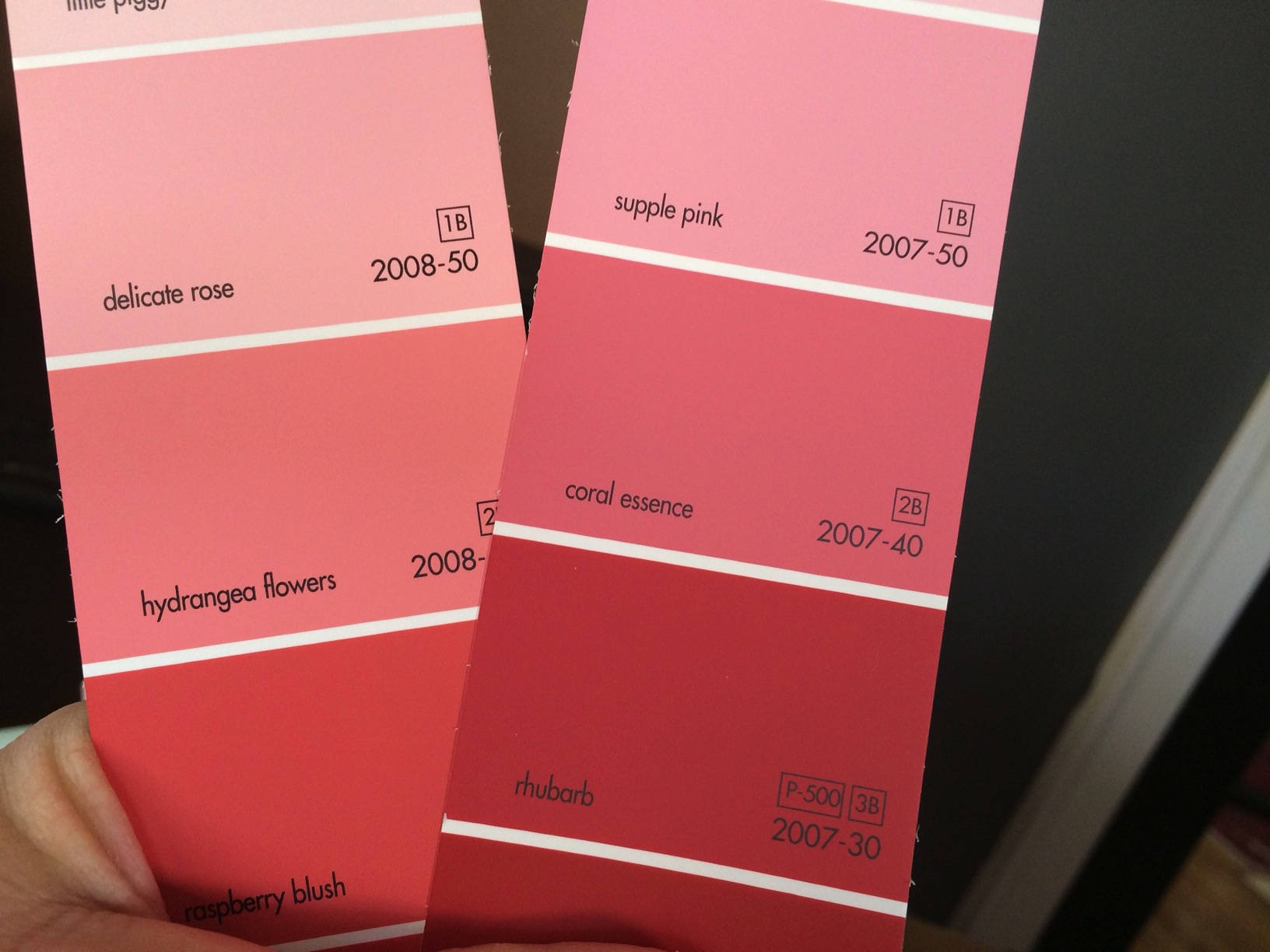
And just for a point of reference… this is the rug in the room we’re wanting to paint… I see bits of Hydrangea Flowers (Benjamin Moore) in the rug!

Ok, today is 2/8… after visiting some friends who just painted their bedroom a dark gray shade… and with a few of the comments, we are now leaning more towards the dark. Just hung a painting with a silver frame and… P. O. P. ! Hmmmm…
I. Remain. Fickle… any suggestions/comments are most welcome!
F L A S H B A C K
O n e Y e a r A g o: Featured Artist… Martha Berkert!
T w o Y e a r s A g o: California Wine Country photo!
T h r e e Y e a r s A g o: Jump in a puddle, go ahead, you know you want to!
Catch you back here tomorrow!

barbara, your home is beautiful�. a friend is visiting Charleston soon�. he is a painter, friends with the wyeths with lots of work from and of maine, but also from other countries�.. i want him to meet you and fred, so i was thinking to give him the name and hours of your time in your gallery�.. you will love him�. he knew scott, and knows monhegan intimately. he is a friend of mine�. i rented a cottage on his property for 14 years�. so we really got to know each other. let me know�. he will be there the 12th of february for about a week�. xx
LikeLike
ABSOLUTELY! Would love to meet him! His work is wonderful! Any friend of yours/Scott’s is a friend of ours! You can give him my email and phone number! I bet he’s here for Southeastern Wildlife Expo?!
LikeLike
you could ask allen blagden about this wall color when he is there�. xx
LikeLike
A definite plus! ;)
LikeLike
The color of the sails in the first small painting
coral crossed with tomato red
LikeLike
WOW! Now that is a color I hadn’t thought of – kind of like a faded terra cotta but more on the pinky/coral side… ooooh! Thanks Beth!
LikeLike
I agree with Beth. I especially love the painting of your living room by Ken DeWaard and I love your living room.
LikeLike
Thank you Jerry, appreciate your opinion! Ken’s painting is a favorite, a treasure!! He’s an amazing artist!
LikeLike
My last home we painted the family room and kitchen yellow….it was called something “straw yellow” like the sample you have above “hardware yellow” …… it brightens up the room beautifully. I had some many compliments on the color of these rooms plus this is my favorite color…yellow!
LikeLike
Sorry I thought it says hardware yellow but it looks like hawthorne yellow? Don’t have my glasses on…haha!
LikeLike
Ahhh, glasses… I know the feeling Maryanne!! Ha ha… The only other this room has been is yellow, but it wasn’t a good yellow… So hmmm, yes! That’s a thought!
LikeLike
grays are always good….I agree that the gray is too blue…if dark applied, should be charcoal I think…or tan you showcased is good too. cheers, t
LikeLike
ahhh, decisions, decisions!! it was so exciting to get a fan deck of colors… but eek! to many good colors! thanks Theresa!
LikeLike
I love the warm stone.
LikeLike
Thanks Mary!! It’s growing on me, I love it in our guest room but it didn’t grab me here… but that is slowly changing ;)
LikeLike
SW 6076 Turkish Coffee
SW 0040 Roycroft Adobe
SW 7062 Rock Bottom
LikeLike
Oh, I can’t wait to check those out! Thanks so much!
LikeLike
Oh, I LOVE picking paint colors!!! I have the Big Ben Moore sample thingy that is about 2 1/2 ” thick. And I am just as obsessive as you because I hate making the “oops” decision. You know, the color that you held up in every kind of light, and you held it next to every peice of furniture and you finally decided after laying in bed and imagining it night after night. Then you slather it all over the walls and……..WHAT?
I have been known to hand mix colors on my palette and take them in to see if they can match it.
I love all of the colors you chose! The house is gorgeous. The Rug!!! The Art and the furniture. The Glossy black door! And I hate to mess you up but I am crazy about the dark gray blue! It is clean, crisp, taylored. Any color frame would look good on it. You obviously don’t need any help!
LikeLike
THANK YOU ELIZABETH!! That color does look crisp against the white… Fred was thinking about painting wall/ceiling/moulding all same color… I can’t decide how that will look… our back dining room area we painted wall and ceiling brown and its fabulous… so maybe it would work as long as the white on the windows stayed and baseboards… need that crispness! Thanks for all the kind words! We love our house ;) – and I agree with you… sometimes that fan deck is more of a nightmare than a good thing, ha ha… WHY does a color look so bad sometimes? cRaZy!
LikeLike
Interesting, I think I love the warm sand…..I’m looking at the office walls and it looks like terra coat, I,m ready for something new….maybe the gal. Left from the living room where 1gal. Of benj. Moore covered so well w/only 1 gal. Revere Pewter. Lv ma
LikeLike
I would like to see that Knights Armor in somewhat paler version, that would be perfect for my eyes. But maybe you should consider also how colours can influence your mood and work with that knowledge accordingly. But i totally understand the need for change. I would repaint mine every month ,)
LikeLike
Hey Richard! Thanks so much for the link! So interesting! I was just going through my fan deck of colors (ahhh), and ran across HYDRANGEA FLOWERS (Benjamin Moore) hmmmm, am wondering if this would be good? I think I am making myself crazy! I like the contrast of the dark gray/white… and am not big on light shades of gray (for me, but I love it in other homes)… when someone mentioned a pink/coral, I would have never thought of that in a million years, so I looked through my samples and hmmmm, I’m rather liking this. For now… Thanks for commenting!
LikeLike
What about pulling that dark teal from the rug. Uber dark green (Charleston Black) is so beautiful and so in right now. Just don’t ask Melissa about it. She refuses to use that shade in our home for some reason…
LikeLike
Hey, good idea Radek… only problem is we have a lot of very colorful artwork and I’m afraid that might clash… which is why i’m not shying away from the coralish color… ahhh, paint colors are tough! We have used Charleston Green quite a bit… mainly outside (painted our wood fence which was SO NICE… it took it from standing out to blending in with nature… much better!), trim on our house is black, but almost indistinguishable from Chas Green ;) Thanks… you guys did such an awesome job with your house… I LOVE the paint job that you did in your living room – what a statement!
LikeLike
check out SW 7048 Urbane Bronze
adds drama and allows colorful art to pop
LikeLike
LOVE IT, thank you so much! This is a fabulous color! Going to get a sample this week!
LikeLike