
Eric Green. Wow, his paintings are so unusual. All tell a story. They are paintings that you can really spend time looking at… the kind where you always see something new that you didn’t notice the last time you looked. I love that. Eric is part of a fabulous show at the Dowling Walsh Gallery located in Rockland, Maine. If you’re anywhere near the area, do stop by, you will be in for a treat!
Read a bit about Eric from the Dowling Walsh website:
Eric Green went to RISD on a full scholarship at the age of sixteen. After attending the school for a week, he left to ride freights across the country, spending four years on the road.
In addition to painting for thirty years, he has worked in a frame shop, assembled pulp testers, traveled with a carnival, restored houses, painted industrial buildings from a hanging scaffold, designed two labels for Brazilian beers, written four novels and a column for the local paper. He has had two solo exhibitions in SoHo and Chelsea, received three grants, and a merit award from the National Academy of Design.
In New England, Eric’s paintings have been exhibited at the Ogunquit Museum, Brattleboro Museum, Robert Hull Fleming Museum, and the Portland Museum.
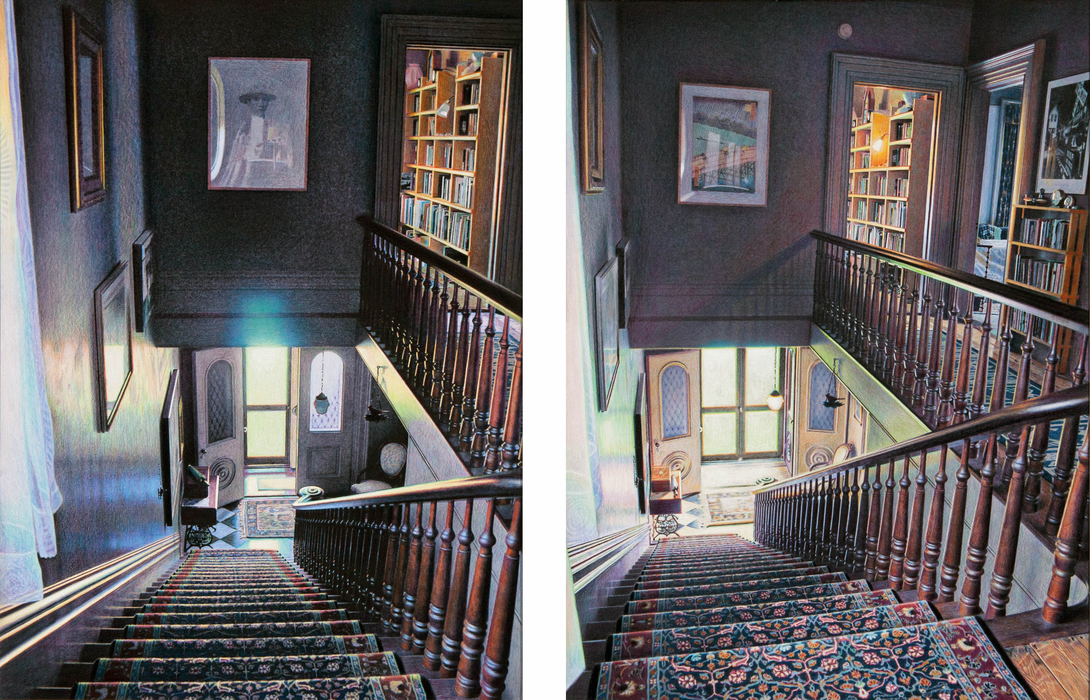
Also read a bit about the time diptychs from DowlingWalsh.com
Artist Statement: Time Diptychs
“This latest series is an attempt to capture time, or the poetic phrase, “the sad beauty of time passing,” something I believe we all experience in life, an emotion that gives existence much of its intensity and meaning. It’s not an easy sensation to describe, so I’m hoping this work will allow the viewer to experience it in a clarified visual form.
The work portrays sections of the interior of our house that I’ve spent the last seventeen years adjusting, a work of art in itself. (Reference: Against the Grain by J. K. Huysmans.) I’m actually drawing a place I’ve carefully created and arranged, so in a way, the image is generated twice. Each diptych is comprised of two panels of the same basic view altered only by the passage of time. What I find interesting is that the art itself can only exist in the viewer’s mind. It is the amalgamation or comparison of the two images that creates the specific emotion, not each individual panel. Gauging and balancing this convergence is everything.
On the 12 by 16 inch cradled hardboard panels, the images are rendered initially with a pencil grisaille, then by layers of sprayed UV varnish and colored pencil, allowing multiple colors to overlap, similar to what we see in nature. All the pencil colors are pure bright hues. Grays and browns are formed by the overlapping tones. The wood color, for instance, is comprised of blues, purples, greens, reds, and yellows, no brown; the wall color in certain sections is eight different hues.”
Image courtesy of DowlingWalsh.com, used with permission…
Catch you back here tomorrow!
