Featured Artist: Kathy Hirsh!

Welcome Home by Kathy Hirsh

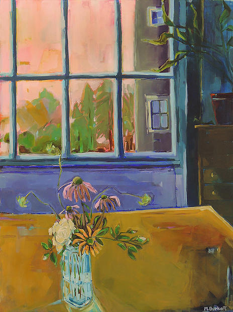
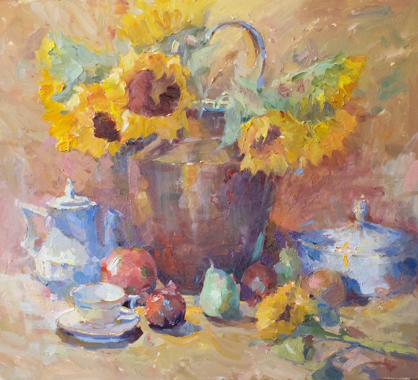
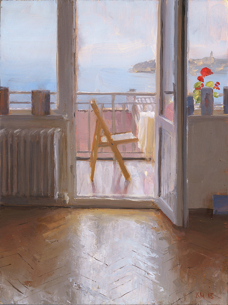
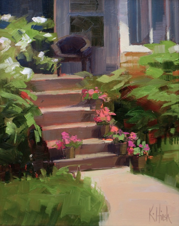
Welcome Home by Kathy Hirsh  8×10″  Oil

Sweet painting, isn’t it? Welcome Home leaves you with a wonderful feeling. Kind of like when you return from a long vacation to your own home which is so inviting. Comfy bed, wonderful shower, pretty flowers… just a good feeling! Nice shadows and colors without being overworked.

If you’re in the Oak Park, Illinois area, check out Kathy’s classes! While you’re there be sure to check out her other paintings!

Read a bit about Kathy, from her website:

Telluride mountains, hay fields in the south of France, rice paddies in Nepal, religious ceremonies in India, sunset in Mongolia-I have been privileged to paint en plein air in remarkable destinations. Living in Nepal and China for 15 years and now back in the states, whether I’m in the studio or out in the landscape-I’m working to capture the stunning color, the light quality and the juxtaposition of form and atmosphere.

As a medical illustrator I worked primarily in black and white for 25 years illustrating surgical procedures. While not exactly coffee table books, I was a best seller on the surgical textbook circuit.  For years I spent my days in operating rooms (like being a courtroom artist, but the defendant is unconscious). Now working in color, it feels like every painting day is a celebration.

Image via KathyHirsh.com, used with permission…

Catch you back here tomorrow!

Featured Artist: Martha Burkert!

Portland by Martha Burkert

Portland by Martha Burkert  48×36″  Oil

Martha Burkert. A cool perspective and a unique eye. She has a way of making things wonderful with color.

Martha has her “Simple Gifts” show going on now at the Elizabeth Moss Galleries, located in Falmouth, Maine. The show runs through November 14, 2015, so if you’re in the area, be sure to stop in and check it out. It’s going to be fantastic! The painting, Portland, is part of the show!

Read a blip about Martha, from her website:

I am primarily a landscape painter. The landscape and architecture that surround me are my favorite jumping off points. I push and pull color around these forms trying to find combinations that feel right. I am not restrained by local color or the hard and fast rules of perspective. The application of paint, the resonance of colors against each other, the muscularity of shapes and the temperature of light and dark are my guides.

Image via MarthaBurkert.com, used with permission…

Catch you back here tomorrow!

Featured Artist: David Arms!

David Arms Gallery

David Arms. An extraordinary artist with beautiful paintings. Meaningful and exquisite. A delight to browse through. Gorgeous paintings, a lovely studio and then… there is the gallery. Wow. Wow. Wow. I think I could live in it! Everything is absolutely exquisite! Could it be any sweeter? When you look through David’s images on his website you’ll see a photo of it at night. Wow!

David Arms Still
Still by David Arms 11×7″

It’s no secret, I love David’s work. This painting, STILL is so perfect for autumn! His paintings are beautiful, many have wonderful messages – you have to see to believe!

David has a wonderful studio click that link to see how beautiful!

Be sure to check out David’s Journal – he has one classy, well thought out website – FIVE STARS! Be sure to check it out!

Read a bit about David from his website (check website for more)!

David Arms was born in 1956 in east Tennessee along with two older brothers who still reside there. His father was a businessman and raised treasured bird dogs. His mother was a homemaker and still enjoys travel and her grandchildren. Growing up, he spent his summers and holidays with a beloved aunt who lived between nowhere and somewhere Tennessee. David had a fairly typical small town childhood – sand lot baseball, church potlucks and an occasional dabbling in art…the soul of the painter however was starting to stir. His mind’s eye was mixing the summer blues and autumn golds on an imaginary palette as he wandered back roads in the shadow of the Smoky Mountains.

After a rather ordinary high school experience, David headed west to Tennessee Tech in an old faded yellow Volkswagen Beetle. Leaving short of graduation, his path eventually landed him in Nashville – the place he has called home since. It was there he was introduced to the world of “special events”, where he soon became known throughout the country for his designs of high profile corporate and social events. His imagination, attention to detail and ability to seemingly create “something out of nothing” resulted in numerous awards for his work.

An ordained, random event then became an intersection in his life.

Having married and moved into their first home, he and his wife needed a large painting to fill a large frame for a large vacant wall. The artist (who had been there all along) suddenly emerged. Almost as if someone else was guiding his hands…a painting filled the canvas.

With a grand leap of faith, his hobby became his calling and his life’s work.

With his wife and two daughters close by, David spends his days in a sun drenched studio filled with Classical and Americana music, french press coffee, books and patchouli. But some days he prefers to paint in the quiet, inspired by the sparrows, wrens and chickadees living at his window. It is here that he creates images that transport you from what you see into that sometimes faraway place of what you feel and what you believe – and his wish is that the viewer look long enough to walk away with a renewed sense of hope.

Let your eyes search his paintings and may you be blessed as you find a place to rest, hope for your heart, light for the darkness…and continue on…as we stumble on…this journey together down Redemption Road.

Wow! What a great story! Catch you back here tomorrow!

Featured Artist: Peter Van Dyck

BP Station by Peter Van Dyck

BP Station  by Peter Van Dyck  40×40″  Oil

Peter Van Dyck. What fabulous paintings. So fresh and different! Peter can even make a BP Station look good enough to paint! Many of his paintings are interiors which are my absolute favorite. I don’t know what it is. They fascinate me.

Peter Van Dyck interior

Studio Still Life

Peter’s interiors blow me away. Many of are his studio space throughout time. Each one is stunning. This painting is absolutely brilliant! Just look at the textures, shadows, etc. etc.!!!

There was a great piece written by Larry Groff (owner of PaintingPerceptions.com) – be sure to check it out HERE.

Read a bit about Peter, from the JohnPence.com (Gallery):

Peter Van Dyck (b. 1978) was drawn to painting as a craft and a profession as a young man. But his urge to immerse himself into painting was strong; compelling him to leave college life and sojourn to Florence, Italy. There he became a standout student and, eventually, an Instructor at the renowned Florence Academy of Art, under the astute direction of Daniel Graves. He studied personally under Graves and Ramiro Sanchez.

Van Dyck was recommended to the gallery by a coterie of his painting peers. All parties are drawn to his haunting, personal paintings of the house he lives in, the studio he paints in, the tools he works with and the simple everyday things surround him. His current body of work is a diary of a year in this young artist’s life. His palette is oriented to the interior, his light and shadows are important to his portrayals, his choices of subjects are modern adaptations of Old Masters’ sophistication, and he handles paint textures with a mastery for an artist so young. Till now, he has shown in Philadelphia and Long Island.

Images via PeterVanDyckArt.com, used with permission…

Catch you back here tomorrow!

Featured Artist: Ober-Rae Starr Livingstone!

Every Moment by Ober-Rae

Every Moment by Ober-Rae  36×48″  Acrylic

What a stunning sky! It looks like some of the October sunsets that are so brilliant and just take your breath away! I love the darkness of the horizon and the wonderful warm fluffy clouds. How does he do it? Beautiful painting by Ober-Rae Starr Livingstone!

Be sure to check out more from Ober-Rae’s website:

Working Method: I work with acrylics. The intensity of color is due to working with anywhere from 6 to 20 layers of color on most parts of the canvas .Sometimes I start with a photograph, sometimes from plein air sketches and sometimes with just an idea. The painting becomes more abstract as it evolves. My main concern is the balance of shapes and colors – their relationships to one another and the feelings that they evoke within the viewer. It is the feeling, the flow of Energy that I really love about the painting process– the intensity and joy that comes when the painting seems to take on a life of its own. It is at this point in the work that changes are made through the heart and not the mind, and the artist feels that he/she is a part of higher creative processes.

Image via Ober-Rae.com, used with permission…

Catch you back here tomorrow!

Featured Artist: Hank Buffington!

Jetty by Hank Buffinton

Jetty by Hank Buffington   8×10″   Acrylic

Hank Buffington. A great artist, and a fabulous one to be friends with on Facebook. This man should be a comedian, or at least write a book about his daily life, he is hilarious. I don’t think he always means to be, but he is. His paintings are wonderful. I love the abstractness, along with the wonderful painterly quality that they have. Those dark rocks, with the green, and the light ocean waves and then that fabulous sky. Very nice painting!

Surf by Hank Buffinton

Surf by Hank Buffington   6×8″   Acrylic

Hank paints all kinds of things, but these two grabbed me. Just look at this painting. Look at the wonderful sky reflections in the wet sand. The crashing waves, WOW. Nice one!

Read a bit about Hank, from his website:

I was born in Pennsylvania but did most of my growing up in a somewhat rural part of New Jersey close to the Delaware River. I didn’t appreciate the bucolic charm of the area when I was a kid and a lot of my drawings were fantasies to take me away from it to a more exciting life. Those drawings eventually took me to art school and after graduating I returned home to begin a career as a graphic designer and digital illustrator.

The past several years I’ve taken time off from being a professional artist to be a full-time dad to our FIVE kids. The forced break from the computer has given me the opportunity to resume painting after years of pushing a mouse. In the summer of 2009 I began painting plein air landscapes to broaden my abilities, loosen up, abandon minutia, and gain a better understanding of light and color through the forced discipline of painting outdoors in the constantly changing weather and light.

I live in Lancaster, PA but paint everywhere I go.

So hard to pick just a few… be sure to check out Hank’s blog – I love the Fourth of July Lightning Bugs… fabulous!

All images via HankBuffington.com, used with permission…

Catch you back here tomorrow!

Featured Artist: Brent Jensen!

Brent Jensen: Autumn Harvest With China bj

Autumn Harvest with China by Brent Jensen    24 x 30″    Oil

Brent Jensen. Amazing artist. Love his work! I know I’ve said this before, but there were truly so many wonderful paintings to choose from it was difficult. I chose Autumn Harvest with China because it’s perfect for this time of year, the sunflowers are stunning, the background is wonderful and compliments everything perfectly. The highlights and shadows make this painting sing!

Be sure to check out Brent’s website! Read a blip about Brent, from his website (and read more HERE):

Brent Jensen received his B.A. in Art from the University of Utah and owned a successful architectural illustration company for 12 years. He has been a full-time plein air and studio oil painter since 2007. As a life-learner, he attends life drawing classes and workshops with well-known fine art painters. Brent also maintains a large library of classical art books to gain greater insights.

Also be sure to check out Brent’s Blog! (Including the latest post which is about this very painting!)

Image via BrentJensenArt.com, used with permission…

Catch you back here tomorrow!

Featured Artist: Jesse Powell!

The Isthmus by Jesse Powell

The Isthmus by Jesse Powell  –  16×20 Oil

Jesse Powell. Wow. His paintings are amazing. Those subtle strokes that depict sun or shade bring his paintings to life. The water in this particular painting drew me in, it’s so clean, so beautiful with the mountain in the distance, the shadows of the tree, and the colors. Gorgeous!

Be sure to check out other paintings of Jesse’s! Showing you one doesn’t begin to cover his collection! Click here to see his upcoming events!

Read a bit about Jesse, from his website:

Jesse Powell was born in 1977 in Los Angeles, California. He has lived most of his life on the California coast, where he has developed a deep attachment and respect for a rapidly disappearing natural landscape. A third generation artist, Jesse’s love for art stemmed at an early age, mostly from the influence of his father,  artist John Powell. He now resides in Carmel, Ca. 

Jesse graduated from the University of Puget Sound with a Bachelors of Fine Arts Degree in painting and drawing, and went on to study Russian Impressionism in the Republic of Georgia under the tutelage of Nicholai Dubovik, Ilya Yatsenko, and John Wurdeman. His education  continued with numerous trips to the Scottsdale Artist School to study with painters such as Matt Smith, George Strickland, and Kenn Backhaus, among others.

Jesse’s paintings have been exhibited in  numerous solo and group exhibitions, including shows at  The Laguna Art Museum, The Pasadena Museum of California History, The Pasadena Museum of California Art, and The Santa Barbara Museum of Natural History and the Autry National Center.    He is an artist member of the Oil Painters of America and the American Impressionist Society and a  Signature Member of the California Art Club and the Laguna Plein Air Painters Association.

Image via JessePowellFineArt.com, used with permission…

Catch you back here tomorrow!

Featured Artist: Kenny Harris!

Threshold by Kenny Harris

Threshold by Kenny Harris  54×48″  Oil

Kenny Harris. He is one well-traveled artist! Kenny has had the opportunity to study at some pretty amazing places. His website shows his paintings grouped by area. It fascinating to see the different locations, having never been there. You will notice a great sense of light and shadow in his paintings, which make them really come alive.

This painting, Threshold is from the China series. I love the blue going up the stairway and the view into the next room. Look at how the floor shows the light, amazing!


Istanbul Balcony by Kenny Harris kdratelier.com

Istanbul Balcony by Kenny Harris  8×6″  Oil

Is this a stunning painting or what? Just look at the light on these floors. Check out the wonderful view (I would like to be here right now!), and that little pop of red that brings this all together and makes you say… WOW!

Read a bit about Kenny, from his website:

Kenny Harris was born in 1974 and is currently living and painting in Venice, CA.

Raised in the SF Bay Area, he received his B.A. in Fine Art from Colorado College in Colorado Springs. During his junior year abroad, he studied in Florence, Italy, immersing himself in Renaissance Art History, and classical figure drawing at the atelier of Charles Cecil. After living and painting in San Francisco, he moved to New York, where he studied under Frank Mason at Art Students’ League.

In the spring of 2001 he left New York for Central America, painting through Honduras, Guatemala and the Yucatan. He then landed in Venice Beach, where he has been ever since. Travel has continued to influence his painting; his experiences around the world inspiring bodies of work. Central and South America, Europe, Cuba, Istanbul and China have been recent subjects. He also draws inspiration from his environs in Venice, California.

Kenny combines his classical training with the energetic, gestural use of line and color from the latter half of the 20th century. His oils walk the line between calm, naturalistic light studies and boldly defined color fields, with brilliant light and reflections. They define a place and a mood, charging spaces and cityscapes with personality and resonance.

From 2002-12 he has participated as an exhibitor in the prestigious Venice Art Walk. He exhibits on both coasts, and teaches undergraduate and graduate level painting at Laguna College of Art and Design.

He currently shows at Koplin Del Rio in Culver City and George Billis in New York.

All images via Kenny-Harris.com, used with permission…

Catch you back here tomorrow!

Featured Artist: Tina Ingraham!

Islanders Breakfast by Tina Ingraham

Islanders Breakfast by Tina Ingraham  20×24″ Oil

Tina Ingraham. A unique style with soft brushstrokes, wonderful color palette, and charming subject matter. Tina also mentors (coaches) students, so if you’re interested, be sure to check out her website.

The Islanders Breakfast. Lovely painting. Happy colors. There is depth to Tina’s paintings and it really makes them stand out! Nice soft edges and fabulous light in this painting!

Open Door II by Tina Ingraham

Open Door II by Tina Ingraham  12×18″  Oil

Another wonderful painting (It wasn’t easy to pick two images!) – I love the light on this building and all the layers underneath. Fabulous! Tina leaves out the details which makes the overall painting so much stronger. The sky, clouds and utility pole just add more charm. Both of these paintings are available at Sylvan Gallery in Wiscasset, Maine!

Read a bit about Carol from the Sylvan Gallery Website:

Tina Ingraham was born in Kenton, Ohio and received her Bachelor of Science in Design from the University of Cincinnati and MFA in Painting from Brooklyn College of CUNY where she received a Graduate Teaching Fellowship and The Charles G. Shaw Memorial Award for Scholarship and Art. As a life-long painter she has painted professionally for thirty-eight years, while incorporating periods of teaching at Bowdoin College and Maine College of Art in Maine, International School of Art in Italy, Stephens College in Missouri, and Brooklyn College, City University of New York. She now mentors painters privately by coaching artists, and teaching her originally designed process of building a painting and teaching color theory in paint: “It’s on the Palette.” Ms. Ingraham received a Fellowship from The John Simon Guggenheim Foundation in 1999, followed by a grant from The Pollock-Krasner Foundation for research in Painting. She was the recipient of The Sally and Milton Avery Fellowship in 1998 which funded her two-month residence at MacDowell Colony prior to her Guggenheim Fellowship year in Italy. While living and working in Italy from 1999 to 2002, she exhibited one-person shows of her still life, figure and landscape paintings in Germany, Italy and New York City and participated in an exhibition with the Association of Munich and German Artists at Haus der Kunst, in Munich. Ms. Ingraham relocated to the United States in 2003 and resides and works from her studios in Bath, Maine. Ms. Ingraham’s paintings hang internationally in private and public collections, including the portrait of Joshua Chamberlain commissioned by Bowdoin College. 

Images via TinaIngraham.com, used with permission…

Catch you back here tomorrow!

Featured Artist: Bo Bartlett!

Galilee by Bo Bartlett

Galilee by Bo Bartlett  88×120″  oil/linen

Galilee, just another of Bo Bartlett’s masterpieces! Bo grew up drawing (in Columbus, GA), and his paintings have become iconic. Once you see them, you’ll know why. Each one is stunning. Each masterfully tells a story. You can tell with a quick glimpse that these paintings are different, in an out-of-this-world way. I love the stories they tell! Be sure to check out Bo’s website, there is so much wonderful reading and great videos to watch – you will be floored!

DO NOT MISS the Videos, they are outstanding. Bo and his family are just so very interesting.

Bo’s Messages come straight from the heart, and I think he has such a wonderful attitude about life and all that goes with it. Do not miss these! There is so much more, just spend some time on his website. These paintings are stunning! We’ve seen his work in person at Dowling Walsh Gallery in Rockland, Maine, and WOW. You can look at them forever! I have to agree with Bo… It’s a magic world, and I think his paintings add that magic!

Read a bit about Bo, from his website:

“Bo Bartlett is an American realist with a modernist vision. His paintings are well within the tradition of American realism as defined by artists such as Thomas Eakins and Andrew Wyeth. Like these artists, Bartlett looks at America’s heart—its land and its people—and describes the beauty he finds in everyday life. His paintings celebrate the underlying epic nature of the commonplace and the personal significance of the extraordinary.
“Bartlett was educated at the Pennsylvania Academy of the Fine Arts, where realist principles must be grasped before modernist ventures are encouraged. He pushes the boundaries of the realist tradition with his multilayered imagery. Life, death, passage, memory, and confrontation coexist easily in his world. Family and friends are the cast of characters that appear in his dreamlike narrative works. Although the scenes are set around his childhood home in Georgia, his island summer home in Maine, his home in Pennsylvania or the surroundings of his studio and residence in Washington state, they represent a deeper, mythical concept of the archetypal, universal home.”
– Tom Butler, excerpt from the book Bo Bartlett, Heartland
Be sure to read about the Bo Bartlett Center at The College of Arts at Columbus State University!

All images via BoBarlett.com, used with permission…

Catch you back here tomorrow!

Featured Artist: Cathleen Windham!

Cathleen Windham | Morning Deliveries | ArtFoodHome.com

Morning Deliveries by Cathleen Windham  12 x 9″ Oil

I love how Cathleen chose such an everyday scene to paint. Most of us wouldn’t think much about painting a delivery area full of trash cans, old trucks and buildings… BUT just look at the interest that there is. Those trash cans are so cool, as is the dumpster. The yellow on the side wall guides your eye to it, and (to me) that subtle mark at the top right brings your eye towards the upper center where the various lines take it across, down to the trashcans, and back up again. I love the bright strokes in the truck window. Very nice!

Read a bit about Cathleen, from her website:

Cathleen Windham is an American artist who works in oils. Windham’s paintings are characterized by the use of every day scenes and settings in an atmosphere where recognition plays an important role. By addressing daily life as subject matter, every day objects undergo transubstantiation. 

In search for new methods to “read the city”, she seduces the viewer into a world of ongoing equilibrium and the interval that articulates the stream of daily events. Her works are an investigation into representations of (seemingly) concrete ages, often providing a backdrop to recapture an abandoned memory. 

Through her interpretation, Windham’s nocturnes in particular evoke a sensation of mystery within a familiar theater. Composed principally in plein-air, these portraits of refulgent light in contradiction against the piceous ambiance of the dark, entice the viewer towards palpitation of intimacy and immense intrigue. Cathleen Windham currently lives and works in Nashville, TN.

All images via WindhamStudio.net, used with permission…

Catch you back here tomorrow!

Featured Artist: Beverly Ford Evans!

Leaf Catchers by Beverly Ford Evans | artfoodhome.com

Leaf Catchers by Beverly Ford Evans  Oil  18×24″

A striking painting indeed! I love the pop of color from the sky reflection as well as the color of the leaves. Nice movement in the water and reflections. Very nice!

Beverly has some shows coming up this year and next, so be sure to check it out!

Read a bit about Beverly from her website, check out her other paintings as well!:

Beverly is a native of Nashville, Tennessee. As a child she was drawn to the beauty that surrounded her. Encouraged by her parents, she began drawing and painting. As and adult Beverly has become a prolific artist. She has studied with accomplished artist Roger Dale Brown, OPA, Dawn Whitelaw, Paula Frizbe and Jeremy Lipking.

What inspired Beverly to return to her love of painting, after a carrier in interior design, was the beauty of her home state. Tennessee is abundant in natural beauty and history. Beverly captures its essence and shares it through her paintings. She also loves to pack her paints and travel to other parts of our beautiful country, where she is inspired by the diversity and beauty at every turn in the road.

Beverly assists her husband, Roger Dale Brown, teaching plein air and studio workshops across the country. Visit www.rogerdalebrown.com    for their workshop schedule.

In recent years, Beverly has combined her love of the outdoors and animals into her art, and has become known for her sporting art. 

All images via BeverlyFordEvans.com, used with permission…

Catch you back here tomorrow!

Featured Artist: Kelly Berger!

Cumulous Collective by Kelly Berger 48x48Cumulous Collective by Kelly Berger  48×48″

Kelly Berger. Just look at this fabulous painting. Bold brush strokes, color that says WOW as well as great subject matter! I love this!

Read a bit about Kelly from Kelly (I love stories like hers!); be sure to check out the Brush Strokes Studio website:

Denver painter Kelly Berger embodies mid-life reinvention, having ditched a career in public relations, part-time philanthropic work and full-time parenting for a long-shelved pursuit of painting. Kelly’s contemporary representational art is gaining regional note and is widely collected in the mountain West and beyond.

During her p.r. phase, Kelly took periodic detours to the art world via drawing classes at the Art Students League and Parsons in New York, as well as the League in Denver. At a career crossroads five years ago, she had the opportunity to commit full-time to painting, which had been her passion all along. Kelly was soon showing her work at Denver area galleries and was invited to join Denver’s prominent Brushstrokes Studio-Gallery as it’s fourth artist/partner in early 2012.  

“Years in the marketing arena have informed the underlying graphic structure of my work,” Kelly explains.  “I’m drawn to strong color, powerful contrast, and dramatic perspective. In terms of process, I’ve recently turned to painting studies en plein air, complementing visual information from my own photography. My formative years in Nebraska and college in Iowa are evidenced in pieces depicting rural towns and plains; my family’s zeal for Colorado mountain life inspires mountain and ski themes; and several years in NYC has driven my passionate focus on urban themes.”

Artistically, Kelly has been further exploring elements of abstraction—casting aside detail where possible, honing in on the center of interest, and letting the viewer mentally  “finish” of the piece.  “This is hardly and original goal, but one I’m pursuing nonetheless,” she explains.  Her medium of choice is primarily acrylic due to its immediacy.  “Today’s pro acrylics are not your granny’s chalky stuff; I find I can build the painting more quickly without risk of muddy color, as is the risk with oil. I actually have had galleries sell my work assuming they are oil paintings.

Though largely self-taught, and a voracious student of the masters, Kelly credits Denver artist Mark D. Nelson with much of her evolution, having attended his studio class regularly for years. She also thanks her partners at Brushstrokes for their tutelage in painting and the art business.

All images via BrushStrokeStudio.com, used with permission from the artist…

Catch you back here tomorrow!

Featured Artist: Conn Ryder!

Malapert by Conn Ryder 48x48
Malapert by Conn Ryder  48×48″   Acrylic/Canvas

Conn Ryder. Fabulous color and movement. I love the fluid brush strokes and those pops of colors with an otherwise subtle background. This Colorado artist gives it her all and it shows! I love the story about her high school art class… so true! What a great instructor! Check out many of Conn’s fabulous paintings on her website (kudos on the website too!).

Read a bit about Conn, from her website:

Conn Ryder was drawn to and garnered praise for her art from an early age.  But it was an incident during a high school drawing class that expanded her way of thinking about art.   Assigned to create a pencil drawing of a shoe, Conn sorted through a box of old shoes and, after choosing a clean white Keds sneaker, tied the laces in a neat bow and began sketching. Noticing this, her teacher lunged toward her desk and heaved the sneaker across the room where it hit and bounced off the wall.  He wildly dug through the box of shoes, eventually pulling out an oversized, raggedy, high-topped basketball shoe with the tongue half ripped off and shredded shoelaces.  He slammed the tattered shoe down in front of Conn and said “Draw this! This shoe has character!”  Conn created the best drawing she had done to date and received an A+ for her efforts.  More importantly, she walked away with a lesson in seeing the character, interest and beauty in the least obvious places.
Conn studied fashion illustration at the Art Institute of Fort Lauderdale, and later studied painting at the Kansas City Art Institute.  One day during college, Conn’s instructor led a group of art students into the painting studio to show them a large vibrant abstract Conn was working on.  The instructor pulled the painting out of the storage slot, only to discover the previously colorful canvas had been covered with thick, black paint.  Conn later explained that out of frustration, she painted the entire surface black, and in doing so, freed herself from the creative fetters of the previous image.  The next afternoon, she feverishly scraped back into the black surface, reworking areas as she went and uncovered a more complex and texturally varied abstract that suited her sensibilities. The instructor said she knew then that Conn was a true artist.  

Conn later turned to representational painting with a focus on oil portraits and still lifes. During that period, she studied with Daniel E. Greene, Joan Potter and Robert Vaughn.  But as other aspects of her life began to take over, Conn’s artistic pursuits became sporadic at best or placed on the back burner altogether. Though the course of her artistic evolution zigzagged through fashion illustration. representational art and at times was suspended, by 2008 Conn found her way back to the abstract painting that resonated in her core. Since that time she has painted with increased dedication to cultivate her own unique artistic voice. Her work has been included in regional, national and international juried exhibits—most recently the prestigious 2014 Governor’s Art Show in Colorado.

Conn draws inspiration from the experiences of her life, from the music that stirs her, from the landscape that surrounds her. . . and most of all from viewing everything in her life with raggedy-shoe awareness.

Image via ConnRyder.com, used with permission…

Remembering those who lost their lives on September 11, 1993 – World Trade Center as well as those who helped and did all they could…

Bless you!