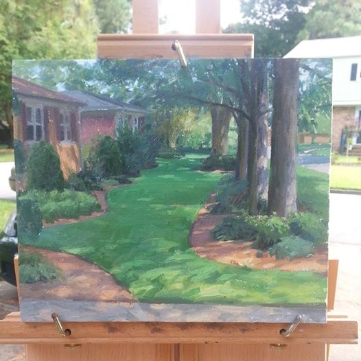
Monhegan Study by Larry Moore 11×14″ click HERE to view
Larry Moore. I love this guys style. He’s a super cool guy to boot. I love his blog, it makes me laugh. Larry definitely has a sense of humor to go along with being a stunning artist!
This is a fabulous study (above) from Monhegan, Maine of the island of Mañana. He captured it so well! Wow! Larry started an Etsy shop where he is selling his studies (WOW… awesome paintings, at fabulous prices! A great way to collect art if the non-studio pieces are out of your price range, or if you’re new to collecting original art.).
This is one artist that can truly paint anything, East coast, West coast, North, South, inside, outside, things, people, you name it, Larry can paint it! Just check out his website! I am so impressed by the number of paintings and how they aren’t alike. Each and every one is different. You can tell that he pushes himself as an artist.
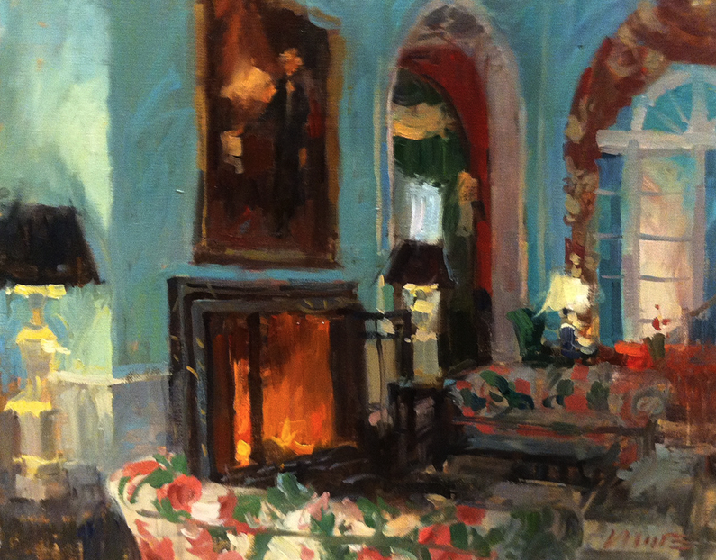
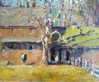
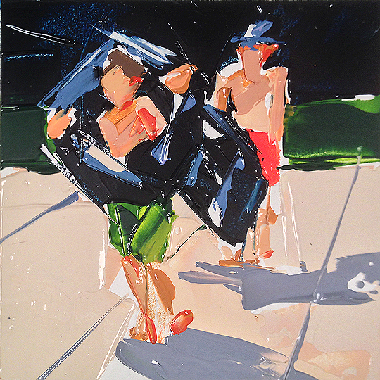
Green 2 by Larry Moore – SOLD
I do try to feature paintings that are for sale… but Larry’s interiors just pop out at me. I love paintings of interiors and not many are painted. Larry’s are outstanding, and they go quickly. Very quickly! So if you see one for sale… BUY IT! ;)
Larry has some WORKSHOPS coming up, so if you’re an artist, you may want to check them out!
I’m an artist, for the most part I paint outdoors, what we call en plein air, which is a fancy french term that means “outdoors”. I’ve been doing this since the mid-80′s and have only recently started to feel like I am in the early stages of figuring it out. It’s a lifelong journey, this figuring it out thing. My background is in illustration where I worked in almost every medium and style you can think of… except maybe egg tempera and marble. I have a huge passion for nature having grown up on a river right next to the ocean with nothing but islands and wildlife behind my house. To paint the great outdoors is to give homage to nature and maybe give the viewers of the paintings a reminder of what was and what could still be.
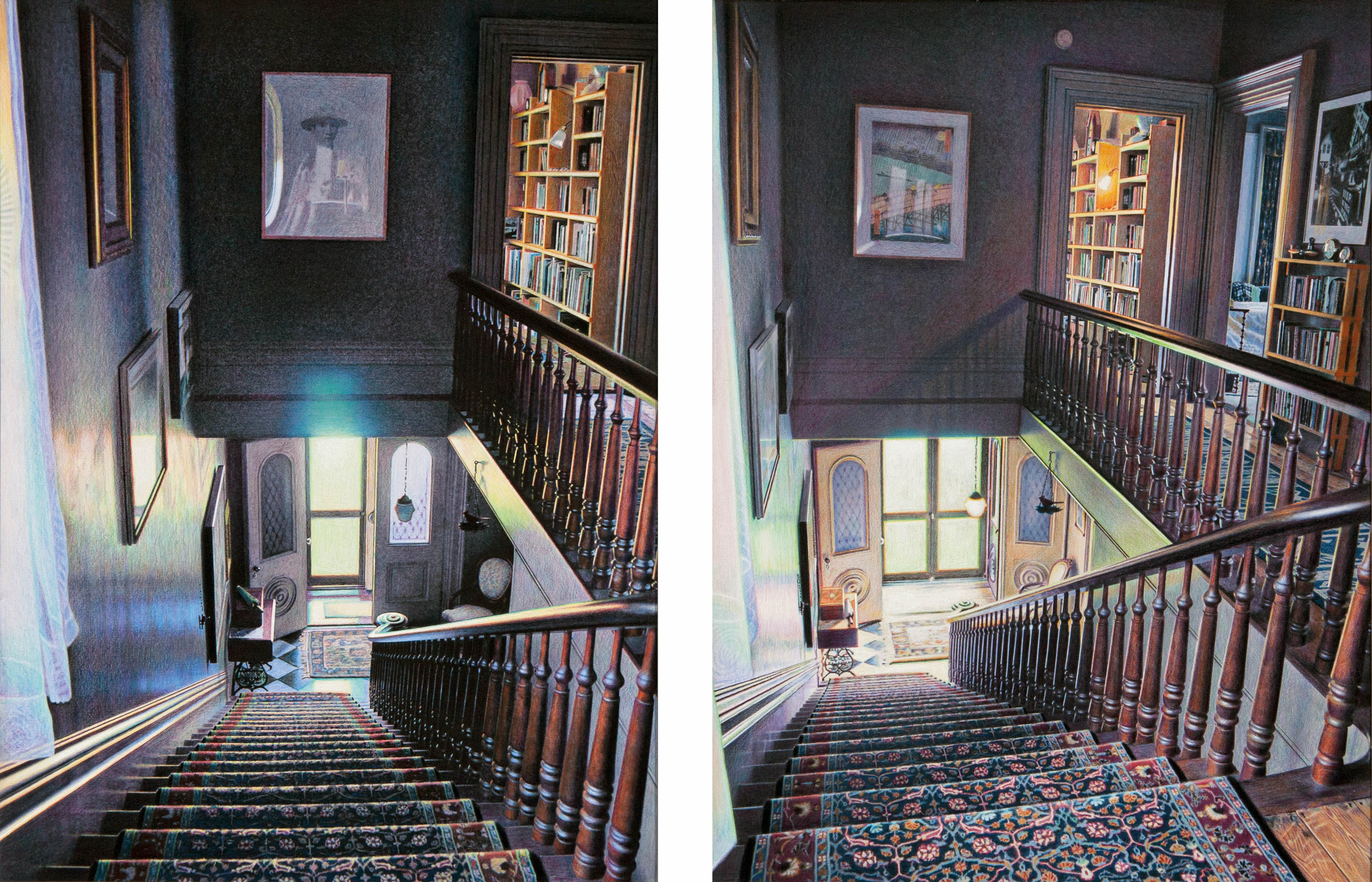
Eric Green, Time Diptych – Cardinal, Grisaille, varnish and colored pencil on board, 16″ x 25″ – including 1″ in between
Eric Green. Wow, his paintings are so unusual. All tell a story. They are paintings that you can really spend time looking at… the kind where you always see something new that you didn’t notice the last time you looked. I love that. Eric is part of a fabulous show at the Dowling Walsh Gallery located in Rockland, Maine. If you’re anywhere near the area, do stop by, you will be in for a treat!
Read a bit about Eric from the Dowling Walsh website:
Eric Green went to RISD on a full scholarship at the age of sixteen. After attending the school for a week, he left to ride freights across the country, spending four years on the road.
In addition to painting for thirty years, he has worked in a frame shop, assembled pulp testers, traveled with a carnival, restored houses, painted industrial buildings from a hanging scaffold, designed two labels for Brazilian beers, written four novels and a column for the local paper. He has had two solo exhibitions in SoHo and Chelsea, received three grants, and a merit award from the National Academy of Design.
In New England, Eric’s paintings have been exhibited at the Ogunquit Museum, Brattleboro Museum, Robert Hull Fleming Museum, and the Portland Museum.
Also read a bit about the time diptychs from DowlingWalsh.com
Artist Statement: Time Diptychs
“This latest series is an attempt to capture time, or the poetic phrase, “the sad beauty of time passing,” something I believe we all experience in life, an emotion that gives existence much of its intensity and meaning. It’s not an easy sensation to describe, so I’m hoping this work will allow the viewer to experience it in a clarified visual form.
The work portrays sections of the interior of our house that I’ve spent the last seventeen years adjusting, a work of art in itself. (Reference: Against the Grain by J. K. Huysmans.) I’m actually drawing a place I’ve carefully created and arranged, so in a way, the image is generated twice. Each diptych is comprised of two panels of the same basic view altered only by the passage of time. What I find interesting is that the art itself can only exist in the viewer’s mind. It is the amalgamation or comparison of the two images that creates the specific emotion, not each individual panel. Gauging and balancing this convergence is everything.
On the 12 by 16 inch cradled hardboard panels, the images are rendered initially with a pencil grisaille, then by layers of sprayed UV varnish and colored pencil, allowing multiple colors to overlap, similar to what we see in nature. All the pencil colors are pure bright hues. Grays and browns are formed by the overlapping tones. The wood color, for instance, is comprised of blues, purples, greens, reds, and yellows, no brown; the wall color in certain sections is eight different hues.”
George Shattuck. Gifted Photographer. Stunning scenes shown in an entirely different light. George’s photographs appear as paintings. They have such a unique and peaceful quality to them. They remind me of somewhere wonderful that I’ve been, a place that has conjured up wonderful memories.
Ooooh, you should see the winter image, the snow, the trees… magical! Check out George’s website!
The River in the Valley by George Shattuck
Peaceful. Serene. I could just look at this all day. The harmony of the colors, the softness of the blues and that fabulous green… so much like a well executed painting! It’s hard to believe this is a photograph! George is represented by the Iris Gallery of Fine Art located in Boston, MA and Aspen, CO, if you’re in the area, do pop in and see his work in person!
Most of my images are created while moving the camera with the shutter open. The exact extent of that movement depends upon many variables and how the elements that affect the normal mechanics of capturing an image (choosing ISO, aperture and shutter speed) come into play. Ultimately it has become a process based upon years of experience along with plenty of trial & error. I am often inspired by the flight of birds or the motion of the tides as a guide in deciding how much movement to use; each shoot is unique in that way. Sometimes the movement is sweeping; creating dramatic minimalist shapes and colors while at other times, the movement is more contained; which creates imagery that project impressionistic qualities. The images that I enjoy creating the most are those that rely on emotional response and perception rather than the reality of the scene. I often work with long exposures in order to reduce what is before me into elemental graphic shapes & colors. I enjoy isolating the details of a scene, often to the point of abstraction; eliminating unnecessary elements in order to emphasize the subject I am working with. The images as you see them are captured in-camera, in the field and in the moment and are not subjected to elaborate post-processing techniques. The colors are offered by nature; most often just before sunrise or before sunset (but not always). I shoot with Nikon digital camera equipment. Ambient light is critical in the process and I utilize an assortment of light-blocking, polarizing and warming filters from Singh-Ray, B&W and others to achieve the results you see.
About George… from his website:
I bought my first camera in 1978 while living on the island of Maui at age 22. It was the highly regarded Rolleiflex 35; a compact range-finder camera with manual controls. It was with that camera that I first became familiar with the triangular relationship between film speed, shutter speed and f-stop. The Hawaiian landscape gave me plenty of creative opportunities to focus on and explore; bamboo jungles, tropical waterfalls, sublime high-altitude sunrises and pristine beaches, all requiring a different set of skills to capture the image authentically. I didn’t know it then, but that period of my young life was the genesis of a life-long relationship with landscape photography. Although largely self-taught as a photographer, I have been mentored through the years by many talented photographers most notably by my friend and author, Bill Tipper. Based in Salisbury, Connecticut, I travel extensively along the New England coast and islands, the Caribbean and more recently within the Berkshires to find the land and seascapes that will respond to my vision and technique. My work is represented by The Iris Gallery of Fine Art Photography; Boston and Great Barrington, Massachusetts. For Inquiries, please visit http://www.irisgallery.net.
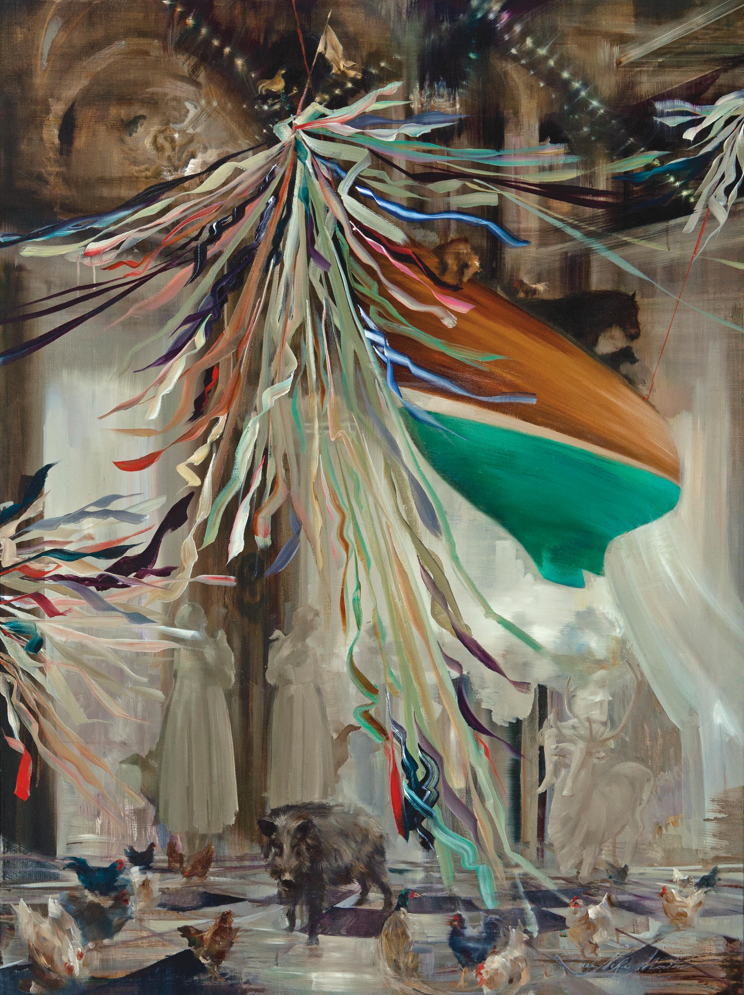
The Ark of the North Country Girl and the Cape of Curiosity by Sarah McRae Morton, Oil on linen, 36″ x 48″
Sarah McRae Morton – Wow. Such interesting subject matter. Her paintings are phenomenal and it shows by the number that has sold. There is a show for Sarah at the Dowling Walsh Gallery in Rockland, Maine. It began on September 5 and runs through September 27, 2014 – if you’re in the vicinity, try to make it! See Sarah’s paintings in person. Experience one of the most amazing galleries ever.
CURRENT SHOW: “The Impossible Sight of a Ship” – SEPTEMBER 5-27, 2014
A family tie brought me to Maine. I have returned, following windy curiosity to see whereseafarers fed my favorite painters, find the “Grim and Wild Maine” described by Thoreau, follow water veins he coursed with Penobscot guides, and hear the wrath of the ocean onthe fortress walls of Monhegan.
The subjects in “The Impossible Sight of a Ship” are the people from whom I am descended, by blood or by the “marrow of artistic tradition”, all of whom led me to a place and time in Maine. The present, as a culmination of chances, is one lock of a braided theme joining pieces in this suite of work. The other two lineages of the binding braid are the history of a family, and that of a string of artists. From each I have inherited substance to make paintings.
These paintings are maps of retraced steps, records of the roads taken to try to capture images of people long gone. They are invented portraits of the shells of tenacious spirits who have survived because their stories are transmitted around campfires, between rocking chairs, and under moth eaten black skies. They had memorable lives or unforgettable brushes with death and left enough legacy, artifacts or genetic residue to retell their stories. What they all have in common is me, a common descendant.
As there is an optimal viewing distance for every painting, it seems true of history too – perspective clarifies some facts and can obscure what we wish not to see. It’s a metaphor I elude to by rendering some detail finely while blurring other passages within the same frame.
My paintings mimic American academic construction. The compositions draw from a canon of western paintings where a common goal was to deceive the viewer- to build a believable window view to an invented scene by an alchemic process using dirt, stone oil, sap, gems and flax. The style of the pieces varies according to the prevalent style of art during each character’s lifetime, displaying facets of aesthetic traditions, or challenges to convention that made American art history.
The process of learning to see gave me the title of the show, “The Impossible Sight of a Ship” .It has been theorized that when European vessels first appeared on the horizon of the Americas, native people could not “see” the ships. Having never laid eyes on such objects before, they were not primed to recognize the shapes of the bow, hull and sails…or see the apparition as portent of a storm.
The concept that it is an acquired ability to recognize objects, illusions, constructions, pictures is a useful analogy for my process of painting. My work is a continuation of the endeavors of others. The ship is impossible for me to see without the ghosts of earlier images on my retinas. I relied on the work of the Wyeths, Homer, Peal, Sully, Eakins to compose these pictures.
Read a bit about Sarah from the Dowling Walsh website (I love bios that tell a story!):
I began painting in a barn loft turned studio when I was eight. The surrounding Amish farmed fields, livestock, barn raisings and quilt auctions were my repeated subjects. Creating pictures led me to an understanding of my place adjacent to that world, and it was art that inspired me to move away from it. Reading through a trove of art history books in the barn ignited my curiosity to pursue art seriously. During and after my high school years I studied drawing and color theory with Myron Barnstone in Coplay, Pennsylvania. For four years I attended the Pennsylvania Academy of the Fine Arts and took history courses at The University of Pennsylvania. When I was awarded a PAFA fellowship to travel to Europe in 2006 I took the opportunity to study art restoration and conservation in Rome. Then, in Norway, I studied with painter Odd Nerdrum.
When I returned from abroad I settled in a coal mining region of West Virginia to create a body of work about the local history. Based on these paintings, I was awarded a Matisse Foundation Fellowship to attend the Skowhegan School of Painting and Sculpture in Maine in 2008. Since then, I have painted series in Cerillos, New Mexico; Carmel, California; Baltimore, Maryland; Freiburg, Germany; and Johnson Vermont at Vermont Studio Center. Painting is my means to relay stories and share ideas. I depend on themes and symbols from western art history to create allegory. When I paint about events I am ever aware of how my lens has been curved, my point of view determined by travel, books, past artists and new meetings. I currently live in Cologne, Germany, but my paintings undoubtedly reflect the setting of my upbringing in rural Pennsylvania. I often return to work in my childhood studio above the horse stalls.
FAC – the Fine Art Collaborative – what an opportunity. Do you see all these wonderful artists? Each so talented and highly sought after for workshops… Guess what? There is another workshop coming up with ALL OF THEM! I’ll feature a few this week and for the next few weeks… Don’t miss out! Sign up while there is still a spot available!
Leslie Saeta. Everyone has heard of Leslie, she’s done very well marketing her art and really making a name for herself. Have you listened to the Artists Helping Artists Blog Radio show? It’s fabulous! She interviews an artist once a week, along with a cohost. The interviews are full of information, and so entertaining! You can listen to past episodes, so check it out! In this lecture, Leslie is going to talk about promoting your art. Who doesn’t need that? Learn from the master!
I get so much out of a demo. I can see how the artists approaches the subject, what they do first, what they don’t do. Sometimes its the little things that make the biggest difference! This lecture and demo is sure to be a hit! Michelle Dunaway‘s portraits just come to life! Don’t miss this chance. I would sign up for as many workshops as I could fit in! So many great artists, all offering a workshop of one type or another, but act quickly, the workshop begins in three weeks!!
Reconnected by Logan Hagege “Reconnected” oil on linen 50×40
Logan Hagege. An iconic superstar Southwestern artist. You see a painting and the style is all Logan’s… you can tell one of his paintings a mile away. Such history and emotion come from them. This piece, above, Reconnected is part of the CHANGING LIGHT – Solo Exhibition at Trailside Galleries in Jackson Hole, WY.
All works at this show are to be sold by draw on September 13th, 2014. SOLD BY DRAW… do you know what that means? It basically means that you put your name in the hat, if your name is picked, then you can buy the painting… if your name is not picked… well, you need to find another painting. I think it’s amazing to be able to sell paintings so quickly! To have so many collectors wanting your paintings! I see why – Logan’s work is stunning!
If you’re in the Jackson Hole, WY area, don’t miss the CHANGING LIGHT SHOW Sept. 1 – 14, 2014 with Artist’s Reception Sept. 13 from 4-7PM.
Trailside Galleries is pleased to present a show of new works by California artist Logan Maxwell Hagege. With approximately 20 new paintings, the American Southwest comes to life in a series of angular images that capture the spare beauty of an arid landscape and of an ancient and enduring Native American culture shaped by the extremes of its environment. The artist will be in attendance at the reception held on September 13th from 4-7pm. .
All works to be sold by draw on September 13th, 2014
Logan Maxwell Hagege is a talented artist who excels in depicting the figure and landscapes. Serious study in art started for Logan when early interest in animation sent him to a local art school, Associates in Art. His interest quickly moved from animation to fine art while attending life drawing classes, and later the Academy`s Advanced Masters Program, which was modeled after the old time French Art Schools where students spent more than six hours per day studying from live models. Logan also studied privately under Steve Huston and Joseph Mendez.
This artist has drawn inspiration for his subjects from his native Southern California as well as by traveling extensively to view various landscapes in the American Southwest and the Northeast Coast of the U.S.
Logan finds encouragement and guidance in masters of the past such as Gustav Klimt, N.C. Wyeth, T.W. Dewing and Maynard Dixon. One idea that drives Logan`s work is that evolution in art is never ending. He is constantly challenging himself with new ideas and new ways of looking at the same subject.
Aimee Erickson. Wonderful artist! Just look at the light and texture in this painting! Very nice! “Sarah” was awarded BEST OF SHOW at the 2014 American Women Artists national show at Addison Art Gallery in Orleans, Massachusetts – exciting!!
Aimee has a great website, check it out, both her studio paintings as well as her plein air paintings! Aimee was also featured by Southwest Art Magazines ARTISTS TO WATCH, a great article!
Paris-born, Portland-based artist Aimee Erickson is an oil painter in the realist tradition. Trained as an illustrator, she has a BFA in Visual Communication Design and has also studied with Sherrie McGraw, Burton Silverman, and Joseph Paquet. Aimee is the first woman artist to paint an Oregon gubernatorial portrait, that of Barbara Roberts in 1997. She teaches at the Multnomah Arts Center, Sitka Center, Creative Arts Community at Menucha, and in her studio.
“My interest lies in the essence of things, in the beauty of nature, and in cycles of consciousness. My paintings include all sorts of subject matter–figures, landscape, still life–with draughtsmanship and design as a foundation.”
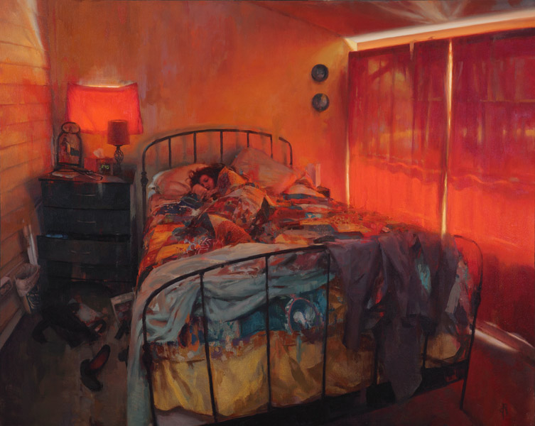
Daniel Robbins… I love his work, it’s always so striking and stands out in some unique way. His paintings keep your eye because you don’t want to leave for some reason. There is so much to see, and if you’re like me, where every picture tells a story, well then… I get carried away imaging the story behind his paintings… Like this painting, “3:45” for instance, is that a friend, spouse, girlfriend… why is she sleeping at 3:45? Ha ha, not that any of the answers matter, you see what I mean, you keep looking, because you’re interested. This is so well done, I love it, the fabulous light coming through the red curtains. Fabulous!
Painting by Daniel K Robbins
This is a painting that Daniel posted on Facebook: The Art of Daniel Robbins I think it’s fabulous. It reminds me of an area of Michigan when I was a kid. I love those big trees. There is a story here! Daniel Robbins is an amazing artist, I especially love his interiors, precious few people paint them… I know he was a guest artist at Robert Lange Studios in Charleston, SC – quite an honor I would say! Check him out, his work is fabulous!
Daniel Robbins grew up in Virginia Beach, Virginia and he has always wanted to create art. During grades 4-8 he was enrolled in the Old Donation Center for the Gifted and Talented, and in high school he continued his study of art at the Governor’s School for the Arts. For college he moved to Richmond, VA to study in the Communication Arts department at Virginia Commonwealth University. While at VCU he received multiple awards for his artistic and academic achievement, including: Most Outstanding Junior and Senior in Communication Arts, Dean’s List, and a scholarship from the New York Society of Illustrators’ Student Competition.
After he received his B.F.A. in 2006, Daniel started to teach drawing and painting as an adjunct faculty member in the Communication Arts department. He has also exhibited his paintings in galleries in New York, Virginia, and North Carolina. Daniel has received numerous honors and awards including: Best in Show at the “Virginia Artists Juried Exhibition,” in Hampton, VA; Virginia’s Finest Artist at the “Boardwalk Art Festival,” in Virginia Beach, VA; Winsor and Newton Material Award at the Salmagundi Club in New York City; and he wrote “The Road Not Taken” for the Artists on Art publication.
His thoughts on his work:
In my work I explore the world around me. Art gives me the opportunity to analyze both the physical properties and psychological effects of my subjects. I focus on the honest experience of seeing. I do not observe something simply as unique or beautiful, but allow my mind to think, question, and respond intellectually to the subject. To focus on beauty alone denies both artist and viewer the full experience of observation and intelligent response. My art represents this process of seeing. The final result of the work is not a representation of one idea, but a multilayered response spawned from repeated observation.
Daniel Robbins continues to live and work in Richmond, Virginia.
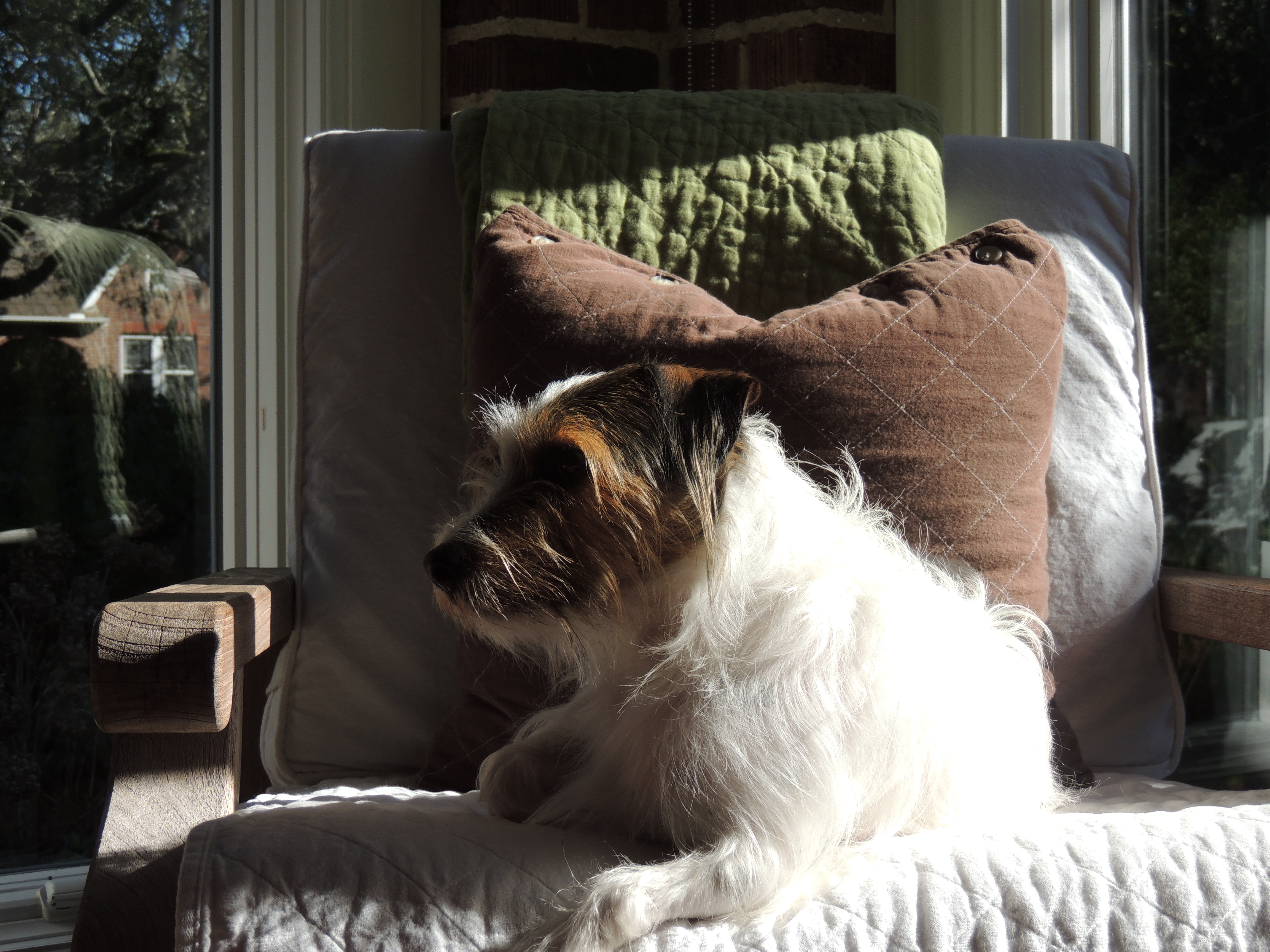
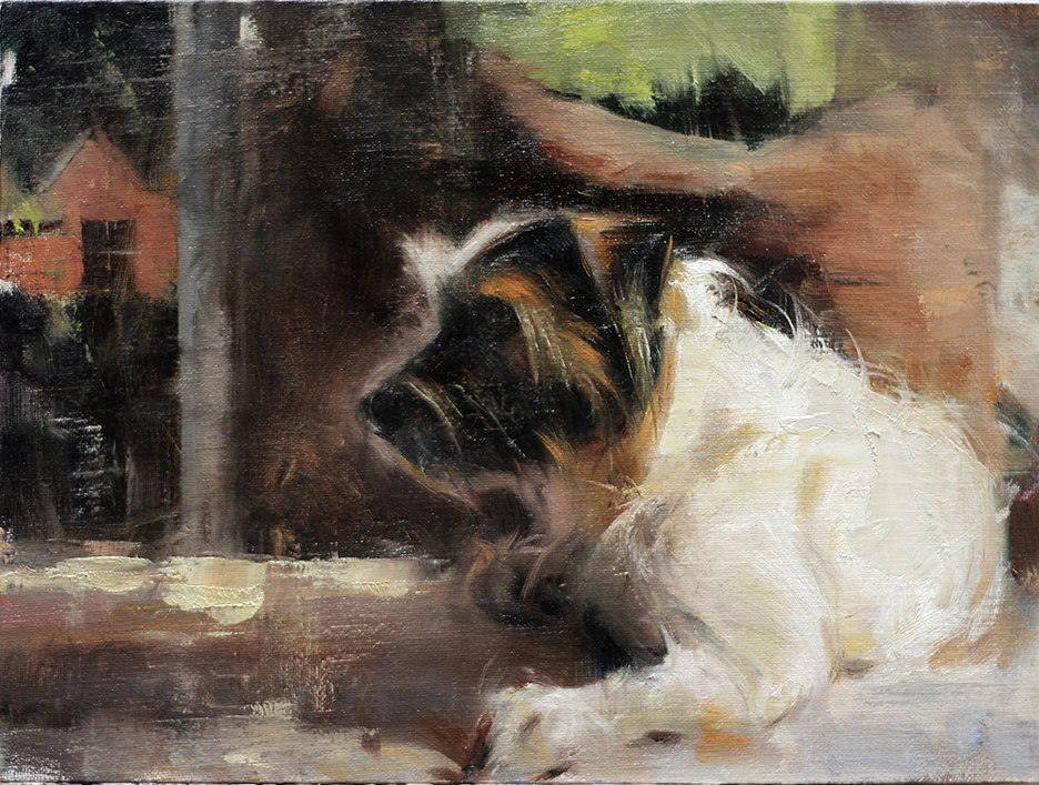
Elizabeth Pollie. Amazing person. Stunning artist. Just look at this image of Charlie, our Jack Russell… in his favorite position looking out the sunroom windows… watching for those “kitty cats” that make him run from room to room having a big time!… Elizabeth had seen this photo and asked if I could send it to her, if it would be OK to paint a study of him. Absolutely! She called them studies. I called them masterpieces! Each one was so spectacular it truly boggled the mind. Clearly Charlie and Elizabeth have a connection!
Study 17 (Charlie) by Elizabeth Pollie
Meet “Study 17” by Elizabeth! Whoa, right! I’ll never forget when she posted it on Facebook. We were speechless. At first I thought it was the photo, and then I noticed the background which I love so very much! This is SO CHARLIE, isn’t it? She captured his very essence without ever meeting him! Look at the hair! How? Isn’t there a magical quality to this painting? Charlie looks like he could turn his head and look at you, doesn’t he? The background is so stunning. I love how Elizabeth eliminated the clutter and left the heart and soul… We will love this painting forever and ever!
Elizabeth is an amazing person, if you ever get a chance to meet her I highly suggest it. She is full of life. If you’re in the Harbor Springs, Michigan area, she has a gorgeous gallery there ELIZABETH POLLIE FINE ART. Please do stop by and say hello!
Recently she was on blog talk radio for ARTISTS HELPING ARTISTS with host Leslie Saeta… I listened to the interview. It was fabulous! For those of you who love art, I highly suggest listening to the weekly ARTISTS HELPING ARTISTS show, and if you can’t listen to it live, they archive the programs, so you can listen later! Artists Helping Artists is the #1 Art Show on Blog Talk Radio! It’s easy to see (or hear) why!
Jacalyn Beam. I really like her paintings. This painting, Dusk, has that wonderful moody sky. The stark tree against the stunning sky with the cool building makes for a great painting! I love how dramatic the sky is!
One more, because this is one I just fell in love with… image from Chadd’s Ford Gallery in PA – just look at that tree… I LOVE THIS!
Nap Time by Jacalyn Beam Image: Chadd’s Ford Gallery
Jacalyn seems like a cool lady. I haven’t met her but we have emailed back and forth. She’s got great stories about painting plein air, like the time she was all set up and painting in DC and a road crew showed up and started jack hammering. Yow! They gave her ear plugs but that just wasn’t enough, she then moved on to a Georgetown Canal and painted a stunning painting!
Jacalyn painting at Biddeford Pool, Maine – stunning, eh?
Jacalyn Beam was born in Chester County, PA. Her early training in art was rooted in the history and beauty of the Brandywine Valley. She holds a B.S. in Music, M.Ed. and Ed.D. and has always held a passion for painting. The Wyeths, Sorolla, Sargent, Sotter, Schofield, and Thayer are a few of her favorite artists.” I paint outdoors because the world is rich with beauty and it’s the optimal way to see three dimensional objects, the subtleties of light and shadows, atmospheric perspective, and ?real’ colors. Plein air painting is also a lot fun! You meet new friends – animal and human, have fleeting conversations with bicyclists and joggers, and experience the sounds and smells of the outdoors.”Jacalyn is a member of the American Impressionist Society, Oil Painters of America, and serves on the Board of Directors for the Mid-Atlantic Plein Air Society. She also serves on the Board of Directors at the Chaddsford Historical Society and chairs the annual Winter Plein Air Event. Recently, Jacalyn was selected by state officials to draft and edit National Core Performing Arts Standards that will reach performing arts teachers and students K-12 across the country.Jacalyn is included in the book “100 Mid-Atlantic Plein Air Painters” published by Schiffer and scheduled for release in 2014. You can find her art at the Chaddsford Gallery in Chaddsford – PA, Peninsula Gallery, Lewes – DE, Strode’s Mill Gallery in West Chester – PA, the Station Gallery in Greenville – DE, and in 2014 a New England Gallery.
Tubing Duo 2 by Sally Shisler – 4 x 4″ Oil on Board
I love Sally Shisler’s work. It’s so different. So loose and free, so happy!! Most paintings are fairly small, all are fabulous! I have an affinity for all the tubing paintings… reminds me of my childhood, the days when we would get up and jump in the river and spend the entire day there. Sometimes we had tubes and would walk down the street, jump in the river and float home with the current, and repeat, many times! Nothing better! You know a painting is good when it can remind you of something or just bring happiness. Sally’s paintings do just that! Sally also has a wonderful blog, so check it out!
Here is what Sally wrote about Tubing Duo 2 (above):
Here is one of my favorites images from an exhibit earlier this year. The image had been with me for a few years and I’ve been waiting for the right time to paint it. The photo was taken at my son’s baseball team’s end of season party at Wekiva Springs in Florida. Lots of sun and fun; lots of color; lots of great photo ops. I always love the opportunity to paint “black”. Though I don’t use tube black. Most artists are taught to mix it so that there’s depth. I use alizarin crimson, sap green, and ultramarine blue. I mix it to lean towards one of the 3, so that it retains some color. It’s the value of it that makes it read as black.
But wait! That’s not all! Sally has another side… she paints more serious work, dramatic, love these knife strokes!
Bio: In 2006, as one of the original members of the Daily Painters* Online Art Gallery, I committed to the discipline of painting 1 painting every day and posting it on my blog for all the world to see. Crazy endeavor and totally exposing, as any other artist who undertakes the mission will tell you. This provided lots of insight into how life as a full time painter might be, and after deciding that I wanted to be a real painter, I began working and practicing hard. I soon settled into a routine where my creative endeavors grew to match the dedication I have given to a 22 year career in medical illustration, (a field that demands both content and technique precision). With new outlets that offered truer creativity (included plein air painting events) I moved from watercolors to oils, and brushes to palette knives. One day during a plein air painting event, I picked up a knife, threw caution to the wind and let things rip! Since that day, I have welcomed a remarkable transition from realism to impressionism. Happily, touches of abstract expressionism are also beginning to emerge. Palette knife painting holds the promise of lively and fresh work. It’s my best opportunity for both technical and spiritual growth. Sally has a lot going on, if you’re in the Winter Garden, FL area you may be in luck! Check this out…
Opened new studio in Winter Garden Florida in June where I paint and teach private palette knife lessons.
Active gallery member of SoBo Gallery in Winter Garden Florida where I teach a variety of workshops and exhibit regularly.
Three day palette knife workshops at Sobo Gallery this September 24-26 and November 19-21, 2014. (Contact me at scshisler@gmail.com)
Workshop scheduled at The Sandy Springs Art School in Atlanta Georgia for early June of 2015. (Contact Donna Thomas).
All images courtesy of Sally Shisler, used with permission…
Vanessa has wonderful paintings from all over the world. She is also participating in this years out of this world workshop being held in September “The Fine Art Collaborative 2014” (there is still time to sign up!)! Wonderful paintings by an artist who really knows art… read on! Here is a bit that Tom Balderas wrote about Vanessa on The Fine Art Collaborative 2014 site: Vanessa, a founder of the ‘Realism Without Borders’ group is the California Editor of the Nationally acclaimed art collector magazine ‘Fine Art Connoisseur’ as well as a long time contributing writer for ‘Plein Aire’ magazine. A highly collected painter, she brings to the table the highest professional standards that are certain to make this September’s event another huge success.
Vanessa Rothe – “Travel Sketching, Studies in Watercolor” – 1 Day Workshop – September 26, 2014
Bonjour welcome to my travel sketching class! Weather you are a world traveler or a simply a wanderer in your own town, an artist always stops to admire their surroundings and often takes notes. Some use photography to capture the moment or scenes they see, others sketch or make watercolor studies. A fine artist often uses both. Photography can help to capture the moment, and the line based aspects of the scene but color and perspective can often be a bit off. For capturing the light, shadow and important color, a nice watercolor sketch is great to have… and often very charming!
Learn to create beautiful “color studies” that can be helpful later to make a larger watercolor or oil paintings. These color studies can actually be in and of themselves a little “chef d’oeuvre”, a charming addition to your portfolio, or a sketchbook of memories from a trip you never want to forget.
We will start with sketching basics to learn some fundamentals that will give your drawings a little structure for about an hour. We will have a short coffee break, oui? Then I will explain the “How to” of watercolors and a little basic color understanding, mixing and technique. I will show you how to use and to “not use” white. After a short lunch, we will be working from print outs of colorful fruits, charming scenes of Europe, boats with water, and some simple gestural figure in the landscape.
I will be doing demonstrations for you to watch all along the way. You will be given helpful hand outs, learn how to pack and set up to paint, I will suggest some great inspiring books, give you photos to work from and of course lots of instruction and inspiration!
Prior basic drawing skills and beginning watercolor are recommended but not required. Please note: this is not an extensive classic beginning watercolor class that would include full basic how to instruction and full color explanation of each of the watercolors. It is focused on fun travel sketching and making great color studies. Private lessons can be offered separately for this.
10 student maximum
$100
http://www.vanessarothe.com/ Read a bit about Vanessa from her website: Once a successful Graphic Designer/Art Director working with Disney Press, Walter Foster and Sony, Vanessa has taken to a more traditional color palette as she paints in oils.Vanessa Françoise Rothe grew up in the artists colony of Laguna Beach, CA, the daughter to a hand painted silk and well known German clothing designer to the Stars, Detlev Rothe, and her French mother Jacqueline Ricaud. She received top art scholarships to study at the University of San Diego, University of CA, Irvine, and at the Laguna College of Art and Design as well as Ateliers in France and Italy and has learned directly from professional painters. Vanessa has been fortunate and honored to exhibit alongside some of the Nations most well known painters. She has had many successful solo exhibitions at Wendt Gallery in Laguna Beach, along with an impressive list of group shows including Richard Schmid Fine Art Auction, the Annual American Impressionist Society Exhibition, Artists for a New Century at The Bennington Center for the Arts, and California Art Club exhibitions. After exhibting at WENDT GALLERY in Laguna Beach for 4 years, and now at her own Studio Gallery at 418 Ocean Ave, Vanessa is also proud to exhibit at Gallery McCollum in Laguna Beach. She also can be found participating in various group exhibitions such as The Bennington Art Center Vermont, Gallerie DDG Paris, Richard Schmid Fine Art Auction, J. Willott Gallery, and the Annual American Impressionist Exhibitions of which she has been named a signature member. She is honored to be a Signature member of the American Impressionist society, a member of the California art Club, Oil Painters of America, and LagunaPlein Air Painters Association. Vanessa is also proud to be the California Editor of the Nationally acclaimed art collector magazine FINE ART CONNOISSEUR as well as a long time contributing writer for PLEIN AIR magazine. She has had both classical training in the US at University of San Diego, University of CA Irvine, Laguna College of Art and Design as well as abroad at Ateliers in France and Italy. She continues to study the figure at Laguna College of Art and Design. She has been a graphic designer and Art Director for such companies as Walter Foster Publishing, Disney Press, and has owned her own successful graphic design and fine art studio for over 20 years. In addition to showing at fine art galleries worldwide, she now teaches atelier style private art lessons and workshops, is the Author/Artist to a new series of art instructional books by the leader in art instructional books, Walter Foster Publishing entitled “An Art School Approach to Oils”. Influenced by a blend of classical traditional representational art, Impressionist works, artists such as Sargent, Sorolla, and Chase, as well as modern master friends such as Scott Burdick, Susan Lyon, Ray Roberts and Peggi Kroll-Roberts, she takes the essence of a subject and captures its charm with the use of color, shadows, and light. The natural simplicity of her work, her visable brush strokes and pleasing color combinations form a realist yet slightly impressionistic style which her collectors admire. Her subjects include the beautiful pastoral landscapes of France, Switzerland and Italy, the allure of historic cities such as Paris and Venice, classic California seascapes and landscapes, vibrant still life as well as some new figure work.
Setting Sun From Bear Island, Maine by Sarah Faragher- oil/canvas – 20″ x 26″
Dramatic. Gorgeous. So different! Sarah definitely has her own style, her paintings are unique which is so nice. I love the colors and the feel of this one!
Sarah is represented by Landing Gallery in Rockland, Maine, if you’re in the area, stop by and check out her work!
My paintings are memoirs of my experiences with nature. Through painting I participate in the landscape, recognize transcendent moments in nature, honor the integrity of natural forms, and describe where my heart lives. I often feel as if the places I paint have commissioned me to tell their autobiographies, at the same time that I tell my own.
I was born in Bar Harbor, Maine, grew up even farther downeast in Addison, a small town in Washington County, and now live and work in the beautiful midcoast region. I make my living as a painter and as a seller of used and rare books.
I paint directly from nature and in my home studio. Much of my recent work is part of an ongoing series entitled Home Truth, about the meaning of home, memory and its depths, and the passage of time. I paint the places I love, and the shapes, moments, and situations within those places I find beautiful and haunting. I deeply love to paint, and I hope it shows!
I love to work in places of integrity, with minimal human-made stuff in evidence, places that haven’t changed much since some of my heroes painted there too. The natural energy and sublime beauty that motivated them is still present, and motivates me in turn. It’s all around and I find it intensely satisfying.
Seven Nineteen Fourteen by Charlie Hunter – Oil on Theatrical Muslin – 12 x 24″ – SOLD
Charlie Hunter won the first place award in the Plein Air Easton Quick Draw competition with this painting “Seven Nineteen Fourteen“! Do you know what that means? It means it was completed in less than two hours… WHAAAAT?! I know! Jaw dropping… Just look at the level of detail that was accomplished in that short time… using basically these colors: Van Dyke Brown, Burnt Sienna, Ultramarine Blue, Permanent Green Deep (Cobra water-mixable oils).
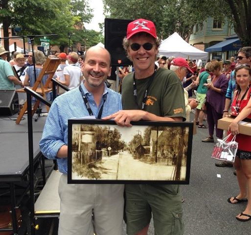
I have to include a photo where you can see this painting in full context…
Quick Draw Judge Peter Trippi (L) and Charlie Hunter (R) at Plein Air Easton, MD 2014 Photo via Charlie Hunter Facebook Page
Charlie’s one of those cool artists with a sense of humor. You just have to love that! If you would like to keep in touch with what’s happening in Charlie’s art world, with a little dose of humor added… Subscribe to his mailing list! While you’re there check out his paintings… quite amazing, aren’t they? I see Charlie has a few workshops coming up, in case anyone is interested!
“I do not know if I have ever said no one is born with a natural sense of design, but if it is within the realm of human evolution, or the whim of the Divine, to allow one individual to possess such a gift, then Charlie Hunter is certainly the lucky winner… No Oriental or Occidental master of the pure line can surpass what Charlie, almost matter-of-factly, does when he takes pencil in hand.” – Richard Schmid, ALLA PRIMA II, 2013
I was born in a small town in New Hampshire where we used to swim in the abandoned granite quarries. We had pigs and chickens and rambling barns. I’d walk home from school along the branch line rails of the Boston & Maine, and read the names and slogans on the box cars that’d roll by, things like “The Nickel Plate Road” and “Santa Fe All The Way”…..
When they put a highway bypass through our barns, my family returned to the house built by my great, great, great grandfather in Vermont, where my Great Aunts lived. We made (and still make) maple syrup there and had (and still have) a hand-cranked cider press which makes amazing cider but can remove a finger if you’re not careful (just ask Uncle Andrew).
My Dad was an occasional minister who ran a small print shop. There was always a lot of paper and drawing stuff around. I drew a lot. Though I did not appreciate it at the time, in college I was lucky enough to be forced to draw the figure every morning from 8:00 am till noon. Afterwards, I got a job designing tour posters for acts like The Clash and REM and The Jerry Garcia Band. I got to design a lot of album covers.
Now I live back in Vermont on the banks of the Connecticut River in an old mill town. There, I like to paint what nature does to what man creates. I tend to use a monochromatic blend of ultramarine blue, viridian, yellow ochre (sometimes) and burnt sienna. Sometimes I do an underpainting from life, then, in the studio, apply transparent glazes (of pretty much the same colors) on top. Sometimes this works and sometimes it makes a big mess. But I always learn something.
A few years ago I was invited to join the Putney Painters, run by Richard Schmid and his wife Nancy Guzik. A bunch of us get together just down the road on most Saturdays and we paint up a storm. It’s amazing fun.
My goal is to paint beautifully that which is not traditionally considered beautiful. Sorta like a less-grotesque Anselm Keifer in a considerably better mood. It’s my hope that these paintings maybe move you even a little bit as much as the way the real thing moves me. Thanks for looking.
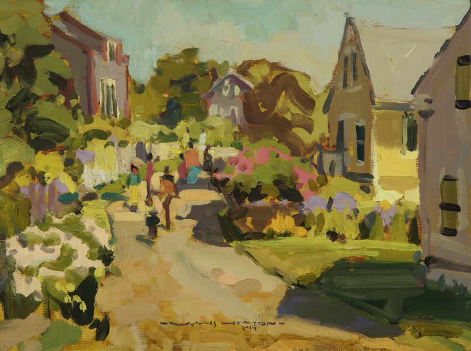
Wyllis Heaton. Amazing artist! Such unique style! For those of you who have been to Monhegan, I know you’ll recognize the above scene! So fabulous without being overworked, very nice! I even love his signature, very cool!
Can I say… you’re in for quite a treat?! Wyllis just unleashed one heck of a website! It’s gorgeous, showcasing each painting perfectly. Ahhh, the wide variety of paintings boggles my mind. This guy is talented. I loved reading about his different jobs, so interesting. I love when artists put some personal info on their website… it helps us who are far away not only see their art, but get to know them as a person! I am impressed!
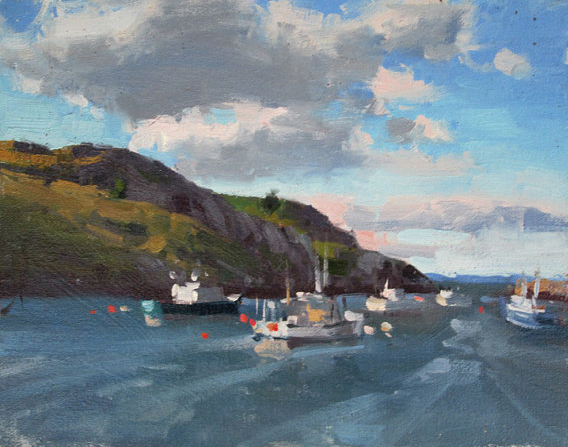
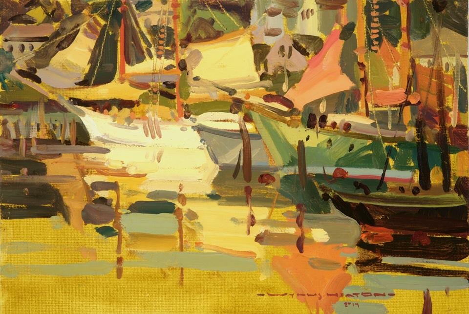
Camden Harbor, Maine by Wyllis Heaton
Ahhh, Camden Harbor (Maine), a beautiful place and captured so nicely! I love the warm palette! The water is incredible and the boats, whoa! I just happened to pick two Maine paintings because I have Maine on my mind. Lots of friends are there or on their way there right now to paint, and these paintings bring back great memories!
Wyllis, you are amazing! We all look forward to seeing your next work of art! Did you know that Wyllis is also an award winning landscape designer? I would say he’s one very talented guy!
Wyllis started painting at an early age and his work is widely collected. He studied at the famed Art Center College of Design and has continued his studies with other modern masters of the craft.
After college he taught painting for seven years to a close group of 100 students, many of whom went on to art colleges and careers in the visual arts, while winning honors of their own along the way. He relocated to Santa Barbara in 2007 to design and install gardens along with his brother Adam Graham.
Currently, Wyllis is displaying artworks at a number of galleries in the Santa Barbara area, and in Bar Harbor, Maine.
All images via WyllisHeaton.com – used with permission from the artist…
I look forward to seeing Wyllis Heaton’s work in person one day! Catch you back here tomorrow!