Featured Artist… Stacy Barter!

StacyBarter PickinPunkins sb

Pickin Punkins by Stacy Barter

Doesn’t this have a fairytale quality to it? The pumpkins are so cool, and the big one in the wagon is quite like Cinderella’s carriage! The little girl’s face, concentrating on not dropping the big heavy pumpkin… and the dappled sunlight tie this up into one pretty painting. Very nice!

Here’s a blip about Stacy from her website (this is a tiny portion):

Stacy Barter’s oil paintings depict her intense fascination with light and atmosphere. “I am constantly striving to capture depth and dimension in my oil paintings. Working from life, whether it’s from flowers or a model is exhilarating and ever changing.”  “This is my passion, life dedication and contribution”.

She resides in Orlando, Florida with her husband Terry and teaches workshops and is on Senior Faculty with Crealde’ School of Art in Winter Park. 

Before I forget, let me wish you a HAPPY FIRST DAY OF SPRING! Whoa, time flies!

Catch you back here tomorrow!

Featured Artist… Jeremy Mann!

JeremyMann TheWhiteVanity PrincipleGlry

The White Vanity by Jeremy Mann – Image: Principle Gallery

How amazing is this? The intricacy of this girls top is amazing. Her reflection in the mirror… spectacular! The rough looseness of the wall, vanity and mirror – out of this world! Jeremy isn’t fooling around, this dude can paint!

JeremyMann AfterTheStorm PrincipleGlry

After the Storm by Jeremy Mann – Image: Principle Gallery

I think it’s so cool when artists are diverse. Jeremy lives in San Francisco and paints many downtown scenes that are out of this world. If you haven’t yet discovered Jeremy, check out his work, it’s pretty darn amazing!

Read a blip about Jeremy from his website:

Jeremy Mann – Biography
Jeremy Mann(b. 1979) graduated from Ohio University with a Cum Laude degree in Fine Art-Painting. Afterward, he ventured out to California where he earned his Master’s Degree with Valedictorian honors at the Academy of Art University in San Francisco. Since then, Mann has garnered substantial attention in the art world. Praised by critics and collectors alike, his work recently graced the cover of American Art Collector magazine.Executed on medium to large-scale panels, each exciting work demonstrates the artist’s unmistakable style. Working on wood panels provides a strong support, where Mann can utilize a number of techniques: staining the surface, wiping away paint with solvents, and applying broad, gritty marks with an ink brayer. Mann paints with confidence and flair. He addresses complex compositions with a mature eye and his colors are both vivid and atmospheric.

Living in downtown San Francisco, Mann paints his immediate surroundings with intimate, dynamic expression. A number of unique compositions are inspired from the city’s pavement, where reflected street lamps and neon signs glitter in the rain. In each work, Mann imbues the city with drama, mood, and personality..

Ever ambitious, Mann covers a wide range of subjects beyond cityscapes: interior scenes of lone, young women as striking and restless as the city itself; a bold and intriguing self-portrait, masterful still life paintings, and pastoral scenes that recall the landscape of his hometown.

Catch you back here tomorrow!

Featured Artist… Lorenzo Chavez!

LorenzoChavez AMarchDay MkngbrdGalry

A March Day by Lorenzo Chavez

So many things to love about Lorenzo’s work. In this particular painting, the iciness of the water drew me in, the stark dark line of vegetation in the background was a nice pop and then that oh so awesome shadow line. Absolutely lovely! You must check out Lorenzo’s work, he’s got a great website! I found this particular image on the Mockingbird Gallery website, very nice!

Here’s a blip about Lorenzo from the Mockingbird Gallery website:

Lorenzo Chavez is from New Mexico where he enjoys a connection with the colorful and historic Southwest and its striking landscapes. He studied at the Colorado Institute of Art and the Art Students League of Denver.  Intensive private study of the Impressionists and 19th century American and Russian painters has made him aware of the wonderful possibilities of painting from life.

 Chavez’s work in both pastel and oil is devoted to plein air landscapes with an emphasis on the American West.  His passion for his craft and his visceral connection with whatever landscape surrounds him weave a powerful undercurrent of emotion and accessibility.

 Chavez exhibits in national invitational exhibitions across the country including the Pastel Society of America, Artists of America and Artists of the West, The Northwest Rendezvous Group, Landscapes of the American West and Plein Air Painters of America.  His worked is exhibited in the C.M. Russell Museum, Laguna Art Museum,Gilcrease Museum, Loveland Art Museum,Pasadena Art Museum, Albuquerque Museum Miniatures and the Bradford Brinton MemorialMuseum.  He was invited to exhibit 7 pastels at the 2010 summer Exhibition for the Society ofPastelists in France.

 Chavez’s work is featured in prominent galleries and magazines including Art of the West,Southwest Art, Pastel Journal, Art-Talk andAmerican Artist.  He was cover artist for The Artist’s Magazine.  He is an active member of the Western Rendezvous of Art, California Art Club, American Impressionist Society and the Pastel Society of Spain.

Catch you back here tomorrow!

Featured Artist… Craig Mitchell!

CraigMitchell JewelOfTheHighCountry CM

Jewel of the High Country by Craig Mitchell

Impressive, right? This is a good size painting, 36 x 48 and just fabulous! I love the brilliant blue sky, the stoic trees, the light on the rocks and the movement in the water that you can hear if you sit still enough.

I featured a cool artist (Tom Hughes) on Monday, (what a nice guy by the way!) and as I was looking at his website, specifically his LINKS (I love when artists post links to supplies they use, art they appreciate, and blogs they read, so thanks for sharing, Tom)! This is how I ran across Craig Mitchell.

Here’s a blip about Craig from his website:

“My father was a fisherman. In teaching me to fish he also gave me a great appreciation for the natural world. Virtually all of my paintings begin as plein air studies used as reference in the studio. Nothing can substitute for painting on location where the colors are true and my view of the earth is unfiltered. Inspiration comes from extended trips into remote wilderness areas of the West where I experience a spiritual exchange within a pristine environment. As a contemporary impressionistic painter, I balance the respect of nature’s conventions with my own interpretation of hue, composition and unity expressed in a fluid painterly style. I also give a nod to the past in technique and other time-proven principles and traditions that transcend artistic genres as a sound foundation for artistic innovation. My personal goal is to explore the process of creation, to engage the viewer in looking and therefore seeing; to capture a transient moment in time and place that eludes us in a busy world.”

Catch you back here tomorrow!

Featured Artist… Tom Hughes!

TomHughes GoldenGate TH

Golden Gate by Tom Hughes – Image

Golden Gate is a painting that Tom quickly did while scouting for workshop locations. Fabulous! I love plein air paintings, they just amaze me.

I truly enjoy Tom’s work… and his website… WHOA! I especially love the  GREATEST HITS link. These paintings are sold but Tom shows the finished painting and the sketch he used to get it to that point. And they are FABULOUS!  Just don’t take my word for it, check them out!

When looking at Tom’s “Greatest Hits” Charles Movalli crossed my mind (another fabulous artist, read more about HERE or HERE…). After reading Tom’s website I see that they are friends. Very cool indeed! I’m keeping my eye on this fabulous artist… can’t wait to see his work in person one day! I would love to be taking his workshop right now… it starts today in Marin County (CA).

Here’s a little blip about Tom from his website:

Tom Hughes was born in Massachusetts in 1965.  He attended Northeastern University and M. I. T. for physics but left in 1986 to work as a staff artist for the Christian Science Monitor daily newspaper, until 1989.  After this, he did freelance illustration for a few years while he taught himself to paint.

Hughes has been a professional artist – having finished his last actual job in 1992 – for 20 years.  He paints figures, portraits and landscapes in various media: oil, acrylic, watercolor and alkyd.  He has had solo exhibitions at galleries in San Francisco, Lake Tahoe, the New England states, and France.  His work has been featured in American Artist Watercolor magazine and Fine Art Connoisseur, for which he painted the magazine’s publisher Eric Rhoads’s portrait in oils.  Tom Hughes is one of the artists whose work is featured in a book about watercolor painting skills, Watercolor Painting by Tom Hoffmann, published in 2012 by Watson-Guptill.

In 1999, Hughes moved from New Hampshire to Meeks Bay on the west shore of Lake Tahoe where he and his wife Charlene lived for several years.  They now reside in Alameda, CA.

Catch you back here tomorrow!

Featured Artist… Matt Smith!

MattSmith at-home-in-the-canyon MS

“At Home in the Canyon” by Matt Smith

“AT HOME IN THE CANYON” is an amazing piece. I love how the little bird is in that big open space. He looks like king of the castle. The light is fabulous, the rocks are rugged and some of the best i’ve seen… and that moving water… nice!

Here’s a blip about Matt from his website:

BIOGRAPHY

Matt Smith was born in Kansas City, Missouri in 1960.  At an early age he moved to  Arizona.  He later moved to Europe where he lived two years in France and one in Switzerland. In subsequent years Smith painted in Germany, Austria and Italy.  Smith has lived most of his life in Arizona, where he has a deep attachment and respect for the Sonoran Desert.

Smith graduated from Arizona State University with a Bachelor of Fine Arts degree in painting.  He spent a vast amount of time studying the traditional styles of such landscapes masters as Maynard Dixon, William Herbert Dunton and Edgar Payne.

Most of the time, Smith can be found painting en plein air from southern Arizona to the Canadian Rockies.  He also paints the California coast to the mountains of Colorado. “I appreciate traditional landscape painting and I am inspired by the pristine landscapes of the American West.  I enjoy working in areas where one can travel for miles without seeing the influence of man.  When I paint, I feel I’ve hit the mark when I’ve captured a balance between mood, look and feel.  You know you’ve succeeded when viewers sense the desert heat or the chill of a mountain snowfall.”  

Smith currently lives in Arizona with his wife, Tracy, who is also a painter.

Catch you back here tomorrow!

Featured Artist… Christine Lafuente!

ChristineLafuente BoatsInManset LaurelTraceyGallery

Boats in Manset by Christine Lafuente{Image}

Most of you know what I’m going to say… LOVE those pops of orange. Lawdy! That beautiful orange next to that rich gorgeous blue… oooowie! Makes for a nice piece! The palette is nice, the composition is serene and happy… kind of like you’re on the back of one of those boats with an iced tea in your hand soaking up the sun after a long winter… ok, maybe I have a wild imagination, but it’s a feel good painting for sure!

ChristineLafuenteBlueCartonsJellyJar LaurelTraceyGall

Blue Cartons & Jelly Jar by Christine Lafuente{Image}

It’s not always easy to paint everyday subjects so that they’re interesting… THIS is interesting to me… perhaps its my fondness for jars, especially with cool lids… (you can use them for SO many things!). Again, that pop of a bright color wakes this painting up leaving the rest of it nice and serene. Very nice.

Here’s a short blip about Christine from her website:

Christine Lafuente is a widely exhibited Painter and Pratt Institute Instructor. She received a Bachelors of Art in English from Bryn Mawr College (1991), a Certificate in Painting from the Pennsylvania Academy of Fine Arts in Philadelphia (1995) and a Masters of Fine Arts in Painting from Brooklyn College (2004).

Catch you back here tomorrow!

Featured Artist… Richard Kooyman!

RichardKooyman Campfire2 rk

Campfire #2 by Richard Kooyman

How is this for loose? I love how it allows your imagination to run free… This could be a group of friends who get together for big campfires, telling great stories, toasting marshmallows, eating brownies… oh wait. I think I’m hungry… all this talk of food!

Amazing paintings are to be seen on Richard’s website. This man is versatile. I love his trees (yep, that’s a tease, now you have to go look ;) truly, they are wicked good)!

Here’s a blip about Richard from the **Emily Amy Gallery

The writer James Joyce believed that the best art was that which “grabs the viewer and arrests them and turns their focus outward from themselves.”

It is my hope that others seeing my paintings can focus their attention outward and become moved by the expansive beauty of both the natural environment and the painted surface.

I am deeply influenced by the art of Fairfield Porter, Tom Thompson, William De Kooning, David Hockney and Victor Higgins and all those that search for beauty through paint.

**Please note… the Emily Amy Gallery has since closed. Richard is now represented by the Pryor Fine Art Gallery

Catch you back here tomorrow!

Featured Artist… Melanie Parke!

MelanieParke anneirwinfafb

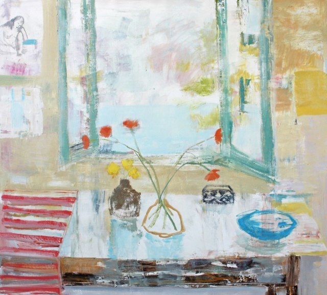
Art by Melanie Parke – Image from Anne Irwin Fine Art Facebook

This caught my eye right away. Different. Yes. Many layers, which I adore. The bright happy flowers looking out of the open window is sweet. The overall colors very spa like, with the darker and more vibrant colors anchoring towards the bottom. Nice! I saw this on Anne Irwin Fine Art’s Facebook page. Melanie has created some nice pieces, check out her website!

Here’s a blip about Melanie from Emily Amy Gallery in Atlanta, GA… and I’ve got to say… this is creativity at it’s finest! The statements/bios/about the artists that I run across are usually very UNpersonal, but we the people (hee) like to know a little something about you… it just makes your art more personal to us. Great job Melanie, this is awesome!:

Statement

A few notes on femininity and my art.

Personal and Professional Impact:

I only learned to really wear a dress after art school when I shined shoes at a Chicago night club in a Betsy Johnson little black dress. My pay was based on tips and needless to say the tips were good. I grasped a new perspective of my femininity around that same time when I was unexpectedly invited, but declined, into a high class call girl ring. Tempting as it was, I had paintings to make and I changed jobs to work in a gallery. During those 20 something years I was doing line drawings based on the misconceptions men and women have about their own and opposite sex.

But that was then. Now 20 years later, I am still very aware of being a woman making paintings. I made the choice of not having children in order to continue my studio practice. When I met my husband I offered to have his baby but that he would have to take care of the child, and luckily he was of the same mind not to. Now we are both painters and he does far more than his half of our domestic chores, bills and the maintenance of our business.

There were not many examples or role models of women who were able to do both children and art in the 80’s and 90’s, equally few men who were willing to share the responsibility. There are more of both now and that makes me happy that younger artists have more options. At 43 I am so grateful that I could continue my painting life uninterrupted.

I identify much of my femininity with my mother who was not your typical housewife from cable’s 1960’s Madmen. She was/is a strong willed, unconventional, horse-breeding, hard working, take charge mother who in all circumstances preferred working outside on a project. She couldn’t fathom a career as an artist for me. Still, she was my role model. A sensual tomboy, a woman who had dreams and determination, who knew what she wanted and a pioneering spirit to make it all happen. Seeing her follow through on her wild hair ideas made me realize it was possible to follow mine, to forge my own path as a painter.

Feminine Elements in the Work:

I have heard viewers surprised that my work was by a woman.

Painting is a pleasure seeking process for me, and abstraction a vehicle with which to think. I defy polarized thinking. I believe the subjective, raw emotion, knee jerk of self reference as an approach to creating only has life when paired with objective examination – connecting conceptual reasoning with abstract ideas and theories of the mind. Elements of accident, drips, crude and tentative mark marking might represent a vulnerable, stumbling, faltering humanness. A willingness to be too exuberant or to utterly fail. And I am interested in interchanging these gestural features with facets of excising line, precise shapes, or graphic forms that may reference mental processes of math, geometry, order, reason, or multiplicity.

I am patient with my work, perhaps nurturing, and do often think of them as little soldiers perhaps more than children. I am willing to see them through. However, I want them to know poetry and the great books. To know the virtues of hard work and the drunkenness of play. I like to look at them for a long while and to have tea with them. I am detail oriented with them, but give them room to be independent. I want them to flirt and I want them to be serious. If my paintings were a girl I would want them to intrinsically know how to dress for the cotillion but not necessarily keep their voices down or have conventional manners. To do what was necessary to stimulate conversation. I have to admit: I would want them to be beautiful, pretty, sexy, dirty and smart.

Melanie Parke January 2010

Catch you back here tomorrow!

Featured Artist… Morgan Samuel Price!

MorganSamualPrice KiawahPathway msp

“Kiawah Pathway” by Morgan Samuel Price

Nice painting… Kiawah Pathway… and it looks just like that tropical location. Lots of palms, big trees and lots and lots of green. Nice light, and the moss in the trees… very good, just a hint to let you know what it is! Seems like it would be easy to whip this painting out… but when your subject has so much of the same color going on, you have to know what you’re doing. I would say Morgan has figured it out quite nicely, wouldn’t you? I’m glad she found her passion early!

Here’s a blip about Morgan from her website

Art has always been an investment on numerous levels. Focused on astute observations requires all my resources.

My reason for painting; I am passionate about the process. I enjoy the challenge. The intrigue of the pursuit of a painting that conveys my enjoyment of the light in nature is gleaned from my experience while observing what piqued my attention.  The love of beauty is the joy of my life as an artist. I am never bored. Capturing the allure, in the simplest things or an expansive view is why I stay a student of observation, to discern those fleeting moments.

Many years ago, a most gifted artist, Loran Wilford, said to me, “You will become your own teacher”.  This simple yet prophetic statement became a fact in my career. I feel very fortunate that early in my life I realized this study would keep me focused as I pursued this multifaceted demanding passion. Being receptive is an asset. Lucky me, I found my passion early.

I’ll say! Lucky indeed! Catch you back here tomorrow!

Featured Artist… John Pototschnik!

JohnPototschnik AnotherSnowComing JPfb

“Another Snow Coming” by John Potoschnik

I ran across a painting by John Pototschnik on Facebook and it caught my eye right away. What fabulous work he’s got! I love how this painting captures the light, and those cool blue undertones of the snow with the pinky highlights just set such a mood for this painting. Gorgeous… Also love the tree with the sunlight hitting it so nicely. Great work! If you get a chance, check out his paintings AND his blog! His blog is absolutely amazing, he keeps you up to date on what’s going on as well as interviewing other artists. These are not fluffy interviews, these are MUST READS! He is entertaining and articulate, check it out!

Here’s a blip about John from his website:

John Pototschnik (Poe-toe-sh-nick) was born in St. Ives, Cornwall, England but grew up in Wichita, Kansas. He received his art training at Wichita State University in advertising design, followed by instruction in illustration and design at Art Center College in Los Angeles. Most recently he has studied human anatomy at the Lyme Academy of Fine Arts in Old Lyme, Connecticut. 

In 1982, Pototschnik began painting professionally in the fine arts. Prior to that, he worked as a freelance illustrator for ten years with many of Dallas’ major advertising agencies and companies. 

Since beginning his fine art career, Pototschnik has become a popular speaker and juror among art organizations. His paintings are in many private collections from Hawaii to Rhode Island and also in several public collections including : cities, banks, corporations and museums. 

Pototschnik resides in Wylie, Texas with his wife Marcia. They have two grown sons. He is a past president of Artists and Craftsmen Associated and the Plano Art Association. He has been honored with four George Washington Honor Medals from the Freedoms Foundation at Valley Forge, the John Steven Jones Fellowship, plus many other regional and national awards. He is recognized in “Who’s Who in American Art” and “Who’s Who in the Southwest”. His work has appeared in “First”, “The Artist’s Magazine”, “Southwest Art”, “American Artist”, “PleinAir Magazine”, “American Art Collector” and “International Artist”, plus six books…”The Best of Portrait Painting”, “200 Great Painting Ideas for Artists”, and “Expressing the Visual Language of the Landscape”, “100 Ways to Paint Landscapes”, “100 Ways to Paint Flowers and Gardens”, and “100 Ways to Paint Seascapes, Rivers and Lakes”. Several of his paintings have been published by the New York Graphic Society and Bentley House Publishing. He is a signature member of the Oil Painters of America and the Outdoor Painters Society. 

“My artistic influences are diverse, ranging from the Barbizon painters of Corot, Daubigny and Millet to the American tonalist, George Inness. I believe all I need to know of the principles of art are to be found in the works of the masters. My paintings are not flamboyant, mysterious, trendy or shocking but I am interested in depicting the truth about life, as I see it, in a naturalistic way free of frills and bravado. I enjoy depicting simple, common, everyday life and its objects as things of beauty and worth. I intend to show the dignity and value of the subjects I paint – just as my artistic influences have. Through continued hard work I want to give to society paintings that transcend the culture and it’s ever changing tastes. . . paintings that speak to the heart.”

Catch you back here tomorrow!

Featured Artist… Diane May!

DianeMay PointTheWay dm

“Point the Way” by Diane C. May – Image

Diane May is an artist from Tennessee who is part of PAPSE (Plein Air Painters of the Southeast). I urge you to check out Diane’s website… take a look at her paintings. Wonderful, fresh and a wide variety. I really love her style! It wasn’t easy to choose only one! Also check out the JOURNAL tab! It shows which plein air events she’s participating in as well as workshops she is giving. I wish her studio was here in Charleston! I would take the Growth Edge Class that begins in the spring! It sounds wonderful! So if you’re in the Nashville, TN area, you might want to check it out!

Here’s a blip about Diane from her website, click HERE to read more:

Diane May is a representational artist with a contemporary expressionist sensibility.  “My paintings celebrate what I find good and right in the world.”  Her work explores light and color in the landscape as well as in the constructed reality of the still life.   She paints on location and from life whenever possible.   When creating larger works in the studio, she references her ‘plein air’ paintings and outdoor sketches in order to maintain an authentic reaction to her original inspiration.

Catch you back here tomorrow!

Featured Artist… Mark D. Nelson!

MarkDNelsonFB

Mark D. Nelson. A fabulous artist and I wish I knew how I ran across him… I wrote his name down in my day planner, as I do any artist who pops up who’s work I truly admire and I want to feature. Is this striking or what?! I am loving that GORGEOUS orange, the delicate yellow flower POPS against the dark background. This is fabulous on so many levels! Mark has the innate ability to add a modern twist to a painting. I would like to be able to paint like this. But I know me. I would cover up all the color from underneath that I love peeking through… I do it every stinking time. One day…

MarkDanielNelson FB

You can FEEL the chilliness of this ride… Oooh, I’m looking forward to getting to the sunlight ;)  Fabulous without being tight…

MarkDNelson Trees Gallery1261

“Trees” by Mark D. Nelson – Image: Gallery 1261

Need I say… I LOVE THAT ORANGE… mental note Barbara… orange against the darks is making my heart sing! LOVING this!

Here’s a blip about Mark from the Gallery 1261 (Denver, CO) website:

As a high school student, Mark Daniel Nelson was awarded the prestigious National Scholastics Art Scholarship, which he used to attend the Colorado Institute of Art. Graduating with Best Portfolio honors, Nelson earned a living as an illustrator working for clients including Coors, University of Denver, The Miami Herald, 5280 Magazine, and legendary photographer James Balog.

Nelson has since shifted his artistic focus to painting abstract geometric forms – natural as well as structural – in pursuit of what he terms “a contemporary sublime”. Nelson’s work has been placed in a number of prominent regional and national collections and has been displayed at the Museum of Contemporary Art in Denver.

Catch you back here tomorrow!

(First two images from artists Facebook page)

Featured Artist… Paula Holtzclaw!

PaulaHoltzclaw StudyForSunlitPines ph

“Study for Sunlit Pines” by Paula Holtzclaw

I first saw Paula’s paintings on Plein Air Painters of the Southeast’s Facebook page. Ahhh, the talent!

When I see that artists have their paintings categorized on their websites I always go to the plein air group first. Those are the paintings that are typically the loosest and most representative of what the artists see’s when they’re painting. I went straight to this study of the sunlit pines (NFS). It’s a beauty isn’t it? I love those trees, the clouds, the shadow and sun… gorgeous!

PaulaHoltzclaw ForMilesAndMiles ph

“For Miles and Miles” by Paula Holtzclaw

What a great name for this one! “For Miles and Miles”, I mean it feels like you’re sitting right there on that rock, looking out over the sea for miles and miles, while the sun hits your face… ahhh, this painting gives you a nice feeling, doesn’t it?

Here’s a blip about Paula from her website:

 Far horizons and infinite skies are the hallmark of Paula Holtzclaw’s art.  Paula is best known for her landscapes celebrating areas still untouched by industrialism.  Her depictions of its beauty, unspoiled by man show her concern that these last wild places may soon vanish.  Her compositions, often large in scale, have a classic and universal appeal.  
     Paula’s love of art began at an early age, passed on to her, she believes, by her grandmothers, both of whom were artists.  After time spent raising her twin sons, she returned to her original passion for painting.  In 2002, Paula left her 20+ year medical career to paint full time.  Always a willing and eager student, she remains committed to honing her artistic skills.  “Travel has been an important impetus for my art, always stimulating my desire for plein air painting, and quick studies which provide the opportunity to learn from nature itself, the greatest of all teachers.  I have been fortunate to study under such fine mentors as Joni Falk, Linda Glover Gooch and Scott Christensen and Jeff Legg.”    
     Paula Holtzclaw’s paintings are collected throughout the nation.  Her paintings have been displayed in many national juried and museum exhibitions, a few of which are the American Impressionist Society, Salon International, Scottsdale Salon of Fine Art, The Oil Painters of America, American Women Artists National Exhibitions,  Bosque Conservatory, Texas , and  ASMA ‘s New England and West Coast  Exhibitions.  Paula was a finalist in American Artist Magazine’s 29th annual competition 2012, and their 2010 and 2009 Cover Competitions.  She was a semi-finalist in their 70th Anniversary Competition, 2007. She has just been selected as one ofSouthwest Art’s “21 over 31” Artists, (November 2010) and also by Southwest Art Magazine as one to collect, July 2009.  A member of Pap-se (Plein Air Painters of the SouthEast), Paula is also a Signature Member of: American Women Artists, The American Society of Marine Artists, Women Artists of the West, and  The National Oil and Acrylic Painters Society.  She is  Associate Member of  California Art Club, Oil Painters of America, and American Impressionist Society. 
      Paula resides in Waxhaw, N.C., a small community just south of Charlotte, (where the horses outnumber the people),  with her husband Chuck, and  constant companion Timber, her “Velcro” Golden Retriever.

And… YES! If you’re wondering if this website looks different… it does. Again. Ha ha…  I think I’m really liking this one! Catch you back here tomorrow!

Featured Artist… Martha Burkert!

MarthaBurkert Daisy mb

“Daisy” by Martha Burkert

There is something refreshing and different about Martha Burkert’s work. Brilliant colors, happy composition and style. Very nice! Check out Martha’s website.

Here’s a blip about Martha from the Maine Home + Design website:

MARTHA BURKERTMartha Burkert grew up in Texas and received a BA in English from Tulane University in New Orleans. She took studio classes at the Maine College of Art in Portland and the University of North Texas in Denton. Burkert was invited to an artists’ retreat at Maine Audubon’s Borestone Mountain Sanctuary in Monson in 2008, and she has exhibited widely at galleries in Maine and Texas. The artist now divides her time between Dallas and Yarmouth. She is represented by the Elizabeth Moss Galleries in Falmouth.Martha Burkert was compelled by the beauty of Maine to learn the technical skills needed to capture it. While she has been painting only since 2000, the artist already had a keen sense of design—she was a location scout and photo stylist for Thos. Moser and for home-furnishing catalogs. Burkert’s mature work shows the influence of some of Maine’s best colorists, including Fairfield Porter (1907–1975) and Alfred Cheney Chadbourn (1921–1998), who worked representationally but leaned toward abstraction.Burkert often creates small paintings and oil sketches on-site. Additionally, she takes photographs in black-and-white instead of color because the chromatic range is too limited for her needs. Yet all these direct responses to nature only serve as references and jumping-off points. In the larger paintings she executes in her studio, paint application, color resonance, temperatures, and commanding shapes become the artist’s focal points. “The bigger the canvas, the more I push color and form in a more exaggerated direction,” Burkert says.

Complex landscapes are often arranged into a repoussoir of more detailed flowers or trees in the immediate foreground, with expansive planes of loosely painted color in the background suggestive of the sea, clouds, or other major landscape formations. In Queen Anne’s Lace, Burkert evinces the liberties she takes with naturalistic representation, and water and sky have turned into bands of yellow and pink. The artist often experiments with color combinations until they feel right to her—an emotional and intuitive process that the artist confesses she doesn’t fully understand.

Growing up surrounded by the landscapes of Texas, Burkert appreciates the beauty of vast unfilled spaces. Maine’s landscapes, on the other hand, are more visually complex and seasonally changeable. The artist therefore likes to distill her paintings to their basic elements. “There is a beauty in simple things,” she says.

Catch you back here tomorrow!