Featured Artist: Michael Albrechtsen!

Winter's Warmth by Michael Albrechtsen 8x10 Oil

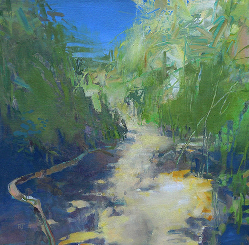
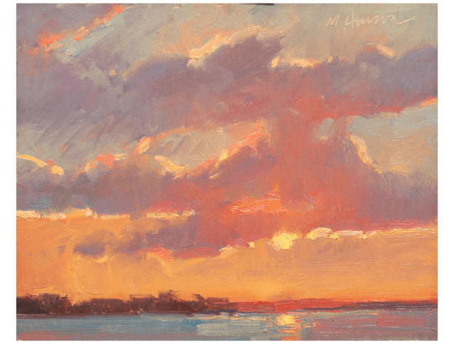
Winter’s Warmth by Michael Albrechtsen   8×10″   Oil

Michael Albrechtsen. Stunning painting! That sky is on fire, the reflection in the water is perfection and those trees on the left… Oh! I love everything about this painting! The variations in the sky are breathtaking. This fairly small painting packs a punch!

Waiting for Spring by Michael Albrechtsen 28x28 Oil

Waiting for Spring by Michael Albrechtsen 28×28′ Oil

Is there anything more beautiful than that warm golden glow  that only happens certain times of day? The soft shadows, the reds that are made so warm, the tree tops catching the light against the beautiful sky. Nice shadows in the snow… Oh, how I wish it looked like this (cold) outside right now. Winter paintings are a favorite of mine in the hot summer months!

Read a bit about Michael, from his website:

“Michael was recruited by Hallmark straight from Utah State University where he received a Master of Fine Arts Degree.  During his college years he took many courses in technical drafting learning much about line drawings, shading, and three-dimensional renderings.  This training has had a major affect on the way Michael paints.  It has trained him to see detail and strive for accuracy.

Michael was raised in Bountiful, Utah where he explored the rural landscape with his friends and family.  He was encouraged by both his Mother and Grandmother to work with his art rather than follow the family occupation of mechanical engineering.  Michael’s dream was sports but for some reason he always carried a camera with him. 

While participating as a Mormon missionary in Thailand he carried a sketch pad with him and he became more and more interested in pursuing a career in art.  Michael, still not sure of his career desires discussed his love of the arts with his wife, Lynda, who encouraged him to pursue his interest.  Michael  transferred to the Utah State University at Logan to delve into his interest in the fine arts.

This emersion in painting was a huge boost in his abilities and desire to paint.  

After graduation, Michael was offered a position with Hallmark and was moved to Kansas City.  During his employment with Hallmark he was in a unique position where he was allowed to use his experience as a landscape and figure painter to do specialty cards for the masculine line of cards. 

Michael mixes what he sees and what he wants to see in developing his paintings.  He may add a stream, a mountain, or waterfall to achieve the feeling he wants for his painting.  Sometimes he will work some low mountains into the background just to give something for the colors to contrast against.  

Michael is fascinated by landscapes but also loves painting figures.  Especially when those figures are of his family and loved ones.  While in school Michael did a lot of figure work with models but now tries to paint figures at least once a week, mostly his children.   When doing figures he only paints those he loves.  Michael is very close to his family.  While doing a workshop in Texas, at night he would practice a magic trick just to be able to show it to his children when he returned.  When he has to be away to paint or teach his family is always on his mind.

Meeting with others who are interested in art gives Michael a lift.  Whether it is an art buyer, an art dealer, or an art student he enjoys sharing the creation of a painting or just discussing the process.  Michael is thankful for a wonderful family and those that buy his paintings.”

All images via MichaelAlbrechtsen.com and LegacyGallery.com, used with permission…

Both of these paintings are available at Legacy Gallery; Michael is in several galleries, including one here in Charleston, be sure to check them out!

Images are not for reproduction, they are property of the artist.

Catch you back here tomorrow!

Emerging Artists: Maura Segal and Kim Gibbs!

Emerging Artists

I haven’t featured any emerging artists in a while, so I would like to take this opportunity to introduce you to artists Maura Segal and Kim Gibbs!

maura segal

Boomerang by Maura Segal 36x48 Acrylic and paper on canvas

Boomerang by Maura Segal 36×48 Acrylic and Paper on Canvas

Abstract, interesting, and a good feeling of movement and depth. I like the varying shades of the background and the bold and finer strokes. Be sure to check out Maura’s work, she’s got a lot of great color going on!

Read a bit about Maura, from her website:

“I grew up in Los Angeles where I reside with my husband and three daughters.

Creating multi-layered artworks is what I enjoy making, using a combination of acrylic paint and carefully selected papers, new and antique. The papers are cut into thin strips and other geometric and organic shapes, resulting in a complex universe of balance, texture, color and vibrant rhythms, emulating their coexistence in the urban landscape.” Read more HERE

kim gibbs

Dusty Road by Kim Gibbs 24x24 Oil

Dusty Road by Kim Gibbs 24×24 Oil

I like the colors in the road and those bits of purple. Nice light in the grass on the right, stands out fabulously against the dark trees! Be sure to check out Kim’s work, I really like her marshes as well!

Read a bit about Kim, from her website:

“Creativity is a natural overflow of Kim’s passion for beauty in our world. She interprets the world through an expressionistic view using vivid, intense color with emphasis on texture.  Her paintings are filled with energy and vibrancy and explore the use of color with light and application.

As a child, Kim was inspired by her aunt’s three-dimensional art and the wonders of exploring her family’s art store.  While raising her own children, she studied watercolor which opened her eyes to seeing how color reacts to light. From watercolor Kim moved on to working in pastels and acrylics, finally finding oil, her current medium.

Primarily self-taught, Kim has studied with many world class teachers and participated in numerous workshops from Scottsdale to Maine. Her instructors have included Albert Handel, Timothy Horn and Millie Gosch, among others. She is a graduate of the University of  Georgia  Journalism School. Her large landscapes are in several galleries in the Southeast. Kim paints daily in her studio/gallery in Charlotte, NC.” Read more HERE

Thank you both for submitting your names via my blog!

All images via MauraSegal.com and KGFineArts.com , used with permission…

Images are not for reproduction, they are property of the artists.

Catch you back here tomorrow!

Featured Artist: Scott Boyle (and workshop – October 2016)!

Roan Mountain Clouds by Scott Boyle 20x24 Oil

Roan Mountain Clouds by Scott Boyle 20×24 Oil

Scott Boyle. Beautiful paintings. Just look at these clouds! Puffy and light – I am a cloud connoisseur, ha ha… they fascinate me! The road leading up to the trees is wonderful and really shows distance, doesn’t it? Beautiful light and shadows in the grass! I think if I were here I would be on the grass gazing up at the sky – watching those clouds roll by…

“Roan Mt. Round Bald – Appalachian Trail” is Scott’s description. I love when artists give you a little blip about a painting. The who, what, when or where makes it that much more interesting.

Scott’s website shows his plein air and studio paintings. This painting happens to be a studio painting, it’s amazing how he has kept it so fresh, as if he were standing in that very spot. Usually I can tell a big difference between an artist’s studio paintings versus plein air paintings, but not with Scott’s. Truly, it’s like he was right there!

Hoyle Homestead by Scott Boyle 12x16 Oil

Hoyle Homestead by Scott Boyle 12×16 Oil

Just look at this home that Scott painted, the Hoyle Homestead, “The oldest known standing structure in Gaston County – Dallas, NC.”

This is such a fabulous house, I love the warm sun on the front of the house and THOSE TREES! What character! A really beautiful painting! Be sure to check out Scott’s website – you can tell that he loves where he lives – the areas that he paints are breathtaking!

Are you looking to take a workshop? Well, you may be in luck! 

Scott will be teaching a 3 Day Plein Air Painting Workshop in Dallas, North Carolina October 11 – 13, 2016 – click HERE for more info!

Read a bit about Scott, from his website:

“North Carolina landscape artist Scott Boyle is a visual explorer, a promoter of plein air painting, and the founder of the North Carolina Plein Air Painters, which organizes numerous outdoor painting events around the state each year.  Additionally, he teaches workshops and frequently speaks on subjects relating to outdoor painting.

While growing up in Indiana Scott was recognized to have unusual artistic abilities from a young age. He was fortunate to have parents who immersed him with opportunities to develop his talent with private lessons and years of study with traditional Brown County Artists in Indiana during his earlier years.

Scott moved to North Carolina in 1987, where his senses were awakened to the rich and subtle beauty of the Southern Appalachian Mountains.  He soon discovered that painting small sketches outdoors was the best way to explore the landscape.  He continues in the tradition, commonly known today as plein air painting, following after the tradition of the great 19th Century painters who used this outdoor process as an indispensable tool to produce more meaningful studio works.

Since 2006, Scott has made dozens of trips to the Roan Highlands Region, which encompasses numerous high country grassy balds along the NC/TN border.  He backpacks with his painting gear to capture the visual drama at high elevations.  During the winter, he produces large paintings in his studio from these experiences.

In 2010, Scott was included in the historical Blue Ridge Realists artist group whose work focuses on Western North Carolina scenes. 

Scott currently lives in rural Gaston County, North Carolina with his wife, Esther.” Check out Scott’s Artist Statement as well as the rest of his Bio – good stuff!

Image via ScottBoyleArt.com, used with permission…

Images are not for reproduction, they are property of the artist.

Catch you back here tomorrow!

Featured Artist: Randall Tipton!

Path to the Sea by Randall Tipton 24x24 Oil

Path to the Sea by Randall Tipton 24×24″ Oil

Randall Tipton – What wonderful paintings! I love the abstract quality of this painting.  Loose yet you know exactly what it is.

Randall has fabulous strokes that make it that much more interesting. The colors in this painting are dynamic – that fabulous green near the violet shadows, with the little pops of gold in the path making way to the splendid blue sea. Nice!

Read a bit about Randall, from his website:
A Northwest contemporary landscape painter, sometimes plein air but mostly studio work from drawings, photos, hunches and memory, using an experimental approach.

Be sure to check out Randall’s blog – his latest post has me really wanting to visit Iceland and soon!

All images via RandallDavidTipton.com, used with permission…

Images are not for reproduction, they are property of the artist.

Catch you back here tomorrow!

Featured Artist: David Damm!

Above Laguna by David Damm 14x18 Oil

Above Laguna by David Damm 14×18″ Oil

David Damm

Striking paintings.  Every single painting is just fabulous. I love how his perspective is always spot on, no matter what painting you look at, they are each perfection without being overly done. This painting keeps your eye in and holds interest. My eyes start at the two regal palms, then to the top of the hill, down to the white building on the beach, then to the palm on the bottom left, swirling into the water and back to the two palms.

Look how many colors are in this painting. This painting has color, yet is so soothing to look at. His palette includes beautiful and natural colors. You can also feel movement in this painting, from the palms to the waves – also love the reflections in the water.

Check out David’s Oil, Pastel and Watercolor paintings! I first ran across David’s work via the Laguna Plein Air Painters Association (LPAPA.org), it jumped out at me! Love it! Looking through his paintings makes me want to visit California again and soon!

Read a bit about David, from his website:

“David Damm was born in Kansas City, Missouri. He graduated from Art Center College of Design and later studied with the noted Russian painter, Sergei Bongart (1919 –1985). His career began illustrating books, magazines and newspapers. In 1981 he began exhibiting, and has since participated in numerous exhibitions, throughout the country, including the Natural History Museum, the Muckenthaler Cultural Center, The Bowers Museum and others in the Los Angeles area. He was featured in “American Artist” and has received many top awards including first place at the 1996 Mission San Juan Capistrano Plein Air Painting Event sponsored by Joan Irvine Smith. His greatest honor was meeting and completing a commissioned portrait of President Ronald Reagan. Damm is a signature member of the California Art Club and a board member. He is a signature member of the Laguna Plein Air Painters Association and a member of the American Pastel Society. He divides his work between portrait commissions and landscapes, working in both oil, pastel and watercolor.”

All images via DavidDammArtist.com, used with permission…

Images are not for reproduction, they are property of the artist.

Catch you back here tomorrow!

Featured Artist: Kelly Carmody!

Snapper with Lemon by Kelly Carmody 12x16 Oil

Snapper with Lemon by Kelly Carmody  12×16″  Oil

Kelly Carmody – this woman can paint!  Portraits that are stunning, Interiors that are magical and Still Life paintings – Wow! Snapper with Lemon is a wonderful painting, the color harmony is perfection – the lemon looks as if it were just sliced, the background is a nice compliment without distracting. Beautiful! Be sure to check out the rest of Kelly’s paintings!

Would you be interested in taking a class with Kelly? She’s got a few to chose from, what an inspiration her class would be!

Read a bit about Kelly, from her website:

“Kelly Carmody has exhibited at venues including the Portrait Society of America and the Art Students League. Most recently, she was selected for the 2015 BP Portrait Award Show at the National Portrait Gallery in London and the 2016 Outwin Boochever Award at the National Portrait Gallery in Washington D.C.  In addition, the historic Guild of Boston Artists elected her to become a member in 2015,  she won the Edmund C. Tarbell Award in her first juried members show. The winning portrait is on the cover of July/August edition of Fine Art Connoisseur.   In June of 2015 she received the Blanche E. Colman Award.

She  currently has work at the Sloane Merrill Gallery in Boston,  the Guild of Boston Artists, and the Ann Long Gallery in Charleston, SC.  Publications that have featured her work include American Art Collector, Fine Art Connoisseur, International Artist Magazine, Fine Art Today, Studio Visit Magazine, Boston Magazine, and The Boston Globe. Carmody has won grants from the Ludwig Foundation, Turkey Land Cove Foundation, and Massachusetts Cultural Council, as well as receiving an Edward G. McDowell Travel Grant and the Walter Feldman Grant. In 2014 she won 3rd place in the Portrait Society’s International Portrait Competition.

Carmody attended Massachusetts College of Art and furthered her studies at the Art Students League and in the studio of Numael Pulido.

She paints and teaches in her Waltham, MA studio.” (Read more HERE)…

Images via KellyCarmody.com, used with permission from the artist…

Images are not for reproduction, they are property of the artist.

Catch you back here tomorrow!

Featured Artist: Tracy Wall!

Crane Conversation by Tracy Wall 36x24x1.5 Oil

Crane Conversation by Tracy Wall  36 x 24 x 1.5″  Oil

Tracy Wall. Wonderful artist who isn’t afraid to use color! This painting packs a punch, doesn’t it? I’m loving how the underpainting is showing through, it adds SO MUCH to this painting, then add the bright color of the crane and it’s wonderful shadows and WHOA! Nice painting! Be sure to check out Tracy’s website, she’s got great paintings! This painting is available at Abend Gallery! Also be sure to check out Tracy’s blog!

Read a bit about Tracy, from her website:

“Tracy grew up in the Midwest and has called Colorado home since 1981.  She has studied at the Art Students League of Denver under the influences of Michelle Torrez, Ken Velastro, Kevin Weckbach, John Lencicki, and Rob Gratiot with additional workshops from David Shevlino, Carol Marine and Sally Strand.

After starting at the University of Denver studying Fine Art under the guiding hand of Maynard Tischler, Tracy answered the call to study science (BS in Zoology at Colorado State University), education (MA in Special Education at the University of Northern Colorado) and health (MT in Therapeutic Massage at MTIC). She has now come full circle and has returned to her first love: the visual arts.

Tracy’s work can be seen in private and corporate collections across the country.” Read more HERE

All images via TracyWall.com, used with permission…

Images are not for reproduction, they are property of the artist.

Catch you back here tomorrow!

Featured Artist: Paul Bond!

Princess and the Dragon by Paul Bond 33x44 Oil

Princess and the Dragon by Paul Bond  33×44″  Oil

Magic realism artist. Perfect description for Paul Bond, his work is amazing and transports you to happy times! Paul’s work is so creative, I can look at each piece and think of different stories, what a treasure!

McKenas Bittersweet Departure from the Island of Happiness by Paul Bond 24x30 Oil

McKena’s Bittersweet Departure from the Island of Happiness by Paul Bond 24×30″ Oil

Wildly inventive, with that magical quality that transports you back in time but with a modern twist. I love this painting! Be sure to check out Paul’s Blog as well as his Shopwow, Wow, WOW! I love his coffee table book (you can see a bit of it – how wonderful)!

Read a bit about Paul, from his website:

“Paul Bond’s art lives in the spaces between dreaming and reality. Drawing from the Latin American genre of Magic Realism where symbolic, surreal and fantastic elements blend with realistic atmospheres, they remove the veil on a world where everything is possible. Bond shares the following about his work:

“When viewing a scene, object or line in a novel that moves me, my mind’s eye is continually imagining what elements I could introduce or alter to make a grander statement about what I am experiencing. The physical world to me is heartbreakingly beautiful and profound. And the best way I can know how to channel those deep emotions life inspires in me is by adding to it through a world of my own creation. A world intended to both deepen my own life experience and to stir the souls of my fellow travelers.”

Bond’s award-winning magic realism paintings have been featured in galleries, museums and cultural centers, including the Gateway Museum in Farmington, NM and the San Diego Art Institute. His paintings are now in private collections throughout the US, as well as Australia, Europe, Asia and the Middle East. Corporate collections include the Hotel Hershey and PB&J Restaurants, and his art is featured in many contemporary art publications.” Continue reading HERE

All images via PaulBondArt.com, used with permission…

Images are not for reproduction, they are property of the artist.

Catch you back here tomorrow!

Featured Artist: Barb Walker!

Cozy Up by Barb Walker 12x12 Oil

Cozy Up by Barb Walker 12×12 Oil

Barb Walker. I love her style. She doesn’t overdue her strokes. Her paintings are wonderful without being overdone. Those of you who paint realize how difficult that is to accomplish. I love interior paintings and this is a wonderful one. I love the character that this wingback holds. Wonderful!

Sconset Lane by Barb Walker 12x12 Oil

Sconset Lane by Barb Walker 12×12 Oil

Sconset Lane. This is a famous Nantucket view that has been painted by many artists, I love this version. The road is wonderful, the houses, flowers, you really get a sense of it! Be sure to check out Barb’s website and check out her Daily Paintworks Gallery of Art – lots of red dots, I can see why!

Read a bit about Barb Walker, from her website (my favorite bios are personal and Barb’s is exactly that, you read it and get a sense of who the artist is – we share the love for a place called Maine, ahhh!):

“About me? Just have always loved nature, being outdoors, colors, life. Sketched for as long as I can remember. Have met so many good people who are great painters that I’m not sure which I enjoy more – the painting or those I have met. 

We live in Ohio, and travel to Maine almost every year. The galleries are amazing – the coast is breathtaking!”

All images via BarbWalkerPaintings.com, used with permission…

Images are not for reproduction, they are property of the artist.

Catch you back here tomorrow!

Featured Artist: Mary Aslin!

Cadenza by Mary Aslin 12x9 Pastel

Cadenza by Mary Aslin 12×9 Pastel

Mary Alsin. Pastel. Stunning work. I think the fluidity in Cadenza is beautiful. Soft, movement with beautiful light. Mary has a way with pastels doesn’t she?

Reverie by Mary Aslin 20x26 Pastel

Reverie by Mary Aslin 20×26 Pastel (Sold)

Another beautiful, soft painting. The edges are carefully blended, yet details like the hair and flowers appear more crisp and detailed. Another stunning painting!

Be sure not to miss Mary’s blog, it’s full of wonderful information!

Read a bit about Mary, from her website:

With the recent passing of my father, and the contemplation that comes after a major life event, I asked myself–again–“what is it that really moves me as an artist?”.  There is so much visual imagery available to everyone these days and so many artists from which one can take inspiration. 

Looking back at the work I have done and what I will continue to inspire, three key elements remain as fundamental as a cornerstone of my art:  light, story, beauty

Sometimes, these words when applied to art implies that the work is trite or too sentimental.

Yet, my working methods and inspiration are neither. 

Most of my art is based on working from life and grounded in the fundamentals of classical art.  I draw the live model and study figure anatomy.  I reference art of the Masters, and have visited many of the world’s art museums. 

The natural world–with all of its light and beauty and the stories told–is the stage.  I am the audience.

At my easel, I applaud. Continue reading HERE

All images via MaryAslin.com, used with permission…

Images are not for reproduction, they are property of the artist.

Catch you back here tomorrow!

Featured Artist: Kami Mendlik!

Ponte Vedra Outpost by Kami Mendlik 12x9 Oil

Ponte Vedra Outpost by Kami Mendlik 12×9 Oil

This painting is moody and thick with not only paint, but with interest. The lighting is perfect – I happen to love the power lines, subtle, yet adds to the interest. Those dark trees are amazing, they really make the other trees, sky and path stand out, don’t they?

Be sure to check out Kami’s blog, lots of great information and beautiful scenery! Wow, what a studio she’s got! I love it!

In case you missed the article in the June/July 2016 Plein Air Magazine, check it out! Interested in taking a workshop? Check it out HERE!

Read a bit about Kami, from her website:

My deep passion for exploring and capturing nature with paint came at an early age.  I grew up just North of Stillwater Minnesota on my family farmland where my daily wanderings kept me endlessly curious about this land that I felt very much a part of.  I have vivid memories of watching the pink tops of the seedpods in August, and thinking how incredible it was that the grasses seemed to dance across the prairie.  It was clear to me then that they do not exist on their own, and that the rhythm and harmony of nature was incredible!  They had a wave and a rhythm unique to themselves, but were very much a part of a greater thing that I later in life learned was belonging and harmony. I loved that!  The grasses dancing belonged, just as I, and could not exist without each other element connected to another that made their existence possible.  I would escape for hours completely engrossed with my sketchbook or paints observing the land.  

 As I grew up, I continued to paint and study.  My decision to become a painter for the most part was not in one conscious moment, but rather an accumulation of my life’s experiences and my strong desire to study and capture nature and her harmony with paint.  I went on to study from both living and dead masters of the craft and to this day consider myself not only an artist and a teacher, but very much of a lifelong student.  The more I know, the more I know I don’t know, and this found knowledge keeps me inspired to pass on to others my discoveries of all nature’s beauties through paint.  The respect that I have for Nature and her awesomeness is beyond words.  My desire to study and attempt to translate this, is why I paint!  

 St Croix River School Of Painting:

 In 2008, Kami started and founded the St Croix River School of Painting in Stillwater MN where she teaches the fundamentals of representational painting with a special emphasis on color.  In January of 2014 she purchased a 16 acre farm just North of Stillwater, where she converted a 100 year old hip roof barn into her studio and the St Croix River School of Painting’s new location.  The property is a landscape painters dream with endless inspiration for painting. Read more HERE

All images via KamiMendlik.com, used with permission…

Images are not for reproduction, they are property of the artist.

Catch you back here tomorrow!

Frank Gardner | Marc Hanson – Stunning Work! – Show at Addison Art Gallery TOMORROW!

TWO FABULOUS ARTISTS, Frank Gardner and Marc Hanson – ONE FABULOUS SHOW Opens Tomorrow at Addison Art Gallery!

The opening is Friday, July 30, 2016 from 5-7PM – if you are anywhere near Orleans, MA – you won’t want to miss it! These are two artists I admire so much, they both push themselves and the results are breathtaking!

Read a bit about the show, from Addison Art Gallery – then check out a sample of the paintings in the show – oh, how I wish I was close by:

Orleans MA — On Saturday, July 30 from 5 to 7, the Addison Art Gallery will host an opening reception for Marc Hanson of Mississippi and Frank Gardner of Mexico. Long time friends, Hanson and Gardner have often traveled together to paint, and have exhibited together in Addison Art Gallery and museum shows on Cape Cod. This past winter, they decided to join talents again. 


 frank gardner

Peaceful Harmony by Frank Gardner 24x30 Oil

Peaceful Harmony by Frank Gardner 24×30 Oil

Just look at the reflections in the water! The light on the ladder, the colors and textures in the pilings. WOW! I have always loved Frank’s paintings, they have something about them that are definitely all his, but this latest group of paintings is different and I love every one!

Snorkel by Frank Gardner 30x24 Oil

Snorkel by Frank Gardner 30×24 Oil

SNORKEL jumped out to me – I could look at it forever. There is a quiet innocence to it. That wonderful feeling of being a kid of vacation, remember the days when the family would be packed into a car and head for some place wonderful like Cape Cod? Frank’s paintings pull at your memories of those times. I love the kid in this painting, as well as the water behind him, with all the wonderful colors, this is stunning.

Frank’s comments on this show:

“My earliest memories of Cape Cod take me back to summer vacations with my family in the late 60’s and 70’s. We would load into the Chevy Impala for the much anticipated road trip every July. ‘Summer on Cape Cod’ is the theme for the new work I am painting for this season at Addison Art Gallery. My inspiration for this series is drawn from old memories and photos from my earliest trips to the Cape as well as from my most recent summer trips. Subjects range from fun on the beach, to classic Cape Cod scenes and some things in between.” — Frank Gardner 

Read a bit about Frank, from his website:

My paintings are interpretations of my experiences. They come from the desire to share the beauty that I see every day by arranging bits of color and ideas to tell a story. Drawn to the colors of fleeting light effects on the landscape I try and accurately represent color I see. However, I also interpret and push color if it is useful to convey how the scene makes me feel. Color combinations and juxtapositions are a lot of what make a subject appealing to me. I look for situations that are unique to a particular place at a certain time, depending on lighting conditions, but also filtered through my mood at the time a piece is painted.

Painting in a representational style, and influenced by the impressionists, I am drawn to fleeting light effects and color while sometimes sacrificing detail. A controlled chaos or loose spontaneity is my favored look, although each color and stroke is well thought out and carefully placed. My goal is to convey to the viewer my feelings about the scene through my use of color and brushwork. I’ll let the subject and my mood determine how much detail is required to complete each painting.

Paint application is important to me. It is a very personal facet of my work. An artists brushwork and paint handling is what sets their work apart from another artist’s interpretation of the same view. It is as unique as a fingerprint. I not only brush paint on, but lift it off, or smear it with a finger or paint rag. It is often the lifting off of the paint or moving it around after it is on the canvas that gives the look I am after. Continue reading HERE

marc hanson

A Little Cedar by Marc Hanson 11x14 Acrylic

A Little Cedar by Marc Hanson 11×14 Acrylic

Marc knows how to make a painting really stand out – I think the lavender in A LITTLE CEDAR adds so much, it makes the rest of the painting stand out. Marc is a master when it comes to landscapes, his paintings will blow you away – His skill has been acquired from years of hard work creating MANY paintings – just look at the light! A that bit of unexpected blue on the horizon… really nice! Everything about this painting is first class!

Brilliance by Marc Hanson 8x10 Oil

Brilliance by Marc Hanson 8×10 Oil

Utter perfection! Some of you may have heard about my affinity for orange. I can feel the warmth from this painting! It’s stunningly beautiful in every way! Marc has a way of portraying a scene without overdoing. I love the simplicity of this painting. Sounds easy, but it’s not.

Marc’s comments on this show: “In my work for this show, I have concentrated on the quieter side of the Cape. That’s the side that I enjoy the most. Although the harbors and towns are all part of the experience there, I prefer to spend most of my time exploring those areas that see less traffic. In particular the Fort Hill area is a favorite. The marshes and lowland areas draw me in and have me thinking about the history of the area pre-settlement. In the end, it’s the light on the Cape that is the real subject of all of the work I’ve done there.”— Marc R. Hanson

Read a bit about Marc, from his website:

Having grown up in a military family, Marc’s youth was spent on the move. He was born in Oxnard, California and spent some of his early school years there. But his geographical resume soon included Alaska, Florida, Arkansas, Nebraska, South Dakota and Norway. After his father’s retirement from the Air Force, Marc’s family settled in the small northern California community of Loomis. Marc began college as a biology major, but soon applied to and was accepted into Art Center College of Design in Pasadena, California, majoring in illustration. After Art Center and a brief stint as a staff illustrator in Sacramento, California, Marc moved to Minnesota where he lived for 33 years while raising a family and pursuing his art. Marc relocated to Colorado in the Fall of 2012.

“I have pursued a career as a painter for many years now. Along the way my methods, materials and focus have evolved. A naturalist at heart, the landscape is the perfect vehicle for expressing the joy I have for the world that surrounds me. My real interest and challenge as a painter is how to best manipulate the core principles of painting into effective visual statements. I’m most successful when I’m able to communicate that joy to the viewers of my paintings.”

Marc teaches landscape painting workshops in many locations nationally. “ I love working with other painters in their pursuit to better their craft. My goal is not to have them assimilate my style and technique, but to teach them how to more closely exam- ine the subject and apply the principles that representational painters must follow to become effective visual communicators.”

He has shown his work in galleries and museums nationally and internationally since the early 1980’s. He is a Signature Member of The Oil Painters of America (O.P.A.)… Continue reading HERE

All images via AddisonArt.com, FrankGardner.com and MarcHansonArt.com used with permission…

Images are not for reproduction, they are property of the artist.

Catch you back here tomorrow!

Featured Artist: Erin Hanson!

Crystal Dawn by Erin Hanson 50x40 Oil

Crystal Dawn by Erin Hanson 50×40 Oil

Erin Hanson. Unique, different, colorful, fabulous! I love her paintings. Just look at these fabulous tree shadows, that wonderful color against the purple and the magical trees. Talk about drawing you in! Wow. Erin’s work is fresh.

Saguaro Dusk by Erin Hanson 48x48 Oil

Saguaro Dusk by Erin Hanson 48×48  Oil

Another one of Erin’s paintings that just blew me away. I feel as if I’m right there in the Arizona desert with her. Erin hikes, rock climbs and visits all kinds of wonderful locations. Be sure to read her bio, it’s amazing, as is her website. She gives so many details for those looking to buy. Very nice!

Read a bit about Erin, from her website:

Hanging precariously and horizontally from red sandstone, hundreds of feet above the ground, may not seem like it would inspire the creation of beautiful oil paintings, but that is exactly what happened with Erin Hanson. After a lifetime of experimenting in different styles and mediums, it wasn’t until Hanson began rock climbing at Red Rock Canyon that her painting style was consolidated by a single inspiration and force of nature.

Erin Hanson began painting as a young girl, voraciously learning oils, acrylics, watercolor, pen and ink, pastels, and life drawing from accomplished art instructors.  She began commissioning paintings at age ten, and by age twelve, she was employed after school by a mural studio, learning the techniques of acrylics on the grand scale of forty-foot canvases.  Two years later, a high school scholarship took her to Otis College of Art, where she immersed herself in figure drawing. Graduating high school at age sixteen and once again demonstrating that she was a child prodigy, Hanson next attended UC Berkeley, excelling further in her studies and creative development and attaining a degree in Bioengineering. 

After graduating from college, Hanson entered the art trade as a professional, inspired by landscapes and vantage points only beheld by the most adventurous. Rock climbing among the brilliantly colored cliffs of Nevada and Utah, watching the seasons and the light change daily across the desert, provided endless inspiration for her work.  In these beautiful surroundings, Hanson decided firmly to dedicate herself to creating one painting every week for the rest of her life.  She has stuck to that decision ever since and has for the past decade been developing a unique, minimalist technique of placing impasto paint strokes without layering, which has become known as “Open-Impressionism.” As other artists began emulating her painting techniques, Hanson was credited as the pioneer and originator of this contemporary style.

Through the years, Hanson has continued to use the outdoors to inspire a huge collection of work.  She visits the Colorado plateau every year, backpacking and hiking through areas such as Zion National Park, Canyon de Chelly, and Monument Valley.  Other favorite haunts include Paso Robles, Joshua Tree National Park, and the Anza-Borrego desert.  Erin Hanson transforms these landscapes into abstract mosaics of color and texture, her impasto application of paint lending a sculptural effect to her art.  Her oil paintings stand out in a crowd, bringing a fresh new look to Western landscapes.

All images via ErinHanson.com, used with permission…

Images are not for reproduction, they are property of the artist.

Catch you back here tomorrow!

Featured Artist: Shari Blaukopf!

Carre St Louis Victorian by Shari Blaukopf

Carre St Louis Victorian by Shari Blaukopf

Beautiful watercolors by Shari Blaukopf! Her paintings have such life to them! They are a delight in every way! Shari is from Montreal, Canada – and these two paintings are from that area. Isn’t this such a charming painting?

Brick and Stone by Shari Blaukopf

Brick and Stone by Shari Blaukopf

Look at those shadows! I love them! I also adore the way she painted a few stones to let you know this building is stone, your mind fills in the rest. Such beautiful architecture creates some wonderful paintings!

When you check out Shari’s website, you will see it starts with her Sketchbook, which is a wealth of information and fabulous paintings and sketches. She makes it look so easy! Shari has instructional videos on Craftsy, which is a very cool site if you haven’t heard of it before!

Read a bit about Shari, from her website:

A friend of mine often signs his emails with a short “keep the brush wet…” I try to keep that in mind when I paint. And I think it expresses what I love most about watercolour. When the brush is really wet, when the washes are flowing, when pigment is mixing on paper in ways that surprise me — that’s a happy day. Someone handed me a watercolour brush when I was in my teens, and except for a brief experiment with acrylics and an even briefer one with oils, watercolour keeps pulling me back.

Every time I put a brush to paper I learn something new, and that keeps me painting. Whether it’s in my Montreal neighbourhood or in my travels, it’s always a good day when I can get a bit of watercolour in.

I was fortunate to spend some summers in Maine studying with Edgar A. Whitney, and I don’t think I could talk about painting without giving a nod to this great master of watercolour. The elements and principles of design that he taught — in his entertaining and often emphatic way — come back to me when composing a painting or a sketch, even after many years. That’s the mark of a truly remarkable teacher, isn’t it?

All images via ShariBlaukopf.com, used with permission…

Images are not for reproduction, they are property of the artist.

Catch you back here tomorrow!

Featured Artist: Galen Cheney!

Miss Simone by Galen Cheney 24x20" Oil

Miss Simone by Galen Cheney  24×20″  Oil

Galen Cheney. Her style is fabulous. I don’t know why the word buoyant comes to mind but it does. Her paintings have life in them.

So many wonderful paintings. The oranges in this painting scream PICK ME, PICK ME! Before I knew the title, I thought that this painting looked like a lady’s head. Exactly, this is Miss Simone, and she is FABULOUS! Be sure to check out the rest of Galen’s work!

Stork by Galen Cheney 24x20 Oil

Stork by Galen Cheney 24×20 Oil

I always think it’s fun to look at abstract paintings to see if anything jumps out at me. I looked at this painting and instantly thought STORK. It’s that fabulous stork color that did it, and the curved strokes, fabulous!

There is a crispness to this painting. Together the color palette sings, I especially love the small dark strokes on the “stork” color pink, which makes them look like shadows. Fabulous green against the “stork” pink. Love this one too!

Read a bit about Galen, from the artist:

Galen Cheney has been painting professionally for 25 years.  After receiving a BA from Mount Holyoke College and an MFA from the Maryland Institute, College of Art she lived in Italy and then criss-crossed her way across the US doing a variety of work from writing for a travel magazine in New York City to carving at a bronze foundry in Portland, Oregon.  She now works exclusively as an artist and teacher.  Galen has received much recognition for her painting, including a nomination for a Joan Mitchell Foundation grant and residency fellowships to the Millay Colony, the Vermont Studio Center, and most recently, Da Wang Culture Highland in Shenzhen, China.

It’s pretty impressive to be nominated for a Joan Mitchell Foundation Grant!

There is a fabulous interview with Saatchi Art and Galen from 2013, read it HERE.

All images via GalenCheney.com, used with permission…

Images are not for reproduction, they are property of the artist.

Catch you back here tomorrow!