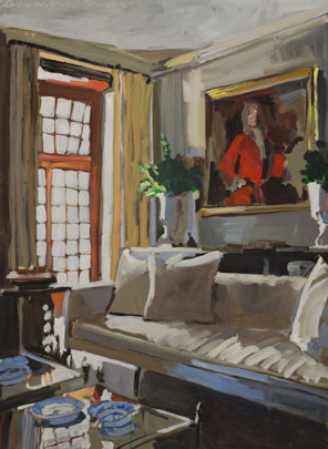
I am excited to have run across Laura Shubert’s work! Any of you who read this blog know how much I love paintings of interiors. I just don’t run across them very often, but I did today! Check out artist Laura Shubert.
What. Amazing. Paintings!
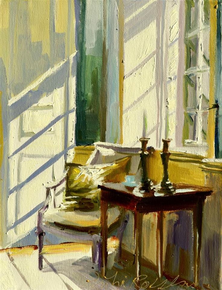
I love the light streaming in the window, the blinds on the door, and all the paintings on the wall!
#22 by Laura Shubert 24×24″
Another favorite! What a sweet vase of flowers. The brightness of the green against the rich color in the flowers is so nice!
#26 by Laura Shubert 40×30″
Light and shadows, a comfy sofa, light pouring in… I want to curl up with the stack of magazines that I have sitting here waiting to be read…
Laura Lacambra Shubert, daughter of a Basque father and American mother, grew up in Florida and Spain and chose art as a career at an early age. She studied painting, drawing, and printmaking at Southern Methodist University, where she received her B.F.A. in 1986.
After studying painting at Academie Port Royal, in Paris, France, for one year, she returned to the United States, where she began exhibiting in solo and group shows across the country. In 2000, she was named a fellow of the Royal Society of Arts in London, England (established in 1754).
Her work can be found in private and corporate collections in the United States and abroad.
All images via LSSStudios.com with permission from the artist.
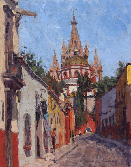
I have admired Frank Gardner’s work for quite a while now. He creates the most amazing paintings, full of depth and texture as well as interest! With today being Cinco de Mayo I thought I would pick some paintings of Mexico, and Frank has some beauties!
Fresh Paint is a gorgeous painting and those colors, ahhh, those colors, they grabbed me right away! The buildings in Mexico are so beautiful, I really want to go there one day! Fresh Paint is available at Galeria Gardner.
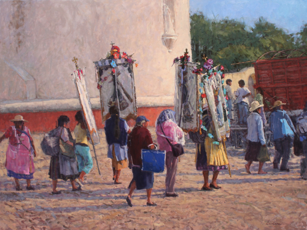
Procession by Frank Gardner 30 x 40″ Oil
I have loved this painting from the moment I saw it! What a delight to be able to see Frank’s paintings in real life! The photos are great, but the real thing is so much better. You can better see the richness, the texture, the feeling of the painting is much more apparent. Frank is a good guy, he’s represented by many galleries throughout the USA as well as his own Galería Gardner. Check out his work when you get a chance!
Frank Gardner was born and raised in Poughkeepsie, New York. He graduated from the Rhode Island School of Design in 1986 with a BFA in Painting. A desire to find true inspiration for his paintings eventually led him to relocate to Mexico in 1990. His studio is in San Miguel de Allende, where he resides with his wife and daughter. Gardner’s painting style adeptly captures his subject’s mood, whether it be a dramatic landscape, colorful Mexican street scene or boats in a harbor. The combination of confident brushwork, dynamic compositions and lively color invokes true character in Frank’s work. Although Mexico inspires a large amount of Frank’s paintings, his diverse subject matter includes landscapes from across the United States as well as a recent series of steam locomotives, automobiles, and industrial machinery. Gardner is represented by several fine galleries in the US and Mexico and his work is part of numerous fine collections across North America and Europe.
Artist’s Statement
My paintings are interpretations of my experiences. They come from the desire to share the beauty that I see every day by arranging bits of color and ideas to tell a story. Drawn to the colors of fleeting light effects on the landscape I try and accurately represent color I see. However, I also interpret and push color if it is useful to convey how the scene makes me feel. Color combinations and juxtapositions are a lot of what make a subject appealing to me. I look for situations that are unique to a particular place at a certain time, depending on lighting conditions, but also filtered through my mood at the time a piece is painted.
Painting in a representational style, and influenced by the impressionists, I am drawn to fleeting light effects and color while sometimes sacrificing detail. A controlled chaos or loose spontaneity is my favored look, although each color and stroke is well thought out and carefully placed. My goal is to convey to the viewer my feelings about the scene through my use of color and brushwork. I’ll let the subject and my mood determine how much detail is required to complete each painting.
Paint application is important to me. It is a very personal facet of my work. An artists brushwork and paint handling is what sets their work apart from another artist’s interpretation of the same view. It is as unique as a fingerprint. I not only brush paint on, but lift it off, or smear it with a finger or paint rag. It is often the lifting off of the paint or moving it around after it is on the canvas that gives the look I am after.
ALL IMAGES VIA FrankGardner.com with permission from the artist…
Greg LaRock, most of you have probably heard of him. His work is fabulous… crisp and clean. His brush strokes are intentional and his light is incredible! The sunlight dances around this painting, so nice! I love the tips of the fence. Brilliant!
I swear I have featured Greg before, but when I checked… I haven’t… I. Am. Slipping. Read on to find out more about Greg…
Blocked In by Greg LaRock 18×24″ Oil – SOLD
Just look at this light! A working area that some wouldn’t think would make a great painting actually makes one of the best paintings! It’s when you paint the atypical that magic appears. This is amazing!
Greg LaRock’s passion is to capture the outdoor landscape and its ever-changing light and beauty. The challenge of depicting the three-dimensional world onto canvas is a difficult pursuit, but when it all comes together, it is an extremely rewarding experience. “When the gap between believability and painterly expression is merged, I’ve done my job.”
A signature member of AIS, LPAPA and ASMA plus an artist member of the CAC, Greg has won numerous awards for his painting excellence including the $5000 first place/grand prize at the Easton Plein Air event in Maryland and the top purchase prize awards for the Newport Bay Naturalist Mural Competition in California and at the Callaway Gardens Plein Air Show in Georgia. Greg has been juried into four of the Oil Painters of America national shows, awarded a “Jury’s Top 50” at the Greenhouse Gallery’s Salon International twice, was an invited artist seven times to LPAPA’s annual Plein Air Invitational. He has also been featured in Southwest Art’s “Artist to Watch” column and included in Jack Richeson Fine Art Series book “Plein Air New Mexico.”
A sought-after instructor for plein air workshops, he resides in Newport Beach, California with his wife and their two basenjis.
Stewart White is an award winning artist with some spectacular paintings. It was so difficult to chose only one image. This is perfect for the start of beach season here in Charleston. This is a painting that you can look at for a long time and still see new and interesting tidbits! The colors are spectacular and the lifeguard waving those flags is so perfect. Stewart paints using watercolor panel, and he paint plein air (outdoors).
OutdoorPainter.com has written a fabulous article about Stewart that showcases two of his latest awards, one being the $15,000 at the Plein Air Convention – woohoo Stewart! Congratulations! Here is another wonderful article about Stewart from OutdoorPainter.com!
For those of you who are interested… Stewart will be teaching a workshop this August… here is the info (located about 15 minutes from Annapolis, Maryland).
Stewart White is a watercolorist from Baltimore, Maryland. He is one of the rare plein air painters using the medium of watercolor. His background in architectural illustration adds to his skill set and his paintings reflect his knowledge of good design. Stewart’s paintings have the pleasing combination of good structure with a painterly style. He is a transparent watercolorist in the purest tradition of watercolor painters. Where as watercolor expresses its nature as fluid oil paint is stiff and seems to want to be expressed in a thick and buttery way.
He studied at the Pratt Institute in Brooklyn and after serving 3 years in the US Army he returned to graduate from UC Berkeley with a BFA. He works as an architectural illustrator and designer. His watercolors both in his architecture illustrations and in painting competitions have won him many awards. In June 2009 he was invited to teach a workshop in Paris on his techniques for architectural watercolors to an organization of architects. He continues to teach in Paris every other year.
Stewart is a member of the Mid-Atlantic Plein-Air Painters Association (MAPAPA). He exhibits his paintings in juried and gallery exhibitions on the East Coast and in Plein Air competitions. He is the Grand Prize Winner of the prestigious Easton Plein air Festival (2009) He was a featured artist in McBride Gallery’s June 2009 exhibit: “Rising Stars: 10 Artists to Watch.” Stewart is a member of the American Impressionists Society(AIS), a signature member of the National Watercolor Society ( NWS),
The American Watercolor Society (AWS) and past President (2012) of The American Society of Architectural Illustrators (ASAI).
I featured Philip back in 2011, the first year that I started this daily blog… his work was amazing then, but I love it even more now. I think his bold brush strokes and vibrant colors are out of this world. Each and every one of his paintings is absolutely the best! I haven’t met Philip, but we’ve gone back and forth with messages, and he is the nicest guy ever, a big plus when purchasing art. I have got to like the artist, otherwise it doesn’t matter to me how good their work is, I just won’t love it… you know what I mean?
The darkness of the rocks, against the sunlit shore and that beautiful water… wow… great combination. I like how color peeks through at you through the clouds. Awesome!
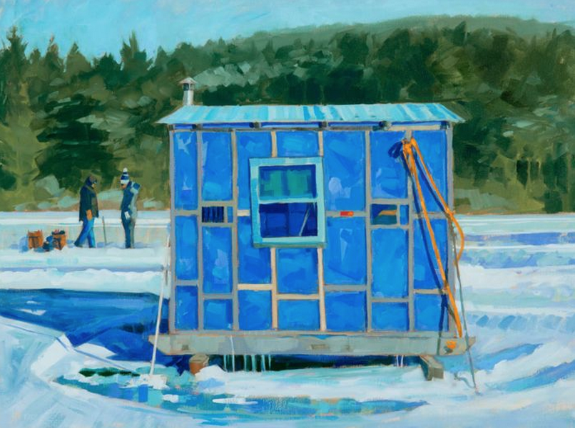
Mondrian’s Ice Fish Shack by Philip Frey – 30×40″ Oil
Another fabulous painting by Philip. The vibrant blue really just sings… and those icicles hanging off the bottom of the fish shack, well, I just love them! This painting caught my eye, reminded me a bit of home (Michigan). As soon as the lake would freeze you would see “shantytown” – Fish Shanty’s (shacks) everywhere! Inevitably some people didn’t pay attention to when the ice would begin to melt and a few would be lost… bloop… gone. This painting really depicts that quite nicely. I remember going ice fishing with my dad out on the frozen lake. Dig the hole, that was the coolest part. Then sit on buckets with the car door open blocking the wind… no fish… Hello!! Where are the fish…?? Ok dad… I’m done and ready to go get something to eat, hee… that would be after about 15 minutes – wonder why we never had a shanty, ha ha… it was big fun regardless, and probably MORE fun, hey, the memory stuck, that has to mean something, right?
Philip is giving a workshop this year, here are the details, if you’re in the Maine area you aren’t going to want to miss it!
Painting Downeast
Plein Air Painting Workshop with Philip Frey
August 28-31, 2014 | 9 am – 4 pm | $400 | www.philipfrey.com
Phil Frey was born in Portland, Maine, in 1967. He honed his artistic muse at Syracuse University, from which he graduated cum laude in 1990. Returning to his beloved Maine, he established his home and studio in the down-east village of Sullivan.
Frey is a master at using bold color to capture the sense of his subject. An admirer of the French Fauves, the 19th-century artists noted for their use of bright color, Frey says of his art: “I’m an artist who tries to joyfully express the surroundings I love through color and a sense of place.”
Frey’s vision is vital, his goal is simplicity. He is often attracted to what might seem ordinary or everyday to someone else. It is Frey’s ability to transform that everyday object into something of beauty and meaning that has caught the eye of Maine’s audience of astute art collectors.
Although Frey’s subject matter is diverse—pure landscapes, seascapes, and even interiors—his joy in the simple act of painting is a constant. So is his need to show “the simple beauty of the extraordinary moment: vivid light on a building, shadows draped along curvy roads, the many colors of foliage, or the intricacy of a working harbor.”
Chance. Of. A. Lifetime! That’s what I would personally call it! If you’re going to be in the Apalachicola, FL area in May, take this workshop with Ken DeWaard and Greg LaRock (another fabulous artist!) if you can! Ken (pictured above), is such a great instructor. Learning from someone like Ken is a privilege… you will leave with great insight and you will master your skills… no doubt about it!
Don’t miss this opportunity to study with two nationally known, award-winning plein air artists in one workshop! With decades of experience, Greg and Ken will guide you through everything you need to know including: simplification, understanding good composition, creating focal interest, achieving depth and atmosphere in your work and much, much more. Watch and learn with demos by both artists including a side by side demo of the same subject matter. Plus, lots of hands on instruction, discussion and free goodies for all students! Workshop is open to all levels.
Fee:$300. Click hereto register OR email info@pleinairfl.com !
Check out Ken’s website, it’s a great one, full of details… to see images of his work. Stunning!
Interiors. I know I keep mentioning them (hint hint to all you artists out there!)… I love them and paintings of interiors are not easy to find. When you do find an artist it seems like all their interiors are sold… it’s crazy! Of course it can’t be any interior, the painting has to depict great detail (for me, without being too tight), sunshine/light and shadows. It has to be interesting… and Cecilia’s are!
Read a blip about Cecilia from her website, and while you’re there check out her lovely paintings!!
CECILIA ROSSLEE grew up in South Africa and has recently moved to Carmel, California where she lives with her husband and three children. Her work reflects the people and objects she loves.
After graduating with a National Diploma in Fine Art, Cecilia moved to Cape Town where she started a prolific career in art. Some of her clients include Planet Hollywood and Sun International Hotels.
In 2000 she formed a publishing company with her husband which supplied a large range of stationery, depicting her art work. She supplied a major, upscale retail chain store, Woolworths, for 9 years.
Since living in Carmel, CA, Cecilia focuses mainly on her beautiful oil painting. Her work is in great demand as she depicts happy, warm images that are dear to her.
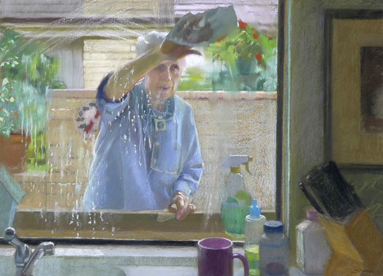
Fabulous painting, isn’t it? I love paintings of everyday people doing everyday things… it makes it so interesting. This pastel painting “Window” is featured in the Artist’s Magazine Competition Spotlight, May issue, 2014. I like how you get a glimpse into this persons life… a bit of their kitchen, their window washing, the outside. I love the concentration in the woman’s face. The movement is spectacular! Great painting Sally!
Sally’s work is so wonderful, she would be a great one to take a workshop with! Lucky you… Sally teaches workshops, check out the link to see when/where!
“I am captivated by light, and my interest in light is on equal terms with the content of a painting.” Strand pulls the extraordinary out of the ordinary through the use of light and color. Assembling multi-layered surfaces in a rich complexity of form and color, her paintings appear to emanate light from within.
A native of Colorado now residing in California, Strand has been exhibiting professionally as an artist for over 30 years. Influenced early in life by an artistic mother and a heritage of artistic relatives, her childhood was a creative mix ranging from art projects to professional puppet shows.
As a result of extensive travels while a young adult, Strand recognized a need to portray her view of the world through art. Her subjects became the familiar people and objects she carefully observed in the business of living – a man reading a morning newspaper; light falling across a bowl of eggs; groups of people waiting, working, playing – slices of life.
Strand was inducted into the Hall of Fame in 2007, the highest commendation of the Pastel Society of America, NY. She is the recipient of numerous top awards, including the PSA Master Pastelist distinction, and most recently the IAPS Master Circle Honor. Her solo exhibitions in galleries and museums include a 2006 one-person retrospective of pastel and oil paintings at the Bakersfield Museum of Art in California.
Widely published in books and magazines internationally, her work is also represented in many corporate and private collections. Strand studied at the American Academy of Art in Chicago and at the Art Students League and National Academy of Design in New York. She earned a BFA degree from the University of Denver. Strand teaches workshops and master classes around the country.
How magical is this? The way Haley’s paintings include her as a self portrait in a heroin type way is so clever. These paintings have such life. You could look at this painting for a long time and still see new things that you didn’t catch on a previous glimpse. Brilliant. And… this is only one of many! Be sure to check out Haley’s work!
There was a great article that The Morning News did, where Karolle Rabarison interviewed Haley… read it HERE… it makes me like this artist even more! This also shows some of her paintings…
The self-portrait confronts the viewer with an outward representation of the inner self. Here is the exterior as seen by the interior.
The self-portrait as a character introduces a further element. While the self-portrait implies that the artist is showing us the truth, a representation of the exterior in disguise conveys the impossibility and doubleness of this endeavor.
Through the seemingly private world of self-portraiture and autobiographical narrative, I hope to present a compelling fictive world, without dictating a precise narrative or relying on a static symbolism. I try to invest the figure with an iconic confrontability – making it operate both as self-portrait and archetypal heroine.
Painting impels me to cross the border freely between the universe of things and the universe of the imagination. The former involves an urgent encounter between the eye and the exterior world, while the latter contains the interior universe of memory, history, narrative, and desire.
Check out Haley’s paintings… they are magical! Catch you back here tomorrow!
All images via HaleyHasler.com – with permission from the artist.
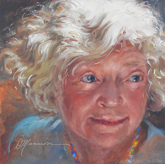
Isn’t this the most delightful self portrait? I love it. Diane looks like such a nice woman, someone who you would like to spend time talking to. Her work is exceptional!
The light on her face and in her hair… so nice… those little punches of color in the necklace, and that soft pretty color on her face. Very nice!
Read a blip about Diane from her website, be sure to check out her blog as well!
My adopted state of Florida both inspires and terrifies me. The sky and water, vivid colors, light and shadows… hurricanes! There’s an energy here that drives my painting. People, palm trees, birds and flowers. Tourists and trailer parks. Painting material everywhere I look! I’m lucky to live where the ordinary is extraordinary. Florida’s beauty contrasts sharply with seedy tackiness. My challenge is to translate this visual chaos with paint in full color.
I paint with several plein air groups in Southwest Florida and often venture out on my own. Sometimes fire ants or rain chase me into my car (auto-painting). A plein air sketch may evolve into a larger studio painting. Over thirty years as an artist/author (more than 64 books illustrated as Diane Paterson, 12 as author) have influenced the way I see and translate visual reference. Sharing my skills through teaching has sharpened my life-long learning process.
My blog has become an important part of my work. I post and write about painting techniques almost daily. Please visit:
Mark Boedges, I am thrilled to have run across his work! Just look at these paintings! I love My Gear (above) great subject matter, fabulous colors, and wonderful loose strokes. This painting is truly a delight to look at. I can almost smell the oil paint… I swear I can! Anyone who paints or truly loves art will love this painting!
Through the Woods by Mark Boedges
Wonderful use of light in this painting Through the Woods! Wow! Amazing color in the tree on the left. Gorgeous!
An up and coming artist, Mark Boedges has in a short time amassed numerous awards and shown his work in many galleries. Although art was always a part of his life, Mark came to painting in a more serious manner only during, and immediately after, college. Out of high school he attended the University of Kansas where he received a degree in philosophy. But by then the painting bug, and in particular painting plein air, had already taken hold. He went back to school to study Fine Art at the University of Colorado. Preferring a more traditional approach to painting, Mark left the program after two years to study exclusively from nature. Painting plein air had become his sole focus, and it would remain so for several years. Through this study his skills quickly developed. His first show was in 2003 and it was a great success, nearly selling out. But all artists need mentoring, and realizing that in order to further progress he needed guidance, Mark began to seek out other artists and to attend workshops to learn everything he could about his craft; which he continues to do to this day. Among the top honors Mark has received are the Grand Prize for Landscape and a spot on the cover of International Artist magazine, as well as more recently the Joseph Hartley Memorial award at the prestigious Salmagundi Club in New York City and Best in Show at the Scottsdale Salon of Fine Art.
Check out Mark’s upcoming Workshops and Private Lessons… HERE! Catch you back here tomorrow!
All images via MarkBoedges.com – used with permission from the artist.
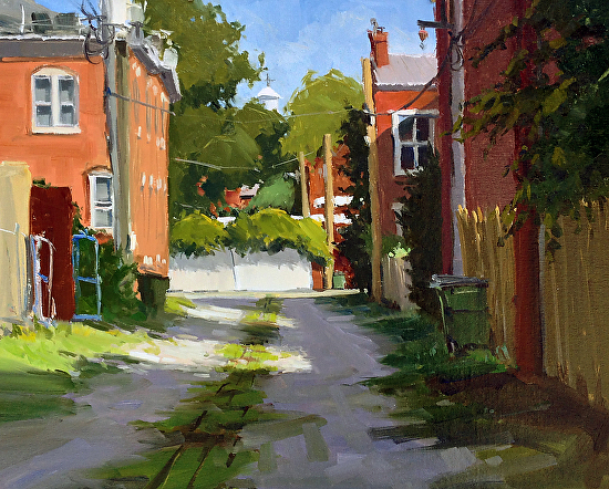
Just another downtown photo in Charleston, SC… We had my sister visiting, and we covered some territory, so I’m not sure where this was at? I remember thinking it was cool looking, so I snapped a photo of it. This wasn’t the best time of day to be taking photos, but sometimes you’ve got to take whatever you can get, right?
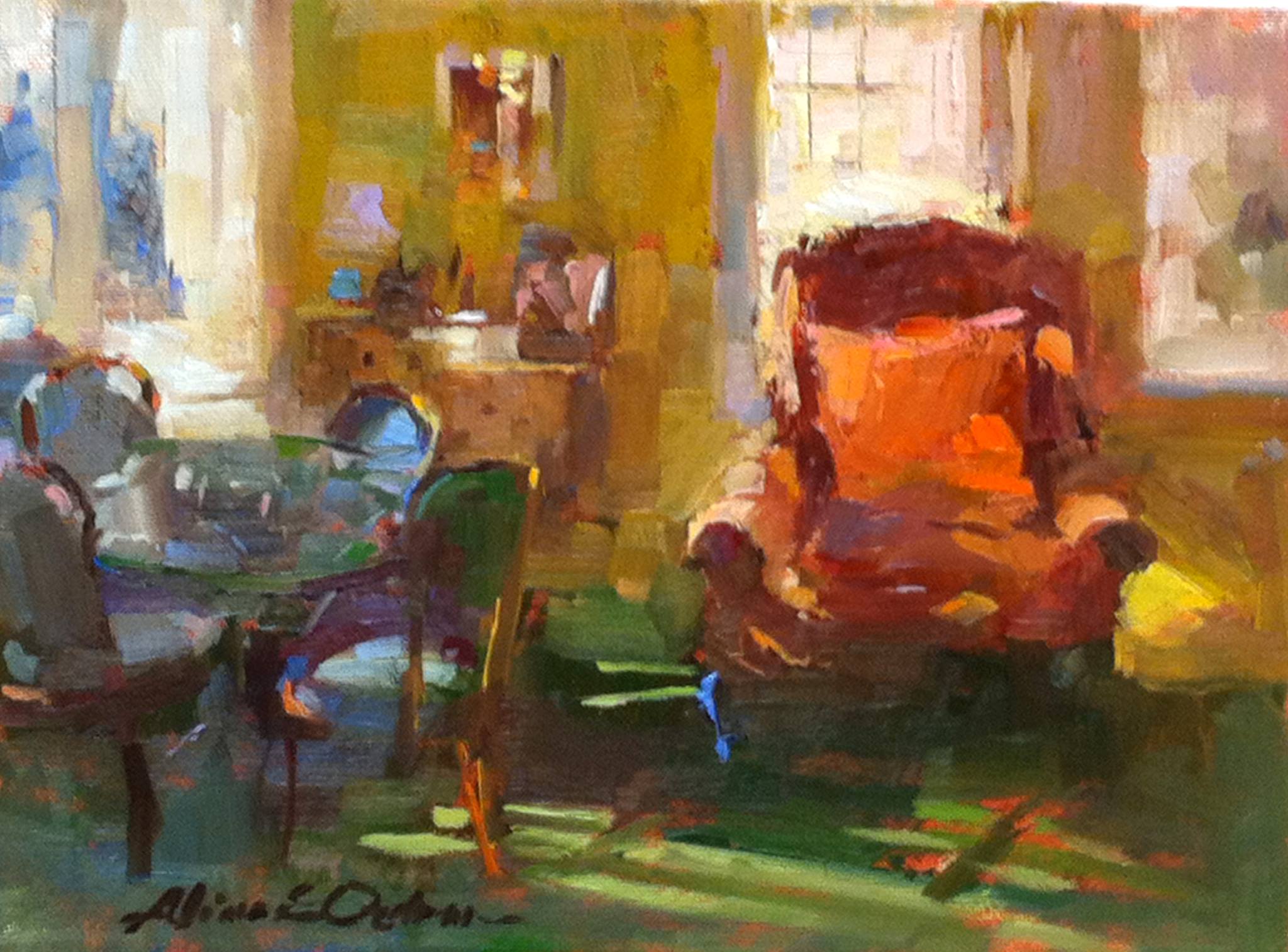
S T U N N I N G ! ! R i g h t ? ? Aline Ordman’s work is the crème de la crème!
I could feel my eyes bug out when I saw this image on Facebook… It is so fabulous in every single way. MORE INTERIORS… PLEASE!
That fabulous red chair just catches your eye, the play of light on the rug and on the yellow chair nearby… brilliant! Just look how loosely this is painted. Stunning!
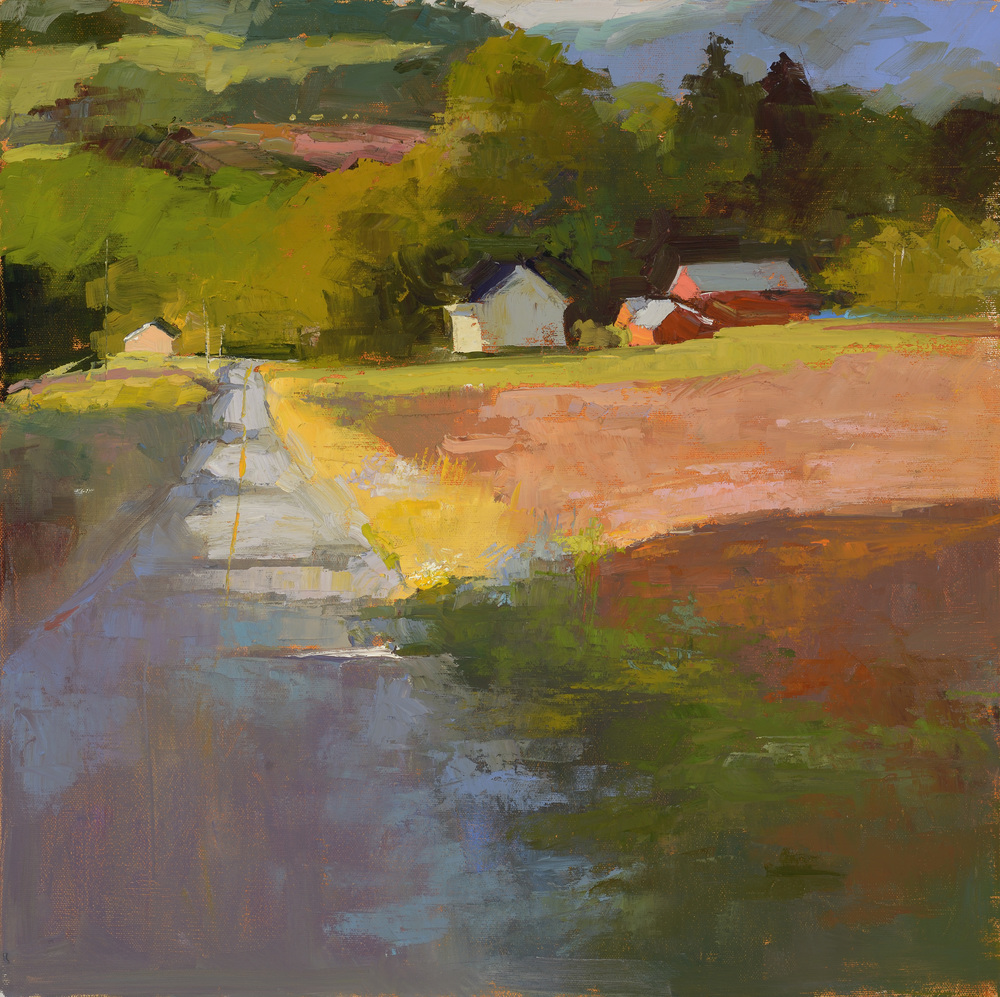
Heading Down the Road by Aline Ordman
I just love that little blip of orangey red on the building. The shadows, the light, those fabulous strokes and variations in color. Wow!
This painting was a Finalist in the 30th Annual American Artist Contest – love it!
Read a blip about Aline from her website:
Aline received her BFA at Cornell University, and continued her training at the Academy of Art College in San Francisco, earning a degree in Illustration.
“My goal as an artist is to find those times and places where beauty is not only evident, but startling and suddenly present.”
Aline is a Master Pastelist with the Pastel Society of America and a signature member of the American Impressionist Society. She was featured in an article in the February issue of the Pastel Journal and she has been honored with awards at the 33rd and 34th and 38th Annual Juried Shows of the Pastel Society of America in New York City. In April 2010, she received First Place in the figure category and third place in the landscape category of the April 2010 Top 100 Pastels issue of the Pastel Journal. Her work has been accepted in national juried shows of the American Impressionist Society, The Pastel Society of America and the Oil Painters of America. Aline teaches workshops throughout the country and in Europe. She is represented by Camden Falls Gallery in Camden, Maine; Blue Heron Gallery in Wellfleet, MA; Banks Gallery in New London, NH, Little Gallery in Mackinac, MI and West Branch Gallery in Stowe, VT. Her website is www.alineordman.comand she maintains a blog at http://alineordmanartwork.blogspot.com/
If you’re an artist, be sure to check out Aline’s workshops!
NOTE: Aline will be teaching a workshop here in Charleston, SC – March 2015 – so be sure to check it out!
Hey! I just signed up with Blog Lovin where you can see all my posts in one place, along with other blogs you follow… one easy way to access everything! Click this Follow my blog with Bloglovin
Spring is here. Just a few short days ago we went from winter to spring in the blink of an eye. And then there were more snow storms throughout the country. How crazy is that?
This painting, entitled Rite of Spring, by artist David Ahlsted is a welcome site for most of you who have endured mountains of snow and ice… not to mention the frigid cold temperatures. This painting is like a landscape and a still life all in one. And it’s happy… can you not feel the sun on your face? What a wonderful imagination, and a fabulous painting!
Check out David’s work, it’s so refreshing and different… wonderful in every way!
David Ahlsted is a realist painter who has lived and worked near the Atlantic Ocean in Southern New Jersey since 1976. He describes his work very succinctly by saying it is “content plus geometry, color, light and shadow”. With his representations of still – life, nautical and industrial scenes, and beach scenes Ahlsted thoughtfully explores abstraction, contrasts and sculptural elements in the everyday.
He received his MFA from Indiana University and presently, he is a tenured Professor of Arts at the Richard Stockton College of NJ. Ahlsted is credited with numerous solo exhibitions throughout the eastern United States, including major exhibitions in Philadelphia and New York City. He has participated in over 60 group exhibitions, including the New Jersey Arts Annual, the Philadelphia Museum of Art, the Aldrich Museum, and the Museum of the City of New York. In addition, he has completed two commissioned public art projects – six large scale paintings for the New Jersey State House Annex and seven large scale paintings for Rutgers University. His work is in the permanent collections of the Aldrich Museum, Glen Mede Trust, Master Card Corp., Noyes Museum, PepsiCo, Inc., Pew Charitable Trust and Rutgers University. His work is represented by Gross McCleaf Gallery in Philadelphia.
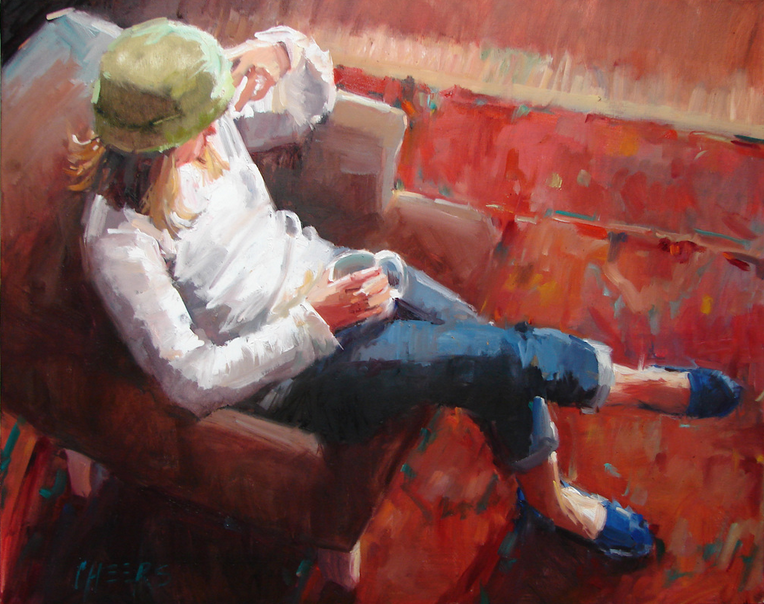
I love Robin Cheers work. It is so fabulous. Nice and loose, with great brush strokes and color. I think this is a fabulous perspective, something different! Robin has a great blog, check it out! For several of these paintings Robin set her camera on a tripod atop the dining room table and set the timer… “Selfie’s” ha ha… I like her sense of humor. All are fabulous! I think Robin should paint more interiors… she hits it spot on. Makes it so interesting! I look forward to following Robin’s work for a long, long time!
Texas-based painter, Robin Cheers’ gift is her ability to bring a magnifying glass to life’s simple moments. Her paintings encourage us to appreciate the extraordinary stories that are told in the most ordinary of circumstances.
“To discover and share the hidden treasures of everyday moments is the goal of my work. Light and gesture are my inspiration. I paint quickly – alla prima – because its the most instinctive way for me to work and capture that moment of pure inspiration. My paintings have become a visual diary of my life. In the summer, I turn to paintings of the beach, farm markets, horse shows and swimming holes. Other seasons find me in the city, frequenting coffee houses and museums, and gathering material and inspiration from each stop along the way.”
Robin’s subject matter invites people to stop and explore, while painterly brushwork speaks to the fleeting moments she captures on canvas. Working from sketches, paint studies and photos, she paints with immediacy, preferring to finish a painting in one session, leaving out details and allowing the viewer to interpret the story to their own ends.
Born in Ohio in 1969, her family moved quite often while Robin was growing up; creative play and art helped her adjust to new situations. Robin graduated in 1991 from Virginia Tech where she studied public relations and graphic arts – balancing the practical with the creative. She worked as a graphic artist and web designer in the years following college, moving once more to her current home in Austin in 1994. She studied painting at night in intensive classes with Elizabeth Locke until 2001 when she became a full time fine artist. Studies with Kim English, Peggi Kroll Roberts and Ken Auster, as well as studying the impressionist masters from long ago, have continued to inform her work.
Image via RobinCheers.com – used with permission from the artist.