Silver, Garlic, and Limes by Carol Tarzier 12 x 14″ Oil on Canvas Panel
Carol Tarzierhas wonderful paintings, from landscapes to still lifes and portraits… they all have a unique quality about them. Silver, Garlic and Limes has wonderful light, I love how that green just stand right out and says LOOK AT ME!
Also check out Carol’s sculptures – wow, is there anything this woman can’t do? I’m impressed!
Interested in taking a WORKSHOP? She’s got those as well!
Carol Tarzier’s primary focus is figurative work in bronze and pastel drawings on paper, with ventures into oil painting and abstract sculpture in bronze. Her numerous solo exhibitions in California and Nevada date back a decade and have earned her numerous awards.
During 1998 and 1999 she turned to commissioned projects, with an eight-foot bronze memorial to C.L. Dellums, the Oakland-based civil rights leader, unveiled in December of 1999. Her abstract bronze, Obelisk 1, a 9′ bronze sculpture, graces a private garden setting in Portola. Tarzier created a memorial to Professor George Hasslein of Cal Poly San Luis Obispo in 2004.
Carol divides her time working in her spacious Oakland studio and teaching art at the Academy of Art College in San Francisco and City College of San Francisco.
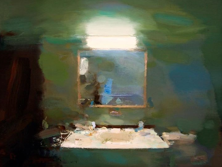
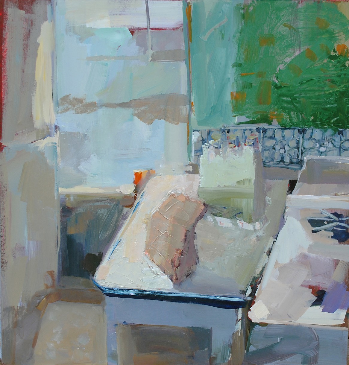
Carlos San Millan. STUNNING. I find more and more I am really drawn to paintings with some abstract qualities to them. I love normal everyday things, especially interiors. Kitchen sinks, a comfy chair, table and lamp, those kinds of things… and this bathroom mirror is quite stunning. I love the colors and the mixtures of paint. I am fascinated by this painting. I can scroll through images and just by the colors, the lights/darks, normally there will be painting that jumps out at me. This one jumped, did back flips and everything else. Whoa!
English Garden #19 by Carlos San Millan 30x45cm Oil
Another stunner. I love the wonderful brush strokes and lack of definition, leaving your imagination to do its job! Next time I attempt painting, I’m going to keep this in mind. LESS IS MORE. I’m going to use a huge brush and I’m going to PAINT WITH PAINT, ha ha… Stunning, Carlos!
A bit about Carlos from his profile on Saatchi Art:
Carlos San Millan (b. 1969 – Spain) engages with painting through a more conceptual view about the traditional subjects as figure or landscape. There is a subtile narration into their paintings, a presence that overlays on viewer’s perception and loads images with tarnished evocation . San Millan was graduated from University of Basque Country School with degrees in painting and design in 1995. He has been featured in solo and group exhibitions in Spain and Latin America.
Images are via csanmillan.jimdo.com, used with permission…
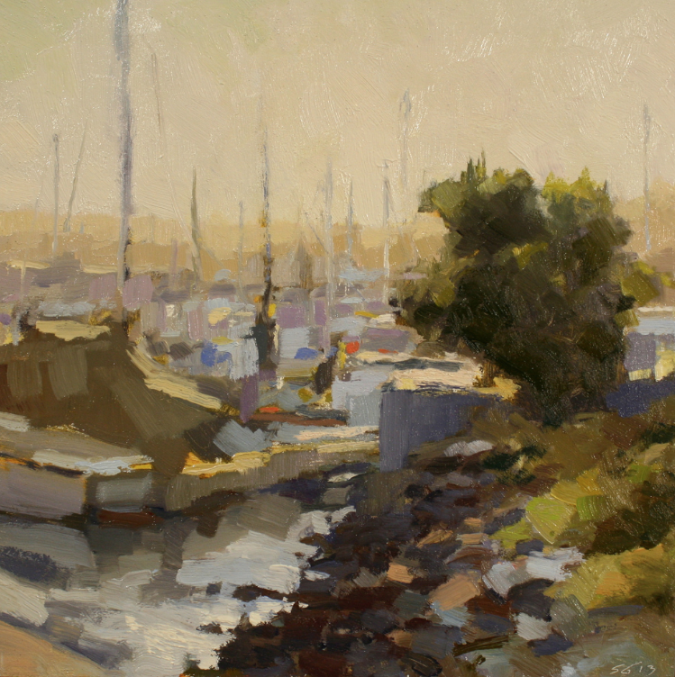
Williamette Valley Vineyard by Scott Gellatly 16×20″ Oil
Scott Gellatly. This man has a nice palette. Paintings with fabulous light, which is so important! This is a great vineyard painting!
Marina Sunrise by Scott Gellatly 12×12″ Oil
There isn’t a lot of light peaking through at sunrise, yet those little dabs of strategically placed bright colors give this painting a WOW factor! The dark colors in the foreground and in the tree make the lights pop and stand out, and those bits of lavender with those wonderful horizontal strokes are just stunning! Great composition keeps your eye in the painting… mine goes from the foreground, to the tree, to the top of the mast and down to the boat, then the water and back up the tree again. How about you? Look how much is left to your imagination… not easy to do! Love it!
I’ve always been driven to make things. No matter the medium, I find excitement and wonder in creating something that didn’t exist the day before. Whether that creation succeeds or fails, it drives my creative process forward – eager to begin the next piece.
Landscape painting is the perfect vehicle for my creative pursuits. It marries my love of nature with an immediate, responsive approach to painting. It can, at times, be a welcome solitary act – and at other times, an opportunity for camaraderie with fellow painters.
I’m a proud Oregon native and currently live in Portland with my wife and two young sons.
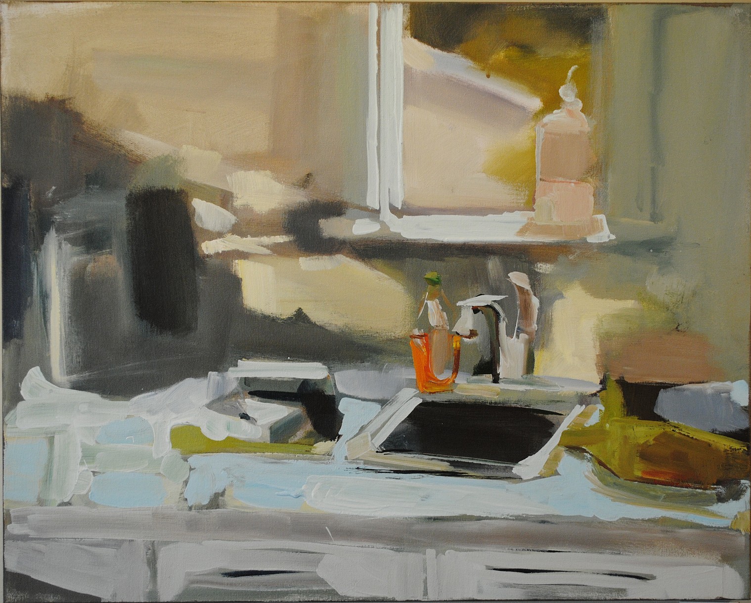
Lisa Daria Kennedy. Unique! Taking an everyday space and making it WOW! I love the kitchen sink and window… the counters, the dish soap… fabulous! The abstract qualities bring it to life! There is a method to her madness, truly… Her story below is inspirational!
GLADES by Lisa Daria Kennedy Acrylic/Oil
Another fabulous painting! So many wonderful layers! Lisa also has a daily painting blog, which you’ve just got to check out!
Fainting Party; Abject Embodiment. I’ve been making paintings every single day for the last 1500 days.Which is nearly five years. As the volume of my daily paintings grow they are not just representing the days that I have lived. As a cancer survivor, I discovered that living is not just surviving and my intimate paintings create a structural frame work of self-preservation.Although my ritual continues, over the past two years I’ve expanded my work to move beyond this self-imposed, rule based project.I now understand the controlled parameters.The project is a way to manage the out of control circumstances of an abject body. However, I’m not interested in depicting the debasing and vile aspects of the abject. I’m interested in how the relationship with the body changes after one experiences the abject.
In my Fainting Party series women are shown in vulnerable poses. The edges of the figures break apart and there’s an uncertainty between where the interior body ends and the exterior space begins. Cancer disintegrates a sense of stability and the potential for further catastrophe is incessant. So, there is a constant negotiation between one’s self and their surroundings.
I portray this negotiation by pulling from art history. I appropriate the reclining nude in my work, however I repurpose her as fainting. The fainting pose symbolizes vulnerability, because the fainting body represents loss of control.
Fainting therefore signifies abject embodiment.
In my paintings, boundaries are blurred and skin and bones no longer act as protective shields. An impending collision between interior and exterior is forever present.
In my research doctors Waskul and Van der Riet state that,
“A person does not inhabit a static object body but is subjectively embodied in a fluid, emergent and negotiated process of being. In this process, body, self, and social interaction are interrelated to such an extent that distinctions between them are not only permeable and shifting, but also actively manipulated and configured. The body is embodied.”
The body is a vessel – a cultural product that is easily assaulted and penetrated, so the figure in my work is gestural. The loose lines imply bodily boundaries and the searching characteristic of my line work represents uncertainty. These gestural lines create gaps and openings in the frame work of the figure so, what is inside can come out and what is outside can come in.
In abject embodiment, the body repeatedly defies it’s own boundaries.
In my work I simulate a feeling of disorientation by including hints of a recognizable world that are tangled up with abstraction. The collision between realism and non-representation creates a disconnect between self and one’s surroundings.
The thing is that those who have never experienced abject embodiment should understand, is that it is we who have experienced it, cannot just let it go.
We deal with our bodies and negotiate our surroundings every day.
I paint to tell this story of a fluid, permeable and negotiated process of being.
Jeanette LeGrue. Wonderful paintings! I am in love with her still life’s and landscapes. There were just so many still life’s that I am leaving it to you to check them out. I couldn’t make a decision, wonderful, colorful, happy, ahhhh!
Cottage & Cat is remarkable with the dappled sunlight, the curtains in the window, the flowers, the trim color, it’s just all so precious.
Jeanette paints plein air, and she has a fabulous post that she did about what you need to pack. This is wonderful information!
Are you looking for art classes and or workshops? Check Jeanette’s website for more information!
Check out workshops and classes..
Read a bit about Jeanette, from her website:
The painter Jeanette Le Grue was born and raised on Kodiak Island, Alaska. The midnight suns, long days of darkness, and dramatic colors of her childhood inspired her to create uniquely powerful and dramatic work. She moved to California in 1980, and now lives, paints, and operates the F.I.S.H. School of Color, in the small town of Tomales, near the coast of Northern California.
Jeanette shows her work in galleries and museums throughout the United States. She has been the subject of feature articles in Southwest Art Magazine, American Artist Magazine, and Plein Air Scene. She has received numerous awards, including First Place in the American Impressionist Society’s National Show, the Irvine Museum Award at the Hawaii Plein Air Event, the Award of Excellence at the Oil Painters of America National Juried Exhibition, and the Helen De Cozen Award at the American Artists Grand National Exhibition in New York.
Artist Statement
“I paint in oil in bold fresh color. My subjects include still lifes, figures, interior scenes, garden settings, and landscapes. But my work is not really about the subject itself. I am more interested in trying to capture the essence of my subject through the lush, luminous, sensual medium of oil paint.
“I paint both in the studio and en plein air. I am inspired by moody days on the water, or patterns of light and dark in the landscape. I try to express the mood or feeling of what I see. I like to paint loose, with large brushes, and apply large spots of color. Although I paint loose, I work within a strong abstract design. I create unusual compositions, sometimes breaking up the frame so that objects are cut off at an odd angle. I see myself as a detective trying to capture the vitality or diversity of a scene. I love patterns of reflected light and subtle nuances of color. I am always experimenting, looking for new ways to express my perceptions and feelings.
“The painters who have inspired and influenced me include such masters as Sergei Bongart, Charles Hawthorne, Joaquin Sorolla, and Franz Bischoff. They have helped me develop my own approach to color and light.”
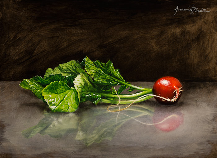
Jeremiah J. White. Get outta here! Jeremiah’s paintings are so realistic it looks as if you could reach in and pick up this gorgeous radish and take a bite, although it’s far too stunning to eat! I love the reflection that it gives off and the dark background. So nice! This painting jumped out at me!
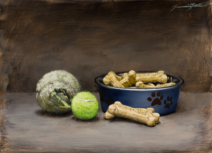
Happy Dog by Jeremiah J White 9×12″ Oil on Panel
How fabulous is this painting? Perfect name – HAPPY DOG! Nothing makes a dog happier than a tennis ball that they chew to bits with time, ha ha The dog cookies are the perfect addition to this painting. I like how Jeremiah has the subject matter so realistic yet the background and foreground has beautiful strokes and is not as realistic.
I’m a native of Colorado, born in 1981, and currently live near Denver. I’m self-trained, and I’ve spent my life learning how to draw and paint in any way I could. I’ve always been greatly inspired by the works of the old masters. Some of my fondest memories are the times I stood in front of the original pieces of my favorite painters, being in awe of the work and trying to decipher their techniques. Afterward, I would go home and immediately try out the new methods; later spending hours reading about the artists and their creations. I also marveled at the works of modern realists and how they could not only use old world ways, but cultivate those methods into something new and powerful. For years, I’ve been developing my techniques using what I’ve learned from these artists, past and present, so I can best articulate myself through my artwork.
I express many of my strongest thoughts and emotions through my work. My need to convey my adoration for what’s dear to me can be just as pressing as the compulsion to reflect upon the complexities of life and death. In my work, symbolism and finding deeper meaning play a very important role: an empty bowl can stand for hunger and need while having nothing; the glow of a facial expression, or the literal glow of light reflecting from skin, can represent love and life; the vibrant color of a specific element or subject can signify the brief happiness it made me feel. Meaning can also shift depending on the situation. Gray skies and fog can trigger a sense of foreboding, but at times can also bring about a sense of calm; a vase can sometimes be a vessel which sustains life or the container for the decay of something beautiful.
Finding beauty and meaning in the ordinary is something that I strive for in my work, because to me, life can be full of images, interactions, and moments that seem mundane, but upon deeper reflection, can become conduits that help us to tap into something deeper. I hope that my work can inspire others to look around their world and find the many treasures hidden in plain sight and to explore what significance it holds for them.
Recently, I was featured as an “Artist to Watch” in the October 2013 issue of Southwest Art Magazine. They did an excellent job at showcasing my work and allowing me to share my artistic processes.
I was also invited by the Albuquerque Museum to be a part of their 2014 “Miniatures and More” event. It was a great honor to have my work displayed for the foundation’s largest fundraiser and to support such an important cause.
Front Entrance by Margaret Petterson Ink & Watercolor Monotype 34.5 x 26.5 inches
Margaret Petterson.We have admired Margaret’s work for years and years. Many of you know her for her large colorful palms or the meandering pathways that are always so inviting… Front Entrance is a fabulous monotype, with wonderful color, great lines and that old wonderful Charleston feel to it!
Are you wondering…What is a Monotype? Margaret’s link shows you the process in detail – I think her monotypes really stand out. It’s quite a process, isn’t it?
I love the unexpected qualities of a monotype, that along with the wonderful looseness just makes for the best painting!
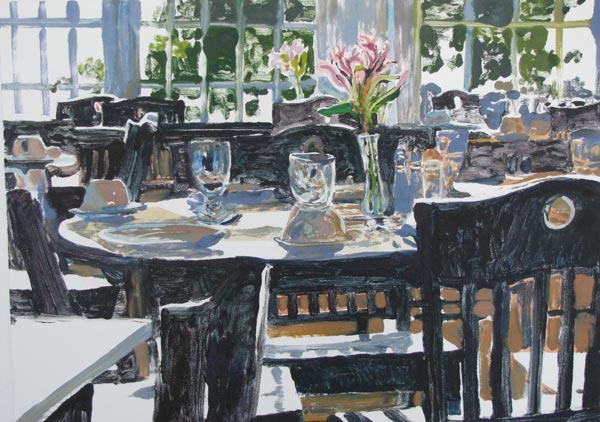
Seat Yourself by Margaret Petterson Ink & Watercolor Monotype 30.5 x 36 inches Framed
Doesn’t this painting have a wonderful feel to it? It makes you feel as if you are fine dining on a sunny day. This is GLORIOUS! I’m not sure I ever used that word, ha ha… but it describes it perfectly!
Read a blip about Margaret, from her website:
I’m an intuitive painter. My brush moves in bursts…I follow these sparks of inspiration and let them guide me. So, yes, there is a bit of planning involved, a brief underdrawing or a couple of rough sketches…but I find that the most magical aspect of the artistic process is that problem-solving that happens when you’re in the thick of it all. — Margaret Petterson
Apparently, this has worked very well indeed for Margaret Petterson, Lowcountry Painter and resident Charleston artist. Her intuitive approach to art has brought her national and international recognition for her oil paintings, watercolors and mixed-media monotypes. The artist has appeared on national television, her paintings have been displayed in embassies in both Jordan and Australia and locally she is proud to be an active leader in Charleston’s growing art community.
Originally from Loris, South Carolina, Margaret moved to Charleston at the age of eight. Growing up in the lowcountry meant being surrounded by the beauty of the marshes, oak-shaded roads, and historic architecture of the Southern city. “I’ve always been an artistic person,” she says, “but it wasn’t until well into my twenties that I began taking it more seriously. I took a watercolor class at the Gibbes Studio of Art, and attended several workshops with local notables…and it seemed as if my artistic career just fell into place.
From the beginning, the artist has been drawn to colorful, lively palettes that play on the shadows and light of Charleston’s natural and built surroundings. Says Margaret, “Nature is bursting with color, and one of my goals is to share that with others…”
Watercolors remained the prevalent paint of choice until around ten years ago. Today you’ll see oils on canvas, as well as the ink-and-watercolor monotypes.
“Typically we have a rule not to buy more than one work per artist, but Margaret’s paintings have evolved so much that we now have something in every medium she’s worked in: watercolor, monotype and oils…Beside the fact that we love the large scale of a lot of her work, her use of color is so striking and she continues to develop that as the years go by…” –Dennis and Mae Tavernetti, Traveler’s Rest, SC
An artist whose training includes studies at Charleston Southern University, multiple workshops locally and nationally, as well as printmaking studies with Patrick Aubert in Florence, Italy, Margaret is one of Charleston’s most lauded artists. Awards include first place in the Springfest ‘92 exhibit in Charlotte, N.C. and inclusion in the competitive Winterpark Arts Festival, and the Festival of the Masters at Disney in Florida. She was selected as Artist of the Year for the 5th Annual Film Festival Worldfest-Charleston. “Margaret Petterson’s vibrant renderings of the Lowcountry scene shows a masterful integration of light and form revealing an artist who continually challenges herself to express her delightful visions,” said Hunter Todd, Worldfest-Charleston’s director.
Margaret’s work has also appeared in several publications including the a book titled, Watercolor for the Serious Beginner (Watson-Guptill Publications, N.Y.: 1997), the cover of Charleston Place Magazine, and the Cooper River Bridge Run poster, as well as feature articles in American Art Collector, Art Galleries and Artists of the South, and Southern Living magazines.Two of her works were also selected by the U.S. Ambassador to Australia to be shown in Canberra and Ammon, Jordan.
Corporate collections include the Federal Reserve Bank, Charlotte, N.C.; NationsBank, Charleston, S.C. and Charlotte, N.C.; BellSouth, Charleston, S.C.; Springs Mills, Inc., Fort Mill, S.C.; Medical University of South Carolina, Charleston, S.C.; Rapid Granulator, Inc., Goose Creek, S.C., Fiberweb, Greenville, S.C.; ADT Security Offices, Rochester, N.Y. and Omaha, N.E. Her paintings can be found in private collections in Europe, the Caribbean, Canada, Australia, and the United States.
Today, Margaret can usually be found painting in her oil studio or working in her new print studio in the Petterson’s country home.
Carol Bass. Fabulous, bright, happy colors! Her work is so amazing. It’s unique, and that’s what I love! If you live in the Charleston area, you’re in luck! For the month of March 2015 Carol’s work will be displayed at the main Charleston County Public Library on Calhoun Street, in Charleston, SC. The show is called W A V E L E N G T H S.
Bonus… Carol is as incredible as the art she creates! From paintings to the “Walking Houses” and “Totem” sculptures, all of her work is out-of-the-ordinary wonderful! Check out her website and see for yourself, or better yet… make it to the Main Library in Charleston in March!
Work by Carol Bass
The layers upon layers and the varying textures and colors make Carol’s work so interesting!
Carol Bass’s work is defined by bold strokes of vivid color. She improvises like a jazz player, a child playing on the beach. She dances with a long brush and thinks of the energy flowing, connecting us to one another and to the natural world.
Her work ranges from her dimensional “Walking Houses” and “Totems” series in the 1980’s, constructed from found object, to her energy sculptures and present-day abstracts.
All images& bio via Carol Bass or Carol Bass Art Facebook, used with permission…
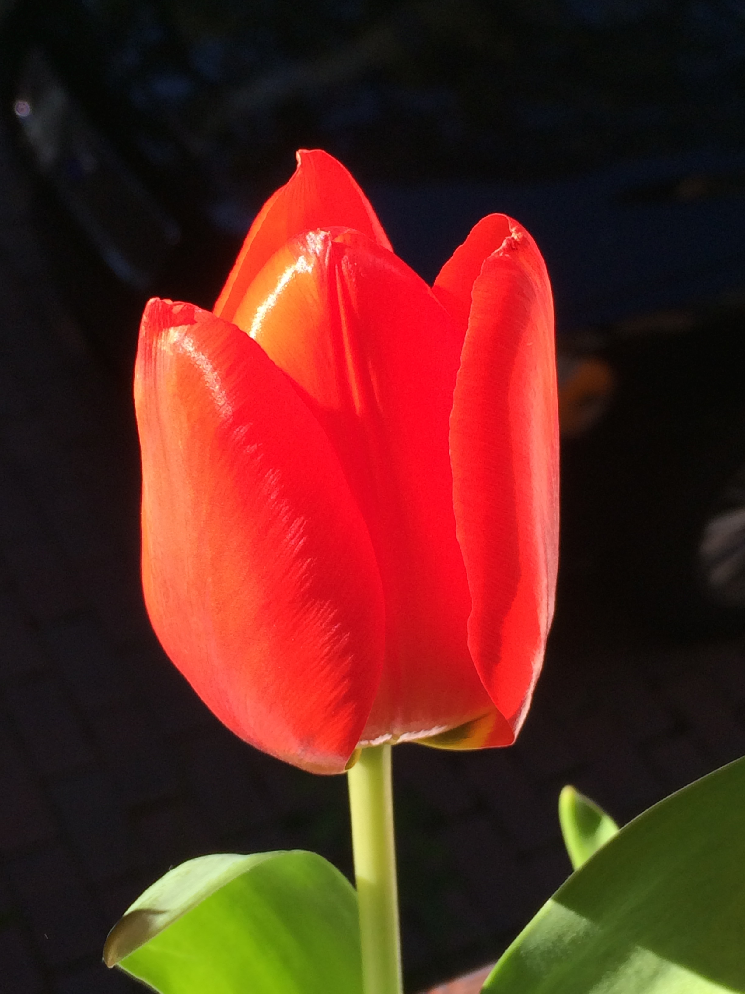
STUNNING, isn’t it? Tulip photo taken with iPhone in sunlight with black car as backdrop – he he… I’m quite sure I looked a little crazy holding a vase of tulips outside the window on a chilly day as people drove past and slowed down. I was trying to get a nice black background to make this pop… I would have preferred a chocolate backdrop, but the car is black, so… This photo reminded me of one of John Matthew Moore‘s fabulous paintings – they are beyond stunning!
Elise Phillips. I love the name of this painting… Happy Hour. Many of her paintings depict Pennsylvania scenes. She did a great job, because before I even read her bio I looked through her paintings and thought of Pennsylvania. This is nice, the cows eating on a cold winter day, the house in the background, all toasty warm with a fire in the fireplace… and lights on in the house. The subtle shadows on the snow are just beautiful as are the trees. A very nice painting indeed!
Read a bit about Elise, from her website, and be sure to check out her paintings while you’re there!
Elise Phillips was born in Wayne, Pennsylvania into a family with an extensive background in the fine arts. Her great, great grandfather founded Newman Galleries in Philadelphia in 1865, and today she is the fifth generation of the family to exhibit there.
A graduate of The Hussian School of Art in 1983, she was an accomplished illustrator and graphic designer with many successful commissions in the business community. With an inherent passion for painting, she enrolled at the Pennsylvania Academy of Fine Arts, emerging well schooled in the tradition of the Academy.
Elise has for many years maintained a studio in Elverson, Pennsylvania, where the bucolic countryside is a source of inspiration for many of her paintings, as is the Jersey Shore, New England and the Eastern shore of Maryland, where she is a frequent visitor.
An award winning exhibitor, she is a signature member of the Philadelphia Water Color Society, a member of the Philadelphia Sketch Club, Oil Painters of America, Mid Atlantic Plein Air Painters, and the French Creek Art Colony.
A Negative View on Saloons by Suzie Baker 12×16 Oil – SOLD
Suzie Baker. Gorgeous, loose, fabulous paintings. Absolutely stunning in every way. Check out her portraits, landscapes and still life paintings! I was so excited when I ran across her work! I saw it on Twitter of all things. I’m trying to get with it and figure Twitter out… I’m getting it a little more… so I am thrilled that my little learning curve ended up with a prize… finding Suzie’s work!
This painting, A Negative View on Saloons, drew me in immediately. I love paintings with a dark, dark and then something to offset it, and these greens are perfect!
Waving to the Folks On Shore by Suzie Baker 9×12″ Oil – SOLD
I think the abstract quality to this piece is so nice – fresh and different. Not too far out for people who need a painting to look like “something”. You know exactly what this is, it has great movement and luscious paint!
Read a bit about Suzie from her website – this made me smile:
“I have a degree in Advertising and Fine Arts, and for years I worked as an Art Director in ad agencies before trading in my Pantone swatches for a palette and brushes. My business trips are now en plein air. I love my job! I paint in oils and am motivated by color, immediacy of stroke, composition, the camaraderie of other artist and ultimately the desire to evolve as an artist. I endeavor for my paintings to communicate confidence in execution with a fresh, intuitive, spontaneous, quality. In my life, I will paint till I can paint no more. When I’m not painting I’m thinking about what I want to paint next. I can’t, not paint.” – from Suzie Baker, Fine Artist
I think it’s so cool that this husband-wife team work together on each piece. I love the retro’ness (is that a word?) of these paintings, reminds me of when I was a kid. Each painting has such life, color and expression.
Check out their work, but also check out their blog!
Read about Signe & Genna, from their website, I love reading about how they collaborate on a painting:
Partners in both life and art, Signe & Genna have been collaborating for nearly ten years.
Genna begins their process by applying rich layers of pattern and tone to gessoed masonite or linen supports. Signe then selects an inspiration image from their extensive collection of vintage found photos, draws with oil pastel atop the abstract underlayer using the photo for reference, and completes the image with blocky ‘panes’ of oil color.
The final results of their collaboration are multi-layered paintings with deep surfaces, crisp at first glance but rewarding the careful viewer with an undercurrent of complex tonality and colorplay.
And because I’m so interested in the artists themselves, I thought you might enjoy this… from Bennet Galleries website:
Signe was born Kerry Signe Cornell in Michigan in 1974. She spent her first five years in the small town of Houghton Lake until she moved with her family to the equally small town of Washington, Georgia in 1979. Always drawn to the creative outlet of drawing and painting, art was a natural choice for a major upon entering college at Young Harris in the even smaller town of Young Harris, Georgia in 1991. After one year at Young Harris, Signe transferred to the big city to attend LaGrange College. After four years of art study at L.C., Signe opened Gallery 155 in Pine Mountain. A short lived venture, Gallery 155 closed it’s doors in August of 1998. The next month, Artists in Residence gallery opened with Signe as one of it’s founding members. Married to fellow gallery partner and potter Gennadiy Grushovenko in 1999, Signe teaches and paints full time at Artists in Residence and is proud to show her works with successful galleries in Atlanta, Knoxville, Chicago, and Asheville. Over the past five years, Signe has been honored with a number of awards at shows and festivals throughout the southeast and has been featured at the Period Gallery in Omaha, Nebraska, the LaGrange National Biennial, and at the Art With a Southern Drawl exhibition at the University of Mobile, Alabama. Her recent exhibitions include solo features at the Tucker Gallery in Evanston IL & Gonchary Gallery in Kiev, Ukraine.
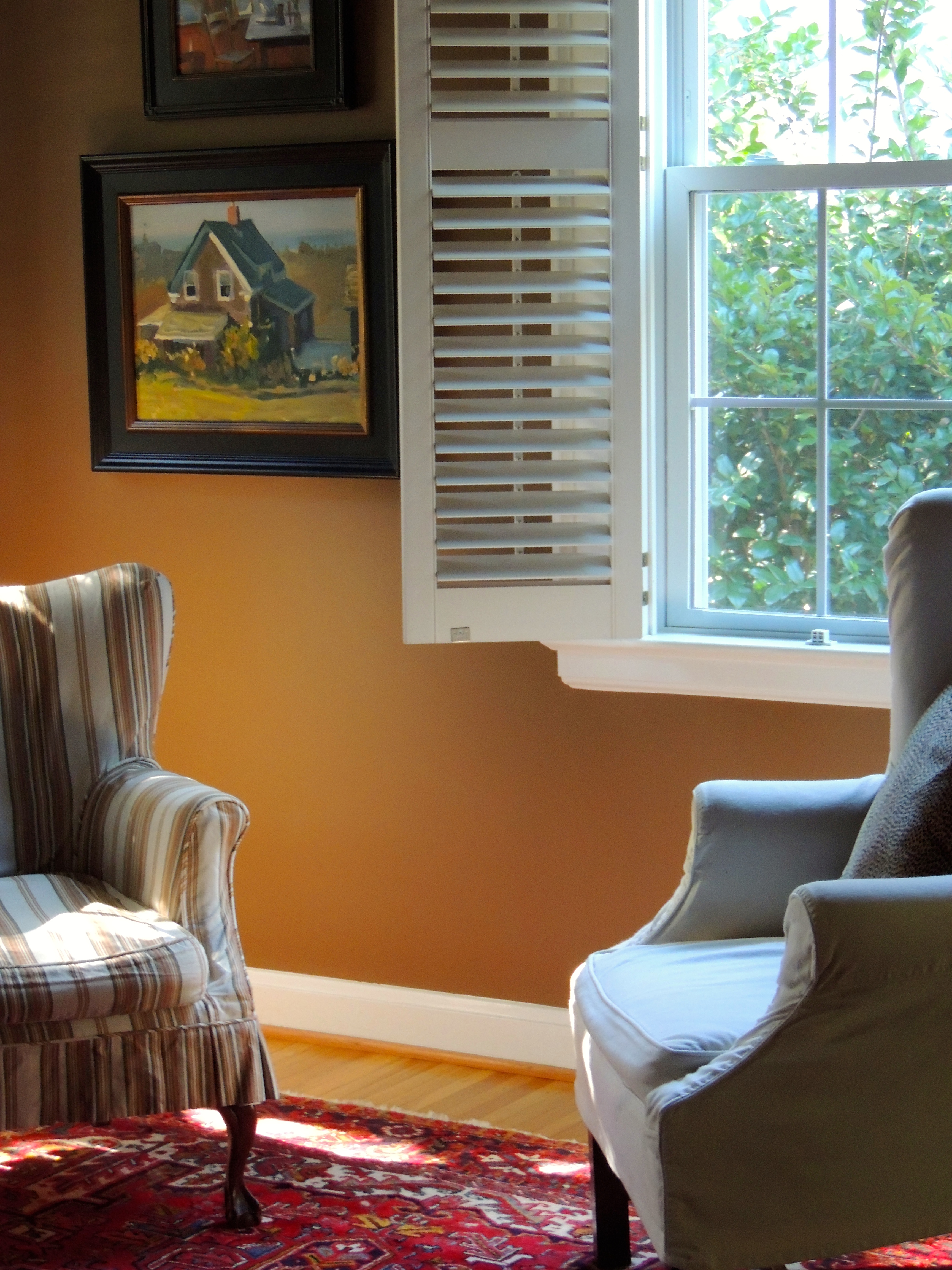
I think the lines of these chairs are elegant in a casual sort of way. The chair on the left is very old (antique), the chair on the right is newer, both are slipcovered. I think slipcovers are the way to go. We were in NYC one year and stopped in ABC Carpet and Home (ohmygosh, the most wonderful home store – wow!), and found the fabric on the antique chair.
I snapped this photo hoping to get a little light on the wingback, but I still love it, with the dancing light on the rug, so pretty!
Read All About It by Mike Kowalski 18×12″ Watercolor
Mike Kowalski. This painting, Read All About It was selected for the American Watercolor Society (AWS) Show for 2015, and guess what?? Mike received the Silver Medal! Quite an honor indeed! The show is held this month at the Salmagundi Art Club in New York.
I love everything about this painting. It’s a cool place that I want to go visit and spend time reading through the different magazines or newspapers. I like that he leaves the details to your imagination, very nice! The areas of shade and light – I just think it’s stunning!
Mike’s watercolors are brilliant. They’re well thought out and brimming with life! I am so impressed by artists who can paint with watercolors! I highly encourage you to check out his website… Gorgeous paintings, you just have to see them to believe!
Read a bit about Mike, from his website – I love how he writes!:
A friend recently told me that a good indication of what would make you happy in life would be to look back at what you were doing at the age of four or five. I was happy outside, observing nature. No need of added stimuli, just the sight, sounds and smells of our natural world. I also drew a lot. After over twenty five years as a freelance illustrator I have started pursuing art that………….. makes me happy. I was recently on the coast of California painting early in the morning. The sun rising quickly, shadows changing, wind whipping up from the west. The colors of the surf were yellows, and ochres, olives and innumerable shades of blue. I had only about an hour to get it all down. Those hours painting are what I live for.
Here’s the boring stuff:
Graduated from Utah State University with a BFA in art/illustration. The instruction at that institution was stellar.
Moved to Southern California in the early eighties where I had the opportunity to paint with Dan McCaw ( who also just happened to be on my soccer team ). I learned an awful lot in that time.
I relocated to the San Francisco bay area where I met my wife leading bicycle trips. After the birth of our first child I got a bit more serious about illustration. We moved up to the Seattle area where I began to concentrate on architectural illustration.
I’ve been busy ever since.
About five years ago I began to take steps toward a career as a fine artist. With four children that transition is slow but steady. I have many years ahead of me.
Clear your calendar for Saturday, February 21, 2015! There is the most amazing artist-led docent tour that you will not want to miss. Charles Williams is a brilliant artist who’s latest show “SWIM: An Artists Journey” will have you absolutely amazed!
This show runs through April 23, 2015, so if you miss the opportunity to meet Charles, by all means make your way to the show anyway!
Franklin G. Burroughs-Simeon B. Chapin Art Museum in Myrtle Beach, SC.
Here is a bit about the show (taken from an email)…
Swim is a highly personal artist’s exploration documenting Charles Williams’ past and more recent interactions and fears associated with the ocean: from wave formations in the oceans to the physical inability to swim and the paralysis caused by his fear. His images merge the conflicting emotions aroused by the ocean: alluring and sensual, yet mysterious and at times overwhelming.
Williams will give three guided tours of the exhibit, at 1:00, 2:00 and 3:00 p.m., and will be available between tours to answer questions about his work. The tours are free and open to the public, however sign-up is requested.
Please call the Art Museum at (843) 238-2510 and sign up for the 1:00, 2:00 or 3:00 p.m. artist-led tour.
These paintings aren’t like any you’ve ever seen. Several are large, very large, 6×8′ – they are displayed in the evening room which makes them even more dramatic. There are eight large scale paintings and forty smaller scale studies.
These paintings are so dramatic and breathtaking – whoa!
More information…
Works on exhibit are available for purchase from the Artist, and catalogs are available from Franklin G. Burroughs-Simeon B. Chapin Art Museum in Myrtle Beach, SC. For more information on the works visit cewpaintings.com and the museum website. “Swim: An Artist’s Journey” is on exhibit from January 15, through April 23, 2015.
Read a bit about Charles… and be sure to check out his website!
Charles Williams is a professional contemporary realist painter from Georgetown, South Carolina and a graduate of the Savannah College of Art and Design (SCAD) in Savannah, Georgia with a Bachelor’s Degree in Fine Art. From utilizing oils for the basis of landscapes, each painting captures his reflection of human emotions in response to and in sync with the natural environment. Recent achievements and awards include a Hudson River Landscape Fellowship, featured work in the Artist’s Magazine’s 28th Annual Art Competition, honorable mention from Southwest Art Magazine’s 21 Emerging Under 31 competition, 2012 Winner of the Fine Art Category from Creative Quarterly and featured cover artist of Composite and Professional Artist Magazine. Williams’ works has been shown in American Art Collector, Empty, Charleston Magazine, Grand Strand, Studio Visit, Bluecanvas and other national publications. He was recently interviewed and broadcast on ETV/NPR station, entitled: “Nature Through the Eyes of an Artist”. His contemporary landscapes have been exhibited in group and solo exhibitions in galleries in New York, Vermont, California, Georgia, South Carolina and several other southeaster states. Learn more…
All images and information via Charles Williams or CEWPaintings.com, used with permission…