Williamette Valley Vineyard by Scott Gellatly 16×20″ Oil
Scott Gellatly. This man has a nice palette. Paintings with fabulous light, which is so important! This is a great vineyard painting!
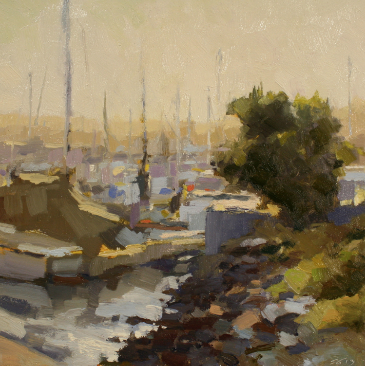
Marina Sunrise by Scott Gellatly 12×12″ Oil
There isn’t a lot of light peaking through at sunrise, yet those little dabs of strategically placed bright colors give this painting a WOW factor! The dark colors in the foreground and in the tree make the lights pop and stand out, and those bits of lavender with those wonderful horizontal strokes are just stunning! Great composition keeps your eye in the painting… mine goes from the foreground, to the tree, to the top of the mast and down to the boat, then the water and back up the tree again. How about you? Look how much is left to your imagination… not easy to do! Love it!
I’ve always been driven to make things. No matter the medium, I find excitement and wonder in creating something that didn’t exist the day before. Whether that creation succeeds or fails, it drives my creative process forward – eager to begin the next piece.
Landscape painting is the perfect vehicle for my creative pursuits. It marries my love of nature with an immediate, responsive approach to painting. It can, at times, be a welcome solitary act – and at other times, an opportunity for camaraderie with fellow painters.
I’m a proud Oregon native and currently live in Portland with my wife and two young sons.
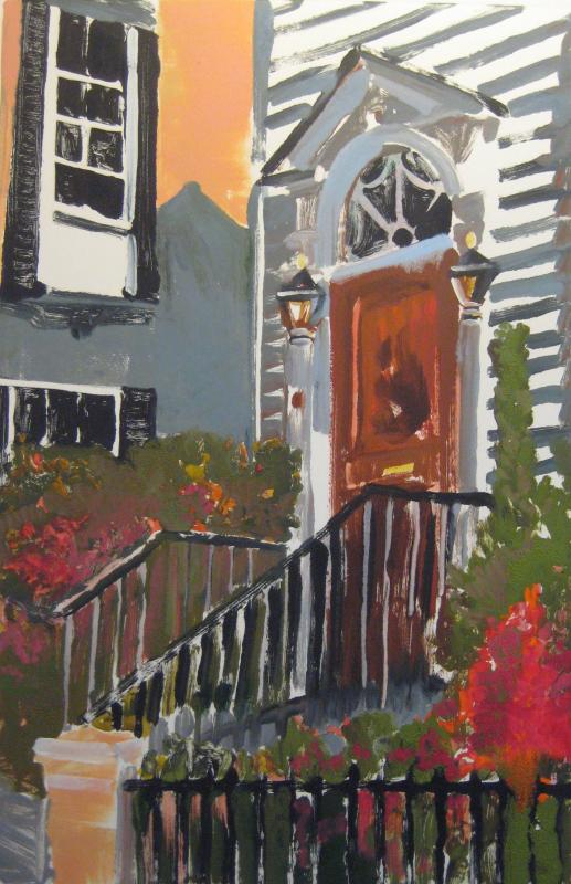
The large, grand, historic homes in Charleston, SC are stunning. Breathtaking even. Besides the cost of the home, taxes, insurance, utilities, etc. can you imagine the maintenance? I’m not sure where I was when I snapped this photo, but it appears that this home may be receiving a makeover? Look at the intricate detail. Just beautiful! You have to be able to look beyond what is there to be able to see what it could truly be. A diamond in the rough…
This home will be stunning! Catch you back here tomorrow!
There is nothing like sunlit trees against a dark sky. So dramatic. The blue in that sky is very “Marc Hanson” to me. We have one of his paintings that has that identical color and that’s what drew me in to the painting. Those two colors together are wow!
See what I mean! That dark sky and the streak of light, wow!
Our Marc Hanson painting…
Speaking of Dark Skies, did you know there is an app called DARK SKY. It lets you know when it’s going to begin raining (or let you know a few minutes before), its fairly accurate, although I cannot believe I paid for it, ha ha…
Well, if you haven’t already realized, it’s Friday the 13th. I try to remain a positive person, so I’m thinking this will be a good luck day, and while I’m not normally a superstitious person, I felt like I should take caution and not spread any bad luck to any artist or architect today, so I’m just going to throw a question out there… I could use some recommendations for some good music!
WHAT DO YOU LISTEN TO?
I listen to Pandora quite a bit (and psssst a good gift idea would be a no ad upgrade for anyone you know who listens!) – and I tend to get in a rut. I listen to the same few stations. Mainly, it’s George Winston. I like George, but Charlie (woof) LOVES George. He will actually sleep if George is playing (YAY!) So the beast usually wins. Also if I’m trying to write or read I need to concentrate, so I listen to George. When I need to switch it up I listen to Masako.
When I’m cooking, I listen to Maroon 5 and Christina Aguilera (something with a beat!) or Happy Radio (Pherrell Williams song “Happy”). Other favorites are Koop (lounge type cool music), Eklipse radio (more happening)…
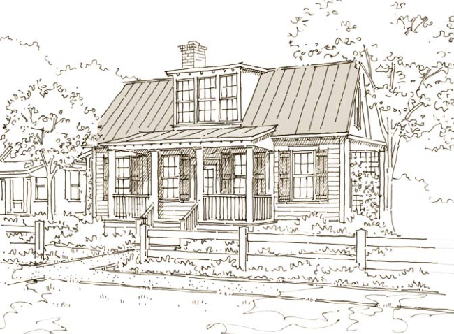
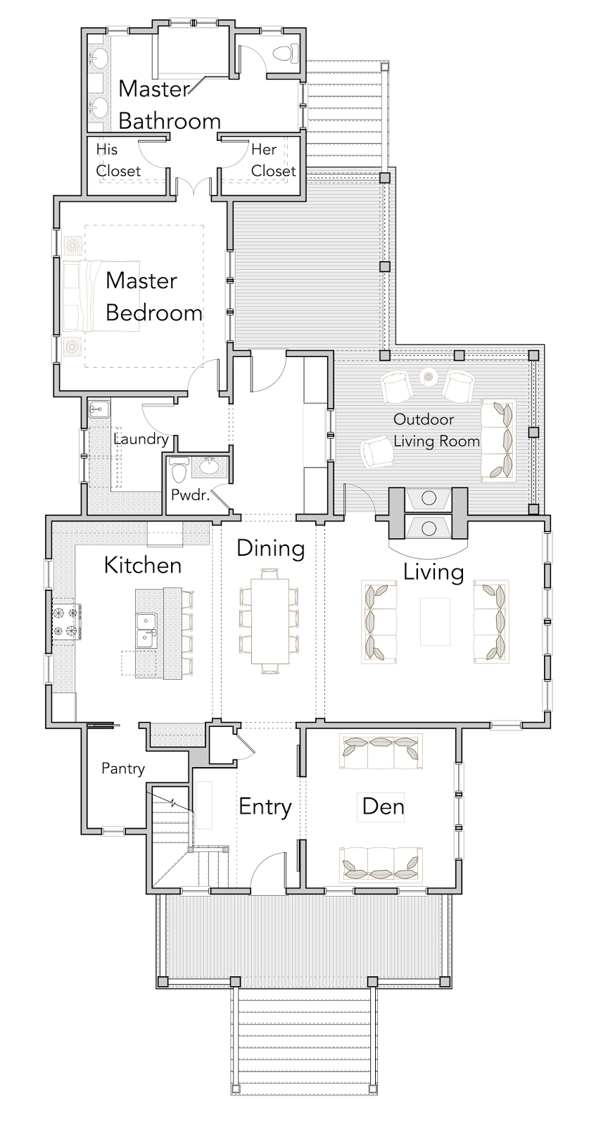
231 Easton Way by Our Town Plans. Quite an impressive house plan. I adore the three windows upstairs. Can you imagine the wonderful light would spill into your space? 231 Easton Way is 1,455 square feet with 3 bedrooms and 3 bathrooms. It boasts exposed rafters and an expansive front porch, perfect for entertaining!
The best thing about this site (other than their fabulous house plans) is the ability to see images of real homes… GORGEOUS and stunning (click the 231 Easton Way link at the beginning) – WOW is all I can say!
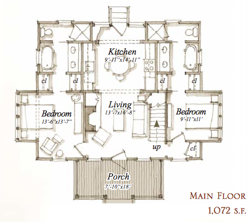
231 Easton Way House Plan by Our Town Plans
How wonderful to have such a nice wide porch for entertaining! The porch is 7’10” x 18′ – nice, huh? Once you enter the home, you see the open plan with the Kitchen/Dining and the Living spaces. There isn’t a separate dining room per-sea which is perfect! There is a wonderful space for a kitchen table which is absolutely what we would use more than a dining room.
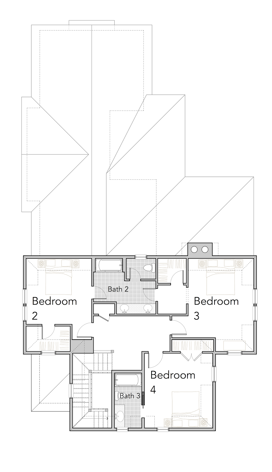
231 Easton Way House Plan by Our Town Plans
What a fabulous loft room! A private sanctuary! Great to use as a studio or a very private guest room!
Images via OurTownPlans.com, used with permission…
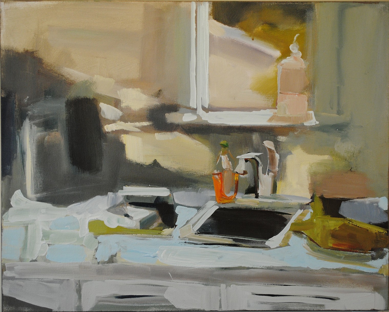
Lisa Daria Kennedy. Unique! Taking an everyday space and making it WOW! I love the kitchen sink and window… the counters, the dish soap… fabulous! The abstract qualities bring it to life! There is a method to her madness, truly… Her story below is inspirational!
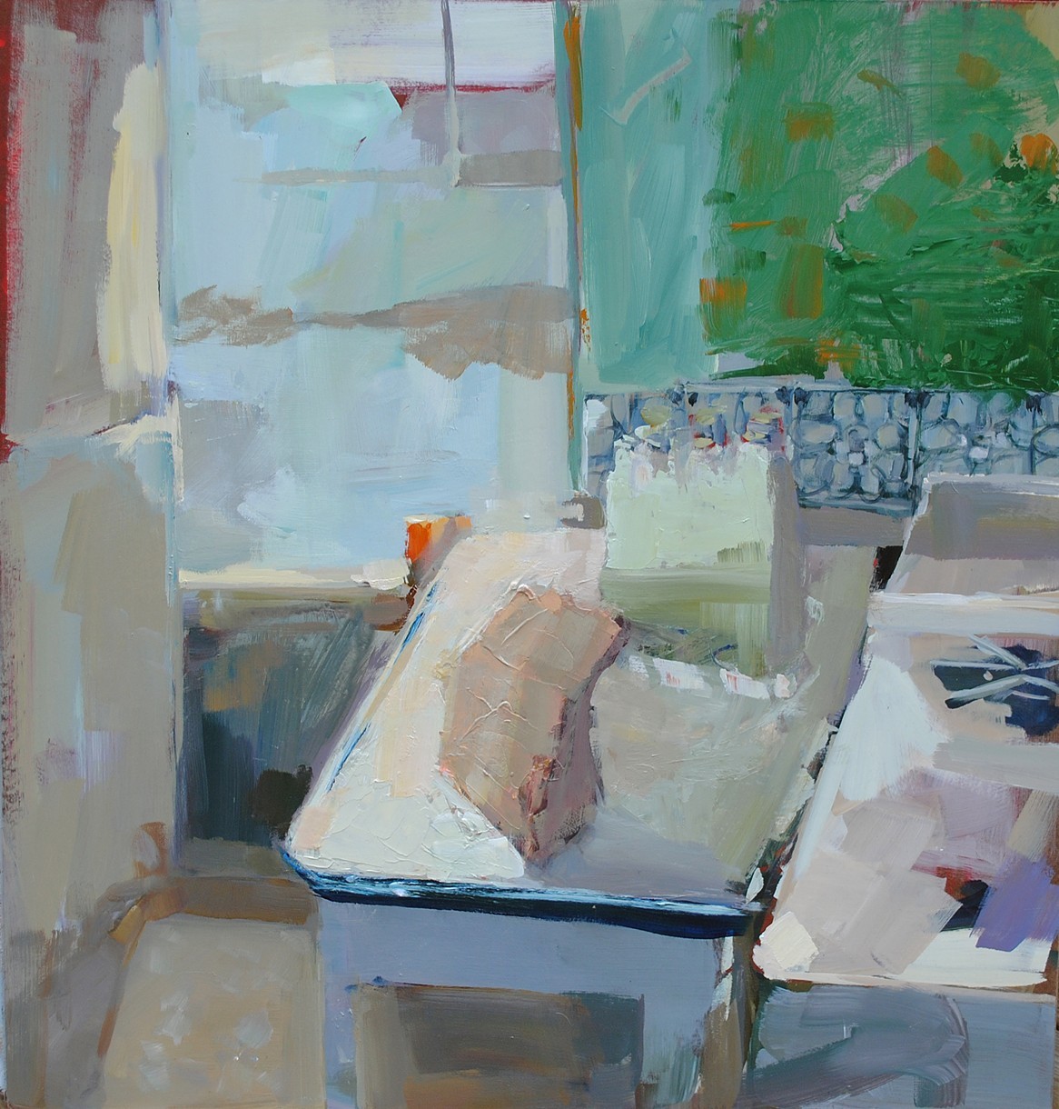
GLADES by Lisa Daria Kennedy Acrylic/Oil
Another fabulous painting! So many wonderful layers! Lisa also has a daily painting blog, which you’ve just got to check out!
Fainting Party; Abject Embodiment. I’ve been making paintings every single day for the last 1500 days.Which is nearly five years. As the volume of my daily paintings grow they are not just representing the days that I have lived. As a cancer survivor, I discovered that living is not just surviving and my intimate paintings create a structural frame work of self-preservation.Although my ritual continues, over the past two years I’ve expanded my work to move beyond this self-imposed, rule based project.I now understand the controlled parameters.The project is a way to manage the out of control circumstances of an abject body. However, I’m not interested in depicting the debasing and vile aspects of the abject. I’m interested in how the relationship with the body changes after one experiences the abject.
In my Fainting Party series women are shown in vulnerable poses. The edges of the figures break apart and there’s an uncertainty between where the interior body ends and the exterior space begins. Cancer disintegrates a sense of stability and the potential for further catastrophe is incessant. So, there is a constant negotiation between one’s self and their surroundings.
I portray this negotiation by pulling from art history. I appropriate the reclining nude in my work, however I repurpose her as fainting. The fainting pose symbolizes vulnerability, because the fainting body represents loss of control.
Fainting therefore signifies abject embodiment.
In my paintings, boundaries are blurred and skin and bones no longer act as protective shields. An impending collision between interior and exterior is forever present.
In my research doctors Waskul and Van der Riet state that,
“A person does not inhabit a static object body but is subjectively embodied in a fluid, emergent and negotiated process of being. In this process, body, self, and social interaction are interrelated to such an extent that distinctions between them are not only permeable and shifting, but also actively manipulated and configured. The body is embodied.”
The body is a vessel – a cultural product that is easily assaulted and penetrated, so the figure in my work is gestural. The loose lines imply bodily boundaries and the searching characteristic of my line work represents uncertainty. These gestural lines create gaps and openings in the frame work of the figure so, what is inside can come out and what is outside can come in.
In abject embodiment, the body repeatedly defies it’s own boundaries.
In my work I simulate a feeling of disorientation by including hints of a recognizable world that are tangled up with abstraction. The collision between realism and non-representation creates a disconnect between self and one’s surroundings.
The thing is that those who have never experienced abject embodiment should understand, is that it is we who have experienced it, cannot just let it go.
We deal with our bodies and negotiate our surroundings every day.
I paint to tell this story of a fluid, permeable and negotiated process of being.
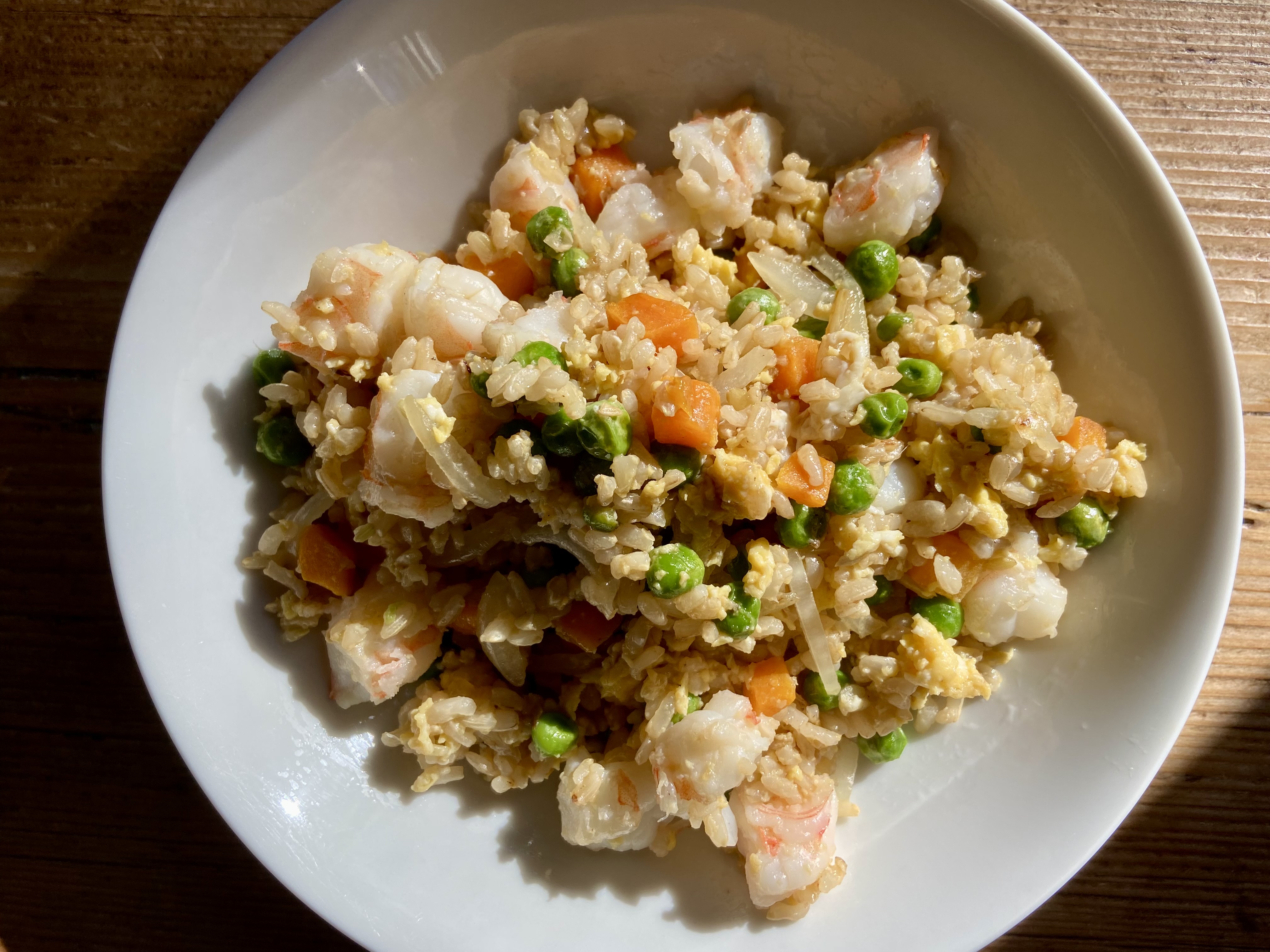
Don’t you just love when you have a recipe that can be a favorite week in/week out? This is one of those recipes! Out of this world good comes to mind! This recipe was in Roper Hospital’s HOUSE CALLS magazine back in the Fall of 2013. I made it the other day and let me tell you… IT’S A KEEPER! All their recipes are fabulous, and this is one more! It comes together quickly, so be sure to have everything measured and ready!
I used Trader Joe’s frozen organic brown rice, which is fabulous, just defrost it! You want the rice cold for this recipe. I used the frozen peas and carrots from Whole Foods, they were fabulous! The carrots were shredded, which I like better than cubed.
Note, I personally don’t care for Sesame Oil, so I used olive oil, I also didn’t use Fish Sauce or a lime wedge… but that’s me ;) – I also don’t eat soy, so I skipped the soy sauce and replaced it with coconut aminos (Trader Joe’s) – my husband then uses soy and I don’t… this is delish!
Via House Calls Magazine – Roper Saint Francis Hospital, Charleston, SC – Fall 2013
Serves 4
1 Tablespoon Sesame Oil
3 cups cooked, cold Brown Rice (defrost if frozen)*
12 oz. Shrimp, shelled
1 Tablespoon Low-Sodium Soy Sauce
1 Tablespoon Canola Oil
2 Teaspoons Fish Sauce (optional)
2 Green Onions, sliced thinly
2 eggs, beaten
¾ cup frozen Peas and Carrot mix, defrosted
Fresh Lime Wedge
*Chef’s Note: Rice should be cold when you sauté it. Try a frozen cooked brown rice, defrosted, such as Trader Joe’s brand, with this, there is no need to cook it according to package directions in advance. (This worked perfectly!!)
HEAT the sesame oil over medium-high heat in a large nonstick skillet. Add the shrimp (original recipe called for raw baby shrimp, I used regular large shrimp and they were wonderful). Add the shrimp and cook for three minutes, turning once, until just opaque in center. Transfer to a plate and set aside.
REDUCE heat to medium and add the canola oil. Once oil is hot add the defrosted pea/carrot mix and green onions. Fry stirring frequently, for one to two minutes. Transfer to the same plate with the shrimp. Increase the heat to medium-high. Once pan is hot again, spread the rice in an even layer on the surface of the pan.
DRIZZLE with soy sauce (and fish sauce if using, I didn’t). Let the rice fry, untouched for 30 to 60 seconds before stirring to allow browning. Toss the rice and cook until crisp and browned, about 2 minutes. Push rice to one side of skillet; add eggs to the other side and quickly stir to scramble the eggs, then work into the rice mixture, about two minutes.
FOLD in cooked veggies and shrimp. Continue stirring until all ingredients are heated through (won’t take long). Serve immediately with a lime wedge for squeezing (we didn’t do this either).
Jeanette LeGrue. Wonderful paintings! I am in love with her still life’s and landscapes. There were just so many still life’s that I am leaving it to you to check them out. I couldn’t make a decision, wonderful, colorful, happy, ahhhh!
Cottage & Cat is remarkable with the dappled sunlight, the curtains in the window, the flowers, the trim color, it’s just all so precious.
Jeanette paints plein air, and she has a fabulous post that she did about what you need to pack. This is wonderful information!
Are you looking for art classes and or workshops? Check Jeanette’s website for more information!
Check out workshops and classes..
Read a bit about Jeanette, from her website:
The painter Jeanette Le Grue was born and raised on Kodiak Island, Alaska. The midnight suns, long days of darkness, and dramatic colors of her childhood inspired her to create uniquely powerful and dramatic work. She moved to California in 1980, and now lives, paints, and operates the F.I.S.H. School of Color, in the small town of Tomales, near the coast of Northern California.
Jeanette shows her work in galleries and museums throughout the United States. She has been the subject of feature articles in Southwest Art Magazine, American Artist Magazine, and Plein Air Scene. She has received numerous awards, including First Place in the American Impressionist Society’s National Show, the Irvine Museum Award at the Hawaii Plein Air Event, the Award of Excellence at the Oil Painters of America National Juried Exhibition, and the Helen De Cozen Award at the American Artists Grand National Exhibition in New York.
Artist Statement
“I paint in oil in bold fresh color. My subjects include still lifes, figures, interior scenes, garden settings, and landscapes. But my work is not really about the subject itself. I am more interested in trying to capture the essence of my subject through the lush, luminous, sensual medium of oil paint.
“I paint both in the studio and en plein air. I am inspired by moody days on the water, or patterns of light and dark in the landscape. I try to express the mood or feeling of what I see. I like to paint loose, with large brushes, and apply large spots of color. Although I paint loose, I work within a strong abstract design. I create unusual compositions, sometimes breaking up the frame so that objects are cut off at an odd angle. I see myself as a detective trying to capture the vitality or diversity of a scene. I love patterns of reflected light and subtle nuances of color. I am always experimenting, looking for new ways to express my perceptions and feelings.
“The painters who have inspired and influenced me include such masters as Sergei Bongart, Charles Hawthorne, Joaquin Sorolla, and Franz Bischoff. They have helped me develop my own approach to color and light.”
Isn’t this the craziest photo of Charlie? This is what he looks like while we’re eating dinner. He sets his chin on my leg so I don’t forget he’s there, waiting, waiting, waiting for anything. Since he’s on a special diet, the only “special” treats are different veggies and fruits. Many more veggies than fruit for sure. This dog does get a few pasta noodles if we have that for dinner, but only if I remember to set them aside BEFORE I put anything on them. I don’t think anything makes him happier… well, maybe lettuce. This dog LOVES IT!
So… this is my beast, every night at dinner saying DON’T FORGET ABOUT ME… no worries Charlie, I promise!
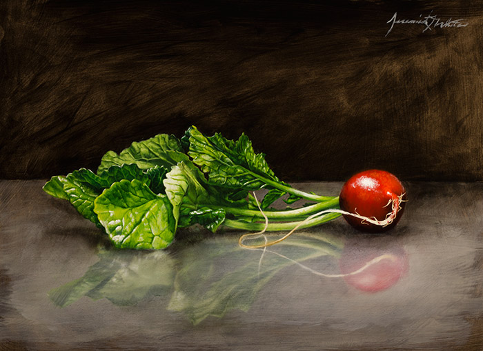
Jeremiah J. White. Get outta here! Jeremiah’s paintings are so realistic it looks as if you could reach in and pick up this gorgeous radish and take a bite, although it’s far too stunning to eat! I love the reflection that it gives off and the dark background. So nice! This painting jumped out at me!
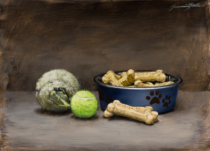
Happy Dog by Jeremiah J White 9×12″ Oil on Panel
How fabulous is this painting? Perfect name – HAPPY DOG! Nothing makes a dog happier than a tennis ball that they chew to bits with time, ha ha The dog cookies are the perfect addition to this painting. I like how Jeremiah has the subject matter so realistic yet the background and foreground has beautiful strokes and is not as realistic.
I’m a native of Colorado, born in 1981, and currently live near Denver. I’m self-trained, and I’ve spent my life learning how to draw and paint in any way I could. I’ve always been greatly inspired by the works of the old masters. Some of my fondest memories are the times I stood in front of the original pieces of my favorite painters, being in awe of the work and trying to decipher their techniques. Afterward, I would go home and immediately try out the new methods; later spending hours reading about the artists and their creations. I also marveled at the works of modern realists and how they could not only use old world ways, but cultivate those methods into something new and powerful. For years, I’ve been developing my techniques using what I’ve learned from these artists, past and present, so I can best articulate myself through my artwork.
I express many of my strongest thoughts and emotions through my work. My need to convey my adoration for what’s dear to me can be just as pressing as the compulsion to reflect upon the complexities of life and death. In my work, symbolism and finding deeper meaning play a very important role: an empty bowl can stand for hunger and need while having nothing; the glow of a facial expression, or the literal glow of light reflecting from skin, can represent love and life; the vibrant color of a specific element or subject can signify the brief happiness it made me feel. Meaning can also shift depending on the situation. Gray skies and fog can trigger a sense of foreboding, but at times can also bring about a sense of calm; a vase can sometimes be a vessel which sustains life or the container for the decay of something beautiful.
Finding beauty and meaning in the ordinary is something that I strive for in my work, because to me, life can be full of images, interactions, and moments that seem mundane, but upon deeper reflection, can become conduits that help us to tap into something deeper. I hope that my work can inspire others to look around their world and find the many treasures hidden in plain sight and to explore what significance it holds for them.
Recently, I was featured as an “Artist to Watch” in the October 2013 issue of Southwest Art Magazine. They did an excellent job at showcasing my work and allowing me to share my artistic processes.
I was also invited by the Albuquerque Museum to be a part of their 2014 “Miniatures and More” event. It was a great honor to have my work displayed for the foundation’s largest fundraiser and to support such an important cause.
Fox Sparrow #6 Plan by Flatfish Island Designs. This plan is 3,110 square feet with 4 bedrooms and 3,5 bathrooms. Quite the stunning Lowcountry plan don’t you think? What a handsome exterior. Wonderful porches, love the cuts in the roof and the dormers. Very sharp! I don’t normally showcase larger homes – I guess they just get too big and loose all the qualities that I love so much. But this one… SWEET! Oh, and that link at the beginning of this paragraph – it’s FABULOUS! Click on it to be taken to the website about this house plan, it shows many photos (actual images of a real house) so you can really get a good idea of how it can look! That’s priceless!
Fox Sparrow #6 by Flatfish Island Designs
You can get a great idea on the use of space in this plan from this image. Just look at the extensive outdoor living space! Wow… and best of all, it comes complete with an outdoor fireplace! LOVE IT!
I have always adored a porch. If it’s just right it can be used as much as your interior space. I like the Den (aka, great spot to read or work on the computer, oh yeah, work at the computer while looking out the windows… always good for inspiration)! Then the Kitchen/Dining/Living spaces all quite comfortable! It’s nice to have a Powder Room and Laundry and then the Master Bedroom/Closet/Bathroom. Very nice!
Fox Sparrow #6 by Flatfish Island Designs
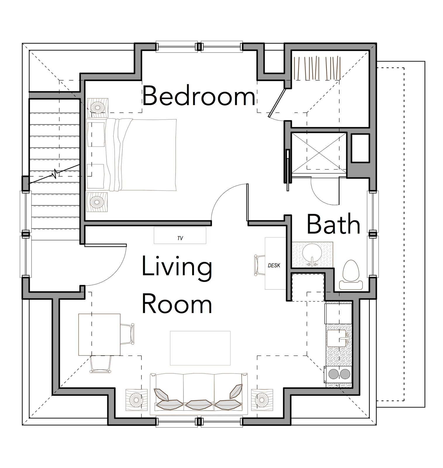
Upstairs are three more bedrooms and two bathrooms. I would make one a storage room ;)
Sparrow Garage #5 by Flatfish Island Designs
BONUS! This house plan has a pretty fantastic garage plan! Isn’t this nice?! The same wonderful roof lines!
Second floor of Sparrow Garage #5 by Flatfish Island Designs
You could build this garage FIRST and live in it while you build the main house! How perfect would that be? What a wonderful guest house this would be! This is wonderful!
Front Entrance by Margaret Petterson Ink & Watercolor Monotype 34.5 x 26.5 inches
Margaret Petterson.We have admired Margaret’s work for years and years. Many of you know her for her large colorful palms or the meandering pathways that are always so inviting… Front Entrance is a fabulous monotype, with wonderful color, great lines and that old wonderful Charleston feel to it!
Are you wondering…What is a Monotype? Margaret’s link shows you the process in detail – I think her monotypes really stand out. It’s quite a process, isn’t it?
I love the unexpected qualities of a monotype, that along with the wonderful looseness just makes for the best painting!
Seat Yourself by Margaret Petterson Ink & Watercolor Monotype 30.5 x 36 inches Framed
Doesn’t this painting have a wonderful feel to it? It makes you feel as if you are fine dining on a sunny day. This is GLORIOUS! I’m not sure I ever used that word, ha ha… but it describes it perfectly!
Read a blip about Margaret, from her website:
I’m an intuitive painter. My brush moves in bursts…I follow these sparks of inspiration and let them guide me. So, yes, there is a bit of planning involved, a brief underdrawing or a couple of rough sketches…but I find that the most magical aspect of the artistic process is that problem-solving that happens when you’re in the thick of it all. — Margaret Petterson
Apparently, this has worked very well indeed for Margaret Petterson, Lowcountry Painter and resident Charleston artist. Her intuitive approach to art has brought her national and international recognition for her oil paintings, watercolors and mixed-media monotypes. The artist has appeared on national television, her paintings have been displayed in embassies in both Jordan and Australia and locally she is proud to be an active leader in Charleston’s growing art community.
Originally from Loris, South Carolina, Margaret moved to Charleston at the age of eight. Growing up in the lowcountry meant being surrounded by the beauty of the marshes, oak-shaded roads, and historic architecture of the Southern city. “I’ve always been an artistic person,” she says, “but it wasn’t until well into my twenties that I began taking it more seriously. I took a watercolor class at the Gibbes Studio of Art, and attended several workshops with local notables…and it seemed as if my artistic career just fell into place.
From the beginning, the artist has been drawn to colorful, lively palettes that play on the shadows and light of Charleston’s natural and built surroundings. Says Margaret, “Nature is bursting with color, and one of my goals is to share that with others…”
Watercolors remained the prevalent paint of choice until around ten years ago. Today you’ll see oils on canvas, as well as the ink-and-watercolor monotypes.
“Typically we have a rule not to buy more than one work per artist, but Margaret’s paintings have evolved so much that we now have something in every medium she’s worked in: watercolor, monotype and oils…Beside the fact that we love the large scale of a lot of her work, her use of color is so striking and she continues to develop that as the years go by…” –Dennis and Mae Tavernetti, Traveler’s Rest, SC
An artist whose training includes studies at Charleston Southern University, multiple workshops locally and nationally, as well as printmaking studies with Patrick Aubert in Florence, Italy, Margaret is one of Charleston’s most lauded artists. Awards include first place in the Springfest ‘92 exhibit in Charlotte, N.C. and inclusion in the competitive Winterpark Arts Festival, and the Festival of the Masters at Disney in Florida. She was selected as Artist of the Year for the 5th Annual Film Festival Worldfest-Charleston. “Margaret Petterson’s vibrant renderings of the Lowcountry scene shows a masterful integration of light and form revealing an artist who continually challenges herself to express her delightful visions,” said Hunter Todd, Worldfest-Charleston’s director.
Margaret’s work has also appeared in several publications including the a book titled, Watercolor for the Serious Beginner (Watson-Guptill Publications, N.Y.: 1997), the cover of Charleston Place Magazine, and the Cooper River Bridge Run poster, as well as feature articles in American Art Collector, Art Galleries and Artists of the South, and Southern Living magazines.Two of her works were also selected by the U.S. Ambassador to Australia to be shown in Canberra and Ammon, Jordan.
Corporate collections include the Federal Reserve Bank, Charlotte, N.C.; NationsBank, Charleston, S.C. and Charlotte, N.C.; BellSouth, Charleston, S.C.; Springs Mills, Inc., Fort Mill, S.C.; Medical University of South Carolina, Charleston, S.C.; Rapid Granulator, Inc., Goose Creek, S.C., Fiberweb, Greenville, S.C.; ADT Security Offices, Rochester, N.Y. and Omaha, N.E. Her paintings can be found in private collections in Europe, the Caribbean, Canada, Australia, and the United States.
Today, Margaret can usually be found painting in her oil studio or working in her new print studio in the Petterson’s country home.
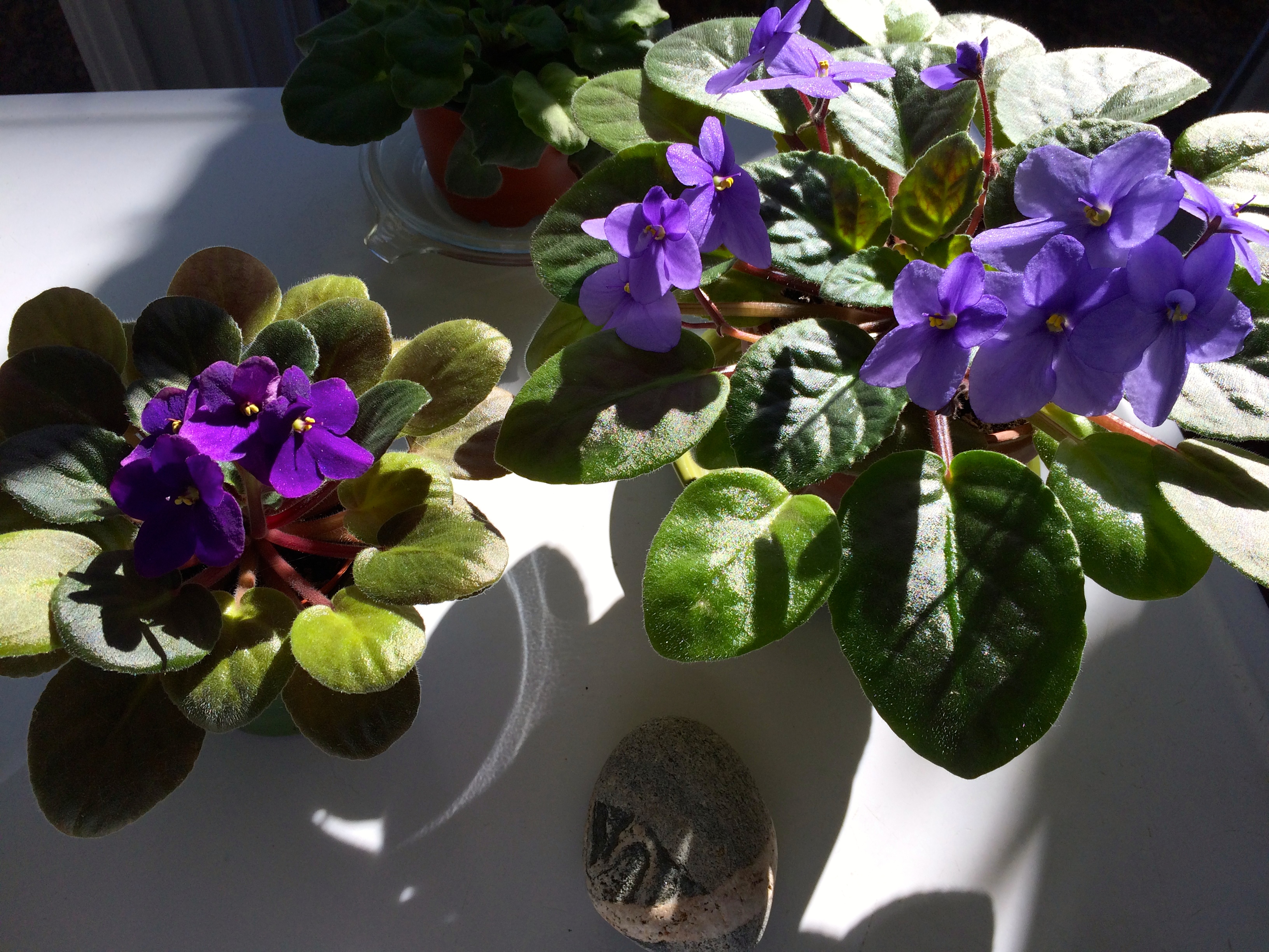
Big, blooming and beautiful… My violets at their peak! I’ve had the plant on the right for almost eight years. They love the sunroom light. Once every week or two (depending how dry they get), I put them in a butcher tray with water. I try to catch rain water in a large bowl, they like that best!
I have one droopy violet, run roh! Seems like it happened before with my larger violet, but then it ended up being OK… Suggestions? Ideas? When you read about transplanting African Violets the process seems long and complicated. We transplanted one and it ended up doing fine. We didn’t do anything special. Let me know if you have any secrets to making these plants live long, happy lives!
Carol Bass. Fabulous, bright, happy colors! Her work is so amazing. It’s unique, and that’s what I love! If you live in the Charleston area, you’re in luck! For the month of March 2015 Carol’s work will be displayed at the main Charleston County Public Library on Calhoun Street, in Charleston, SC. The show is called W A V E L E N G T H S.
Bonus… Carol is as incredible as the art she creates! From paintings to the “Walking Houses” and “Totem” sculptures, all of her work is out-of-the-ordinary wonderful! Check out her website and see for yourself, or better yet… make it to the Main Library in Charleston in March!
Work by Carol Bass
The layers upon layers and the varying textures and colors make Carol’s work so interesting!
Carol Bass’s work is defined by bold strokes of vivid color. She improvises like a jazz player, a child playing on the beach. She dances with a long brush and thinks of the energy flowing, connecting us to one another and to the natural world.
Her work ranges from her dimensional “Walking Houses” and “Totems” series in the 1980’s, constructed from found object, to her energy sculptures and present-day abstracts.
All images& bio via Carol Bass or Carol Bass Art Facebook, used with permission…