Featured Artist: Karen Blackwood (& UPCOMING WORKSHOP)!

Closed For Winter by Karen Blackwood

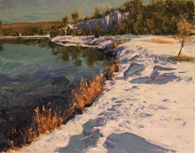
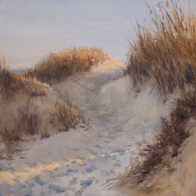
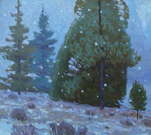
Closed for Winter by Karen Blackwood 24×30″  Oil (Available at Haynes Galleries)

Karen Blackwood has wonderful work. This winter scene has such a wonderful feel to it. The subtle colors, the shapes of the trees, the grasses that break up the snow – nice!

Are you interested in taking a workshop with Karen? She has a one day workshop with a few openings… next month! Karen would be a great artist to take a workshop from, especially if you are interested in seascapes!

Karen Blackwood Workshop

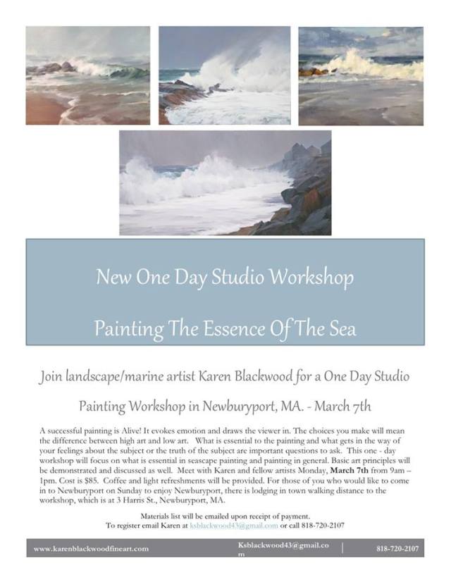
Sounds like a fabulous workshop, doesn’t it? Contact Karen if interested!

Sun and Surf by Karen Blackwood

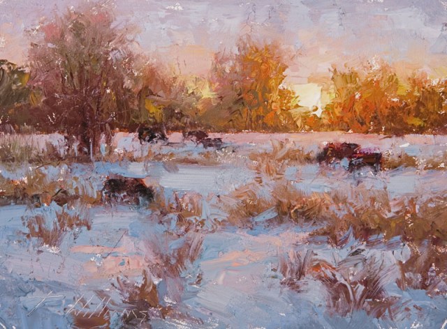
Sun and Surf by Karen Blackwood  18×36″  Oil (Available at Trees Place Gallery)

Karen’s seascapes are well known, they have such lively movement, fabulous colors, light and those waves! Wow!

Read a bit about Karen, from her website:

Karen Blackwood was born in N.H. and received her BA in the Studio Art program at the University of N.H. studying under Conley Harris and Sigmund Abeles, with continued studies at the  Art Students League in N.Y. and the Institute of Art in CA. After spending the earlier part of her professional life as an Art Director for a major New York City ad Agency, she moved to California, picked up her brushes and dedicated herself to painting. Trained in the classical tradition, Karen painted portraits and figurative work before focusing on landscapes. As a member of the California Art Club, Karen’s new passion for landscapes bloomed among a group of plein-air painters inspired by the rich tradition in California Impressionism. The clubs renowned members include Granville Redmond and Edgar Payne. They, as well as American Masters like John Singer Sargent, James Abbott McNeil Whistler, Winslow Homer and the Hudson River School Artists are influential to Karen.

Like the California Impressionists, Karen feels light is a defining factor, and it is the atmospheric quality of the light that she captures in her paintings. Her work is a desire to convey an emotional response to the landscape and to attain that perfect state of being that sometimes comes from painting it. Now living in Newburyport, Massachusetts, the coastal scenery is providing her with endless inspiration for her marine work, garnering her an award as a Finalist in the International Artist Magazine Competition, Honorable Mention in a recent OPA online showcase and numerous selections as the Favorite Top 15% in the Bold Brush Competitions. Read more HERE

All images via KarenBlackwoodFineArt.com, used with permission…

Images are not for reproduction, they are property of the artist.

Catch you back here tomorrow!

Featured Artist: Lea Colie Wight!

Third Floor Light by Lea Wight

Third Floor Light by Lea Colie Wight  22×22″  Oil
Available at New Masters Gallery in Carmel, CA

I absolutely love Lea’s paintings! I was thrilled when I ran across her work! Lea is very versatile in the subjects she paints. Her interiors are full of life, you can find yourself imagining being in the space that she paints. Her portrait skills are over the top, not only capturing what the person looks like, but their entire “vibe”.

I love the painted floor in “Third Floor Light”. Also the brightness as if sun is streaming in, making those painted wood floors shine. The subtle shadows and light. Love this!

Lauren by Lea Wight

Lauren by Lea Wight  48×28″  Oil | Available at Haynes Galleries – Tennessee

Talk about fabulous. Lea can paint people in the most spectacular way. It’s no surprise she has won Honor Awards (see more below)… You’ve got to check out her website… and her self portraits – WOW!

In the painting above, Lauren looks as if she could get up from her chair and walk right out of the painting WITHOUT it looking too realistic. Perfection!

Lea has a few BOOKS available, I bet they are fabulous!

Read a bit about Lea, from her website:

Lea Colie Wight was born in Philadelphia, Pa in 1951.  She earned a BFA from The Minneapolis College of Art and Design in 1974.  In 2003 Lea discovered Studio Incamminati, an intensive Atelier founded in Philadelphia by renowned artist Nelson Shanks and entered as a student.  After completing her studies Lea was invited to join the teaching staff rising to become one of the lead teachers at that school.  Lea periodically served as teaching assistant to Nelson Shanks at The Art Students League in New York and has served as lead instructor for various Studio Incamminati workshops as well as her own workshops.  She has been awarded an Honor Award at the Portrait Society of America’s national competition in 2009 and in 2010 as well as a Certificate of Excellence in 2011. Her work has been featured in numerous publications. 

Lea maintains a studio in Manasquan, New Jersey as well as in Philadelphia.

All images via LeaWight.com, used with permission…

Images are not for reproduction, they are property of the artist.

Catch you back here tomorrow!

Emerging Artists!

ArtFoodHome.com | barbara stroud

Several times a year I like to post entries from Emerging Artists who have submitted their work to me. Check them out!

Take a minute to check out their websites and read a bit about them. If I didn’t post the entire bio/artist’s statement I provided a link so you could continue reading.

Thank you all for submitting your websites!

JULIA LAWING

Winter Folly by Julia Lawing 30x24" Oil

Winter Folly by Julia Lawing  30×24″  Oil

Julia Lawing  (JuliaLawing.com), Julia has a nice website and some nice paintings, nice shadows in this one above!… Check out her website!

Read a bit about Julia, from her website, to read in entirety, visit website!

Julia Chandler Lawing resides in Concord, North Carolina, with her husband Bruce and their four daughters. Born in Atlanta, her family relocated to St. Simons Island, Georgia, when she was 12. The beauty of the Golden Isles’ mossy oaks, tides and marshes, wildlife and coastline continues to influence her art today. Julia graduated from the journalism school at The University of North Carolina at Chapel Hill, advertising sequence, with a concentration in drawing.

Post college, Julia experimented with various mediums including stained glass, ceramics, watercolor and photography. Past work experience includes undergraduate admissions recruiter at the Savannah College of Art and Design, advertising copywriter at The Charlotte Observer, grammar school art teacher, and volunteer docent at the Cabarrus Arts Council… (more)

GREG MARQUEZ

One Buffalo by Greg Marquez 24x36 Acrylic

One Buffalo by Greg Marquez  24×36″  Acrylic

Greg Marquez (Artquez.com), Greg has watercolor, acrylic and sculpture. Talk about well rounded! A very cool buffalo indeed! Also be sure to check out Greg’s blog while you’re on his website!

Greg Marquez is a native of Colorado and grew up in that mythical place called The West. Having spent most of his life exploring the western United States by foot, horse, bicycle and  car he finds that his artwork is imbued with the color and light so unique to this part of the world. Primarily thought of as a Watercolorist, Mr. Marquez also paints with Acrylics on canvas and is an accomplished sculptor. 

His work has been included in many prominent shows and has won accolades and awards. Mr. Marquez has also been awarded two commissions for Veneco Oil in Denver. The first was assigned based on the quality of his paintings on canvas and illustrates on two large, 5×9′, canvasses the natural life above and below an oil-rig near Santa Barbara, California.  The other commission was seated on a large, 4×8′  panel and details some of the wildlife found in the Sacramento Basin area by smaller panels affixed to the larger piece which in turn shows a landscape typical of the area.
Mr. Marquez also teaches painting and drawing and has volunteered many hours in the Denver Public Schools.
Most recently Greg Marquez was invited to participate in the Biennial of the Americas in Denver, CO.

YISRA PREVAIL

Broken Angel by Yisra Prevail 36x24" Acrylic

Broken Angel by Yisra Prevail  36×24″ Acrylic

Yisra Prevail (YisraPrevail.com), her paintings show strength. She has quite a story, be sure to read about her (and click the link to finish reading) and check out her website!

A childhood spent in civil-war torn Guatemala , … subsequently well-travelled, … a relatively new immigrant to Canada, … Prevail wishes to identify her present-day self through a spontaneous exercise/exorcism of paint to canvas. Early Canadian career-achievements in fashion illustration / design / modeling, and public relations eventually led Prevail to a wish for a more personal freedom of purpose—finally to emerge herself in a fine arts studio practice—to paint independently.

Glancing at Prevail’s Alfa series there can be no avoidance of an art historical reference … a flashback in time and place to modern, 1911-13, Germany,—consider an emerging ‘Expressionist’ movement struggling with the critical acceptance of the bridge between representational and non-objective imagery – the beginnings of communication of emotion through the purely ‘visual’ elements of colour and form in painting (witness: Jugendstil, Der Blaue Reiter group, … ).  

Artists are always limited in their choice of influences by taste and tenor of their own time. Where first generation Expressionists explored the metaphysical through orchestrated and articulate critical debate, art theory publication, artist associations, and theme-oriented group exhibitions, … ‘this’ generation expressionist Prevail has chosen to embark upon a personal, contemplative path (stream of consciousness) hoping —paint to canvas—to whisper —an essence of the divine power of creation— “a universal beauty held in heart, soul and spirit”. (…finish reading...)

All images via artist’s websites, used with permission…

Images are not for reproduction, they are property of the artist.

Catch you back here tomorrow!

Featured Artist: Larry Seiler!

View from Sunset Point - Marquette, MI by Larry Seiler 8x8%22 Oil

View from Sunset Point – Marquette, MI by Larry Seiler  8×8″ Oil

Larry Seiler. A fabulous and versatile artist. This is a great little painting, those clouds are moody and wonderful! I love everything about it. This is a painting that would look great in a floater frame. I’m big on those right now!

I love how Larry adds a little info about the painting! Larry’s words:

Every year requires my wife and I to visit Presque Isle park of Marquette, MI…not far from our cabin in Michigan’s Upper Peninsula. The bluffs and rocks are most inviting to spend time on, and the mood of Lake Superior is ever changing.

This is a most popular location for photographers to settle in for the end of day, witnessing often the most spectacular sunsets, and thus…its name. 

Walden Road In-Country by Larry Seiler

Walden Road In-Country by Larry Seiler  8×10  Oil

This is one fabulous winter scene. Look at the wonderful colors in the snow, the trees (love!) and the trees in the distance, top that off with those wonderful clouds and you have one heck of a painting – I love Larry’s description:

Familiar ground for my son and I, we made a day wanting to backpack in…see where deer travel was, other sign of wildlife, and I hoped to catch a good spot to set up and paint.  Was a lovely day…but neglected to bring my snowshoes.  Had nearly a mile of knee deep snow breaking trail.  This is looking back at trails we made walking in…and a lovely sun-filled day.

Larry has many DEMOS on his website and they are FABULOUS! He shows step by step and explains what he is doing. I could watch these all day! I love his process! How generous to share his information – THANK YOU LARRY! Be sure to check out Larry’s book and DVD’s – in addition to painting, Larry is also a musician! Check him out!

Read a bit about Larry from his website, and more from his blog:

Enculturation imbued with print media & tv means we live in a 2nd reality, one the lens sees. Lifeless shadows, static detail rank accurate to life. My renaissance from 20 years in studio came after taking my paints outdoors. Several things happened- I saw color as only an artist can see, (painting being the deeper way of seeing); I was overwhelmed with all to be worked out in short order; thirdly, that taunt of a feeling I knew nothing of painting! Such would send many back to the pretense of the familiar, but I’m not good hiding from myself that which I’m not able to succeed. By right…I should be able to paint outdoors, and was going to do this were it to kill me. Kill me it did! So complete was that death, I could no longer aspire to paint as artists I had admired. Their works now lifeless, labored, detailed, realistic, yes…but no sense of REAL’ness. I wish I had started nature’s schooling much younger, but lives are like books. Not one chapter stuck to one narrative. Life can be filled with many chapters. It can have interesting twists and new directions, and I say go for it! *See my book on landscape painting, and new DVDs available thru “Books & Videos” at larryseiler.com

All images via LarrySeiler.com, used with permission…

Images are not for reproduction, they are property of the artist.

Catch you back here tomorrow!

Featured Artist: Kimberly Santini!

Beamer by Kimberly Kelly Santini

Beamer by Kimberly Kelly Santini  6×6″ Acrylic

Kimberly Kelly Santini. Her paintings capture the life wiggling inside these furry little animals. This painting exudes sweetness. Just look at those eyes and that fabulous fur! I would like to meet this dog… it reminds me of Charlie, especially the wisps of hair in front of the eyes. Great colors in this painting.

24k Bun by Kimberly Kely Santini

24K Bun by Kimberly Kelly Santini  8×10″ Acrylic with Gold Leaf

This painting caught my eye. It makes me smile. Very unique. I like the addition of gold leaf. The colors in this painting are wonderful, it’s painted very loosely and is just perfect. THOSE EYES! The eyes make this painting! I think that’s true for most paintings of animals. If the eyes aren’t right then it doesn’t really capture the animal fully. LOVE the tiny bit of light hitting the eyelashes on the left side. Wonderful!

This is one watermark I don’t mind…

Read a bit about Kimberly, from her website:

First and foremost, I am a Mom. This means I have eyes in the back of my head, spot on intuition, the patience of a saint, killer multi-tasking skills, and mountains of compassion. 

Conveniently, these are also all prerequisites for being an artist.

I see details, study body language, filter and sift through the flood of ensuing ideas, get the kids on the bus, and THEN pick up the brushes and paint.

Painting is my livelihood. It is how I support my family. It is a passion I gratefully share with my students. It is how I give back to my community. It is an example to my kids (and others) to follow their dreams. It is also how I maintain my sanity (ok, in the interest of full disclosure, that last point about my sanity has been questioned).

I’ve got college degrees in art and art history, an extensive professional background in many different art arenas and some odder life experiences (like writing automobile owners manuals) that add up to who I am today. My work is widely and enthusiastically collected, sitting in corporate collections and homes around the world, and has been honored with a variety of wonderful awards (hello 2015 Kentucky Derby!!).

I’ve only just begun. I want to paint the world, to show you how I see light and color. I want us to share a moment where you reach into my paintings with your heart.

It’s the best sort of connection to build a new friendship upon.

Tell me what you think. Sign up to follow my daily pieces, stay in touch via social media, browse my portfolio, or visit my work in person. Then shoot me an email and share your thoughts.

I sincerely thank you for your time, your ideas, your business and your referrals.

Images are watermarked at request of the artist.

All images via KimberlyKellySantini.com, used with permission…

IMAGES ARE NOT FOR REPRODUCTION, THEY ARE PROPERTY OF THE ARTIST.

Catch you back here tomorrow!

Featured Artist: Matt Story – Show at Robert Lange Studios!

Blue Roll Reach by Matt Story 48x48" Oil

Blue Roll Reach by Matt Story  48×48″  Oil  |  Robert Lange Studios

Robert Lange Studios is a gallery in Charleston, SC that is not to be missed. They are cutting edge and display the most amazing, jaw-dropping artists. Matt Story is no exception. They are featuring a show that runs through February 26, 2016 for him, and it’s going to be fabulous! Matt is one talented guy. His paintings are stunning. His perspective is wonderful. Colors are dramatic and make you not want to look away. How??? Wow!

This painting Blue Roll Reach hit me. Those colors! The bubbles, reflections, and movement is amazing. I cannot imagine the amount of  difficulty involved just drawing a figure in that position!

Pink Top Swim To by Matt Story 36x36" Oil/Robert Lange Studios

Pink Top Swim To by Matt Story  36×36″  Oil  | Robert Lange Studios

These reflections are mind boggling! Read Matt’s blog to see the process of photographing, etc. Fascinating! I love reading about Matt, he loves painting, that much is for sure, it’s in his blood – and it shows!

If you’re in the Charleston, SC area, be sure to stop in to check out this show!

Info from Robert Lange Studios:

Robert Lange Studios upcoming exhibit, Water, features the work of the contemporary painter Matt Story. Water, as its title suggests, is an entertaining collection of underwater figurative paintings. The work will hang until February 26 and can be seen daily from 11-5pm.  
Story, currently located in New York, has become recognized for his large scale underwater paintings and his work is enthusiastically collected throughout the United States and Europe.  In the mid-2013 Story began visiting the Charleston area and now in 2016 Robert Lange Studios is excited to have his work return to the city.

Story says, “I try to paint contemporary life as to capture crystals of pristine memory that we all share but never describe to one another.  Each composition uses the gesture of figure or setting to evoke a platonic form, an archetypal notion, a distilled essence, that thing that lasts beyond the moment.”

Story’s realist, bordering on hyper-realist, style gives his figurative works a strong vibrancy but it is not the technique, as much as the subject matter, that sets Story apart. Each painting depicts casually beautiful women submerged beneath the surface.  It is evident that the steps needed to capturing these images are a large part of the artists process.

Read a bit about Matt from Robert Lange Studios website:

Matt Story studied art from an early age and demonstrated a unique skill for rendering verisimilitude, or hyper-realism.  “I was lauded for ‘photo-realistic’ technique, but I was never after that, really, after what a camera impartially sees, because there’s so much more there, captured only by the human filter of memory.  We all posses these invisible imprints, through experience and living, but often its only artists who can play it back for us, to remind us.  The paint surface needs to be a mirror for the viewer, reflecting back not his or her superficial self, but a deep shared humanness.  This is the essence of looking at a piece that’s totally unfamiliar to you and yet, being awed with a sense of recognition.   Your reactions, those memories and feelings are uniquely yours but you’re suddenly filled with a sense that, you share them, at least with the artist, but probably even with everyone else.  That of course is art at its best: the artist, sometimes doesn’t even know what he’s doing because he’s a conduit of his or her own collective awareness.”

Story worked as a technical illustrator and graphic artist from his early teens, and studied art in the United States and Western Europe.  After graduating from U.C.L.A. he worked extensively throughout North America in film and television production.  “The collaboration drove me crazy at some point.  Of course, the isolation in the studio can be challenging too, but it suits me far better.  In fact, I’m filled with a melancholy at the end of the day and I can hardly wait to rise early and launch into the studio (to the chagrin of my family).”
 
Story has worked for over twenty years from his studio in Los Angeles but in mid-2013 began traveling with his wife, first with a long hiatus on the Isle of Palms near Charleston, South Carolina, and recently a long stint near Santa Fe, New Mexico where he paints today, often twelve or more hours a day and seven days a week. His method of oil painting on canvas and panel closely resembles the classical method, used for centuries by masters such as Titian and Caravaggio, two of Story’s heroes, fastidiously building up thin glazes, painting “fat over lean” with traditional materials. His work is included in private and corporate collections in the United States, Europe and Asia.

Please visit www.robertlangestudios.com or call for more information 843.805.8052.

All images via RobertLangeStudios.com, used with permission…

Images are not for reproduction, they are property of the artist.

Catch you back here tomorrow!

Featured Artist: Tracy Yarbrough!

Life is Good Today by Tracy Yarbrough

Life is Good Today by Tracy Yarbrough

Tracy Yarbrough is an artist from the Nashville, TN area. She has some fun paintings that are sure to put a smile on your face. I like the abstract quality of this one, the “drips” which I think add to the painting and the wonderful happy colors. Check them out, she has a great website!

Read a bit about Tracy, from her website:

Creating art that is colorful and expressive, I hope to share some happiness with the viewer. I have fun painting and I want it that to come across in my artwork. 

Using acrylics and sometimes collage, I layer texture, color and line intuitively to create my paintings. I like to use color in an expressive way.  I often paint over old paintings to create something entirely new.  The layers of collage, texture and paint underneath my paintings are similar to ourselves, there are many layers and some secrets are hidden. 

My recent abstract landscapes are inspired by… the beach and the beauty of the where the land and sky meet. the joy of just being.  unplugging and enjoying nature.

Note: I have changed the way I feature artists that submit via the submission form on my website, instead of calling that post an “Artist to Watch”, I am keeping it as “Featured Artist” to lessen confusion. I will try to thank those who submitted. Most of my featured artist posts I run across are artists that I contact, whether it be word of mouth, Facebook, Instagram, a gallery or a slew of other ways. On occasion I will feature artists who submit to me – what a treat to find an artist I could have otherwise missed! Thank you  Tracy, for submitting your work!

All images via chick-pea-studio.com (Tracy’s website), used with permission…

Images are not for reproduction, they are property of the artist.

PS to those who receive this post via email: Yesterday I inadvertently mentioned a before and after photo. Oops! I had changed my thought process part way through the post and didn’t delete that line. If you ever see something that doesn’t make sense, please check my site (you can just click on the title in the email and it will take you there) – chances are corrections have been made. I despise mistakes, but they happen, ugh!

Catch you back here tomorrow!

Featured Artist: Derek Gollaher!

Derek Gollaher painting

White Sand Beach by Derek Gollaher   24×30″   Oil on Canvas

This painting grabbed me right away. I am drawn to paintings that have a dark, dark, if you know what I mean. Not just close to dark, but really dark, look how the deep shade of the water makes the sand that much more stunning! I love how the light is hitting this painting. Really nice… those shadows in the sand… sweet!

Interior painting by Derek Gollaher

Sister by Derek Gollaher   22×28″   Oil on Canvas

This style seems a bit different, and I like it just as much. He captured this woman so perfectly. I have a thing for interiors, and not everyone can pull them off, but Derek did a great job capturing the essence of this scene!

Read a bit about Derek, and be sure to check out his Facebook Page (“Derek Gollaher”)!

Derek Gollaher is a contemporary realist painter. He was born in Fresno, California in 1982. Knowing at a very young age that he wanted to be an artist. He worked with many mediums in the pursuit to find his calling as a fine artist.
Now primarily working with oil on canvas, he finds the most enjoyment in painting figurative & portrait works. He currently lives in Farmington, Missouri where he is drawn in by the areas rich history & endless subject matters.
His perspective allows him to capture the slightest gestures & emotions of the human figure. Being entirely self taught in oil painting, he goes to early nineteenth century painters for insight & inspiration.
About his work Derek has said ”In my paintings I simply try to represent the omitted beauty that is right in front of us.”

All images via Derek Gollaher, used with permission…

Images are not for reproduction, they are property of the artist.

Catch you back here tomorrow!

Featured Artist: Cheryl St. John!

Reach for the Sky by Cheryl St John

Reach for the Sky by Cheryl St. John  11×14″  Oil

Cheryl St. John. Cheryl can paint the scenes that nature offers so fluently. Her paintings are just beautiful. Cheryl is an artist from Colorado who paints plein air (outdoors). She paints the larger paintings in the studio from small plein air studies, so she can capture the feel of her location and portray that onto a larger canvas.

The painting Reach for the Sky makes me happy just to look at. The combination of colors is so beautiful to me. Just fabulous!

Lavender Sky by Cheryl St John

Lavender Sky by Cheryl St. John  11×14″  Oil

I think it’s so fabulous when an artist can really capture the light, and I would say Cheryl did just that. The sky is wonderful, the bright sun is spellbinding!

Are you an artist interested in taking a workshop with Cheryl? Check out her 2016 Workshops!

Read a bit about Cheryl, from the Saks Galleries website:

Cheryl St. John is a fourth generation Colorado Native; it’s in her blood to appreciate the nature and environment.  She says she is a preserver of both.  Cheryl draws inspiration to paint from her vast travels from the wide-open spaces of the Rocky Mountains in Colorado, the high deserts of New Mexico, the colorful hillsides of Tuscany, to the charm of San Miguel de Allende.
 
She is a member of the American Impressionist Society and member of the Plein Air Artists of Colorado.  She says of plein air painting, …”it’s always a challenge, never-ever routine. The changing light and weather conditions create a sense of urgency that translates to a spontaneous and loose interpretation of the scene.”  Transporting structured chaos into the studio for the much larger pieces proves an undertaking Cheryl is well equipped to handle. 
 
She is deeply connected to her environment.  Her paintings reflect harmony and tranquility.  They reflect the soul and spirit of the land to the viewer

Cheryl is known for her “plein-air” landscapes as well her breathtaking large landscape paintings created from the plein air studies. “It’s a bit difficult to paint on a 36X48 canvas on location so working from small studies, created in the field is the perfect solution!” Now, she can enjoy being outdoors, which is where she wants to be most of the time, and enjoy the comfort of the studio when she wants to work large. The nice thing about creating a small study on location is it takes me right back to that “special place” so I can create a large work with the same feeling and emotion.

Cheryl’s inspiration comes from the wide open spaces of the rocky mountains of Colorado, the high desserts of New Mexico, the colorful hillsides of Tuscany and the many other landscapes she is yet to discover. Painting en plein-air is always a challenge, never-ever routine. The changing light and weather conditions create a sense of urgency that translates to a spontaneous and loose interpretation of the scene, which is something she retains in working much larger in the studio. “Besides, it’s a great excuse to be outdoors and what better way to take the viewer to all of the wonderful places I get to visit! My hope is that the viewer can actually feel the breeze, smell the fresh air and soak in the warmth of the sun in each and every one of my works of art. I want my paintings to let you escape to a very special place and enjoy.”

Cheryl studied fine art and design at The Rocky Mountain College of Art & Design and The Colorado Institute of Art, as well as with well known artists: Kim English, Melinda Morrison, Michael Workman, Robert Spooner and many others. Read more HERE

All images via CherylStJohn.com, used with permission…

Images are not for reproduction, they are property of the artist.

Catch you back here tomorrow!

Featured Artist: Don Weller!

Wade and Spade by Don Weller

Wade and Spade by Don Weller  20×20″  Watercolor

Don Weller. What he can do with watercolors is breathtaking. This gorgeous blue sky is mesmerizing! He captures movement with horses so well. Just beautiful!

Ridin' and Racin' by Don Weller

Ridin’ and Racin’ by Don Weller  10.5×18″  Watercolor

You can tell that Don has spent a great deal of time around horses. He paints them so well. I love to see his landscape within the painting as well. He has a way that is unique and wonderful. His palette is gorgeous – his paintings are a treat for the eye!

Don has a few wonderful books available – just beautiful!

Read a bit about Don, from his website:

As a boy Don Weller drew horses and cowboys when he wasn’t exploring with his horse along the Palouse River or over the rolling hills that surrounded his childhood home near Pullman, Washington. He roped calves in high school and college rodeos and sold some cartoons to Western Horseman magazine. His passions were horses and art. 

Graduating from Washington State University with a degree in Fine Art, he sold his horses and moved to Los Angeles where he spent decades doing graphic design and illustration. His work appeared on record covers, posters, in advertisements, and on hundreds of magazine pages. He did covers for Time MagazineTV Guide, and illustrated stories in Sports Illustrated, Boys LifeProReaders Digestand many others. He did posters for the Hollywood Bowl, The National Football League, The Rose Bowl, and the 1984 Olympic Games in Los Angeles. He illustrated three children’s books and published a coffee table book about cutting horses, Pride in the Dust. He created five stamps for the United States Post Office.

Besides illustration and graphic design, he taught school part time, three years at UCLA, where he met his wife Cha Cha, and eleven years at the Art Center School in Pasadena.

Finally Don realized he had seen all the cement and palm trees he could stand. They moved to Utah, near the skiing at Park City. A book project for the NCHA introduced him to a neighbor who trained cutting horses. The west of his childhood came flooding back. It was still there, just as he’d left it. The cutting horse book project took him to Texas and Arizona, California, and Montana. He was in arenas and on ranches.

He began to wonder what it would be like to ride those cutting horses. He found out, and his adventures expanded to cutting contests, rodeos and ranch life.

Now Cha Cha and Don live in rural Oakley, Utah, with Buster the border collie, two cats, and five horses who are bred to cut. Don creates western paintings and rides the cutting horses. In the summers the menagerie grows to include cattle and sometimes buffalo. In winter they ski. Read more HERE

All images via DonWeller.com, used with permission…

Images are not for reproduction, they are property of the artist.

Catch you back here tomorrow!

Featured Artist: Tony Karpinski!

Painting by Tony Karpinski

Painting by Tony Karpinski

Tony Karpinski. Wow! His paintings are enlightening. They tell a story about where he lives (UK) – these are paintings of London and they are stunning. Don’t you just love his brush strokes and colors? The way he portrays light is amazing. He gives you a glimpse at what London looks like, and let me tell you, it makes me want to be there right now!

Painting by Tony Karpinski

Painting by Tony Karpinski

Tony captured this scene so well. The statue is just stunning. The background is fabulous, and the light in this painting is crazy wonderful! I love how the woman is perched against the column reading her book, sun hitting her face. What a delight! This would be me! I would walk around, grab a bite to eat, and maybe a coffee or tea, and then take time to just be… either write, read, or sketch. How wonderful! The song “Leaving on a Jet Plane” comes to mind right now… on it’s way to London!

Check out more paintings by Tony, available via Haynes Fine Art of Broadway, located in Worcestershire (UK). Stunning paintings (& sculpture!), I encourage you to take a peek!

Read a bit about Tony, from his website:

My heart is rooted in London. I was born in London, I grew up in London and I spent most of my adult life in London. Yet it is quite remarkable that despite having also spent most of my adult life as a professional artist it is only now that I have started to paint my beloved City.

It could be seen as a long and necessary apprenticeship that has led me to this moment. A combination also of how I see London now and a new style of painting in which I think my subject should be interpreted. I would like to align myself with such stellar company in terms of vision if not talent as Blake, More, Dickens and Chaucer all of whom were obsessed with the light and darkness of a London. To paraphrase Ackroyd “In a city that is built in the shadows of money and power; all of them were entranced by the scenic and the spectacular, in a city that is continually filled with the energetic display of people and institutions. They understood the energy of London, they understood its variety, and they also understood its darkness.”

I live just outside of London now and going into town allows me to look at it with fresh eyes, seeing the smaller things that I could possibly overlooked if I saw it day in day out.
I’m filled with a great sense of excitement when I’m in the streets, I feel like a fly watching a fast moving City in slow motion.  I love watching people, my focus is always on the people of London simply going about their daily business and moving around living their lives, I don’t look for action, just simple beauty.

Of course this new avenue I have entered has opened up exciting new worlds to me of all the great cities on this planet, a never ending stream of reference material and so much to see and paint. The truth is though I could spend my whole life in London, never get bored and constantly see something incredible and new.

All images via TonyKarpinski.com, used with permission…

Images are not for reproduction, they are property of the artist.

Catch you back here tomorrow!

Artist to Watch: Mary Erickson!

Wind on the Water by Mary Erickson

Wind on the Water by Mary Erickson  12×24″ Oil

Mary Erickson. What wonderful colors in the water! The reflections, the bird, grasses, trees all so nice and so serene. This painting captures the coastal areas so nicely.

Path to the Sun by Mary Erickson

Path to the Sun by Mary Erickson  8×8″ Oil

Mary is well known for her beach scenes. She has a way of painting sand, it’s just beautiful. I love the footpath to the beach. Think of all the people who have made their journey through this area… Isn’t that hint of sun at the far end just stunning? You just know that when you step off of this path you are stepping into sunshine, which sounds fabulous during these cooler months!

Read a bit about Mary, from her website:

Mary Erickson grew up sketching the beaches of Long Island Sound and sold her first painting to Gulf+Western Industries in Stamford, Connecticut at 13.She studied at the University of Bridgeport and Sacred Heart University, and initially worked in small business management. Erickson’s passion for painting, and a move to Florida in 1986, stirred the desire to pursue art as a career. Finally, she realized a long held dream, and in 1993, Mary began painting professionally.

Preferring to work on location, in the tradition of painters since the French Impressionists, Mary travels extensively. She creates field studies (plein air) then returns to the studio to produce large paintings using the visual knowlege and critical information gathered in the field.Painting tours have taken her to Spain, Guatemala, Argentina, Ireland and throughout the United States. Whether solitary excursions (like scouring the coast of Maine for painting sites with her rescue dog, Maggie) or group efforts with other professionals or students, Mary believes these painting trips are essential to an artist’s career and growth. Future trips are planned to Italy, France, Costa Rica, Mexico and New Zealand.

Erickson currently maintains studios in Marshville, NC and Venice, FL. In the summer she rents a large house in Port Clyde, ME and shares the experience with other professional artists. Daily painting excursions and art talks into the night typify the weeks into early September. Read more HERE

Be sure to check out Mary’s upcoming EVENTS for 2016.

Thank you Mary for submitting your website for a possible feature – what a treat!!

All images via MaryEricksonArt.com, used with permission…

Images are not for reproduction, they are property of the artist.

If you are an Artist (or Emerging Artist) I welcome you to submit your website for a possible ARTIST TO WATCH future feature.

Catch you back here tomorrow!

Featured Artist: John Wentz!

Passages No. 15 by John Wentz

Passages No. 15 by John Wentz

John Wentz, a California artist with a twist. I like the idea of not seeing every little bit of a painting, leaving something to my imagination. I think these three women are incredible. John captured a moment – he captured it so well that I keep going back to those three woman wondering what are they are talking about?

Is the one on the right saying I told you so? Is the one in the middle smirking, or just wanting to get to her lunch destination? How about the one on the left? She looks like she could possibly be the one on the right’s sister? Behind her sunglasses, I believe her eyes are rolling back in her head.

See what a good thing it is to use your imagination? I can come up with an infinite number of scenarios, ha ha… Interesting, different and very cool, be sure to check out John’s paintings!

Read a bit about John, from his website:

John Wentz is a contemporary painter whose process resides in an area between rigid technicality and honest expression. Working within the classical idiom of the human figure, his goal is to reduce and simplify the image to it’s core fundamentals: composition, color, and paint application. Paint application and brush strokes are broad and simplified as a means to connect and convey these ideas to the viewer in a way that only painting can.

 John was born and raised in the San Francisco Bay Area. His interest in art began at the age of 6 when he first discovered Batman and Spiderman comic books. After years of copying comics panel by panel he worked in the commercial arts as a muralist, billboard creator and freelance illustrator. After learning to paint by doing airbrushed billboards, he decided to pursue Fine Art and work in oils. Since then, he has had 3 solo exhibitions in San Francisco and numerous group exhibitions both nationally and internationally. His works have appeared in many publications and have won multiple awards. John now paints full time in his studio in Alameda, CA.

All images via WentzArt.net, used with permission…

Images are not for reproduction, they are property of the artist.

Catch you back here tomorrow!

Featured Artist: Eric Merrell!

Arriving Quietness by Eric Merrell

Arriving Quietness by Eric Merrell

Eric Merrell. His paintings never cease to amaze me. They’re so different, so striking, both in color and subject matter. They aren’t just a replica of what is seen, his paintings include the feeling of where he’s at. I have to say there isn’t one of Eric’s paintings that I don’t absolutely love. Rare for me, I usually hone in on a painting or two that really stands out, but wow.

Eric has a fabulous palette… How does he do it? How does he make a painting evoke feeling and sense of wonder with not a lot of color (in these instances). In his paintings that have color, his color is different. It stands out to me, not in a way where the color is too bright, or exactly what the scene is that he’s painting, it’s so much more. Who knew color could show so much feeling and mood of the area?

Eric is a cool guy and a fabulous artist. Do not miss watching his video – it is FABULOUS. My favorite quote in the video: “When night falls in the desert, it almost becomes an entirely new world. A lot of the shapes lose their definition, the edges become blurred together, it becomes more abstract. And sound becomes much more prevalent, you can hear little things scurrying around through the sand. It’s hard to tell where the facts end and fiction begins”. This video is so well made – don’t miss it!

Journey to the Oasis by Eric Merrell

Journey to the Oasis by Eric Merrell

The light at night is spectacular. The shadows are so wonderful. It’s obvious that Eric loves the desert. I have never personally been to the desert, never walked around in it, so it amazes me. There is such beauty out there! In the video just released, Eric takes you into the desert, explains his process, it’s such a well-made video, you’ll want to watch it more than once, and then share it. His demeanor is so genuine, his paintings are beautiful, it’s no wonder he’s such a success!

Be sure to check out Eric’s Blog,  2016 Workshop List, and Exhibitions!

Be sure to check out the newly released video (Joshua Tree State Park), it’s fabulous! :

N O C T U R N E S   |    The Paintings of Eric Merrell

(Produced and directed for The Los Angeles Review of Books by Alec Ernest)

Read a bit about Eric, from his website:

As a native Californian, Eric Merrell spent his formative years on both East and West Coasts. Early art classes in Northern California preceded art school, which he attended first in Philadelphia and later in Pasadena. Though he graduated with a BFA in Illustration from Art Center College of Design, his goal was always to paint outdoors.

Following that objective, Merrell began exhibiting with the California Art Club, one of the oldest art organizations on the West Coast devoted to outdoor painting. Exhibiting with the CAC caused Merrell to become aware of and recover much of the club’s history that had been lost; founded in 1909, its history is intimately tied to the history of Los Angeles. Through the CAC he met and sought out further study with artists Peter S. Adams and Daniel W. Pinkham.

Merrell was selected as one of six artists from around the world for a Joshua Tree Highlands Artist Residency in 2009. The following year he presented a solo exhibition at The Forbes Galleries in New York City, and in 2011, another solo exhibition at American Legacy Fine Arts in Pasadena. He has consistently exhibited for over a decade in the California Art Club’s Annual Gold Medal Juried Exhibition, currently held at The Autry National Center in Los Angeles.

After making a connection to California’s deserts over a decade ago, he has taken special pride in painting the color and light found in these stark and often overlooked arid lands. There is a mystery to these deserts during the day; even more so at night. Merrell has made a special focus of painting nocturnes on location – not only is it possible, but he feels that this is an area that is relatively unexplored, as technological advances now allow an artist to actually experience what moonlight looks and feels like, working from direct observation rather than from memory or other methods.

With a foot in both the ‘traditional’ and ‘modern’ camps, Eric strives to combine the methods of the former with examples of individuality from the latter, using his own sense of color and design to create work that is singular and timeless. His works have been noted for their distinctive aesthetics and brushwork, developed over years of pursuing his personal vision.

All images via EricMerrell.com, used with permission…

Images are not for reproduction, they are property of the artist.

I’m a little concerned about the “things scurrying around through the sand”! Ha ha…

Catch you back here tomorrow!

Featured Artist: Todd Williams!

Winter Sunset 3 by Todd Williams

Winter Sunset III by Todd Williams

Todd Williams. His ability to portray light in his paintings is uncanny. Winter Sunset III is such a wonderful painting. The moody, cold skies, and that sunset… ooh, that sunset, how that wonderful golden glow just makes the landscape come alive. I enjoy the subtle hints of light in the snow. Just gorgeous!

Glow of a New Day by Todd Williams

Glow of a New Day by Todd Williams

Glow of a New Day is another exceptional painting. I think the areas with that wonderful orange just make the light so dramatic. The sun shining in the girls hair, the movement of the sheets, the bright sun, the beautiful trees and sky all contribute to one dynamic painting!

Be sure to check out Todd’s latest project “Legacy of Nebraska”, an exhibition featuring a painting from all 93 counties. Also, click HERE, or HERE for links to purchase his new 2016 calendar!!

Read a bit about Todd, from his website:

Born in the small farming community of Central City, Nebraska. Since his childhood he has been aware of the natural beauty of the world around him, an awareness that he continues to cultivate today through the art of painting.

Todd was eager from an early age to pursue art. At a time when most of us leave our crayons behind, he was being accepted and encouraged by his classmates, as an artist. “When I was 7, I took out some colored pencils and a posterboard. There was a poster of a tiger in my bedroom and I remember spreading out on the floor with these pencils, looking up and drawing the tiger. The next Friday I took it to show and tell at school. The other kids and the teacher liked it. I’ll never forget that feeling of acceptance from sharing my experience in color and shape. As children we all love the colors and our crayon expressions. But the reality is that everyone of us is an artist at heart. We just move on to share and express it in other ways.”

After studying painting and illustration at the Kansas City Art Institute, he graduated with a Bachelor of Fine Arts degree, Williams went on to be an in-house Senior Artist/Designer for Hallmark Cards and DaySpring Cards for the next ten years.

Today, he excels in his ability to paint all subject matter using spontaneous brushwork and creative virtuosity. Most of the time he can be found painting en plein air. Through this discipline he has found his own recognizable voice, which is now becoming his signature style. Read more HERE
 All images via ToddWilliamsFineArt.com, used with permission…

Images are not for reproduction, they are property of the artist.

Catch you back here tomorrow!