TNH B 02A House Plan by Moser Design Group!

house plan front/side view, front porch, side screened porch, chimney, light color home with blue shutters, wooded setting

TNH B 02A by MKDesign Group

Classy homes that fit well in established neighborhoods, blending seamlessly with homes of a bygone era, not an easy feat. It’s so important when building in an older neighborhood that the flow, the very vibe that keeps the neighborhood looking cohesive is kept. Not that all homes have to be the same, far from it.

Continue reading “TNH B 02A House Plan by Moser Design Group!”

Featured Artist: Micheal Zarowsky!

sunlit-trail-thru-a-clear-winters-day-by-micheal-zarowsky-18x30-mixmedia

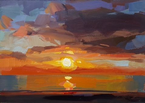
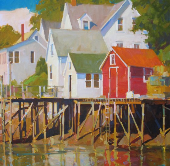
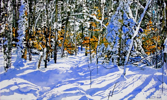
Sunlit Trail Thru A Clear Winters Day by Micheal Zarowsky  

18×30″  Mixed Media Acrylic on Gessoed Birch Panel

Micheal Zarowsky, a talented artist from Canada. What a pleasure his paintings are. His snowy paintings make me smile. The incredible light and those beautiful shadows. I mean, just LOOK… I can hear the silence in the woods. Hear the occasional bit of snow drop from a branch up high. Micheal has mastered these paintings, as well as other subjects, but I will leave that to you to check out… don’t miss it!

Also, be sure to check out Micheal’s blog!

Read a bit about Micheal, from the Artist Statement on his website:

“SOME THOUGHTS ON MY LIFE AS AN ARTIST

Growing up has been but a series of preoccupations

I never had any lack of confidence in my ability to draw. As just another way to express myself, it started out as a way to occupy idle time. My first exhibition was of drawings at age eleven. I studied philosophy and psychology and found I was able to re-organize and develop my thinking which in turn opened up the parameters of my world even further.

My return, after university, if it is a return to painting, is a return to mystery in the sense that losing myself in the work takes me places as much as I take it. Not knowing any limits, while searching for a way to express myself through painting, I experimented and through trial and error, pushed back the boundaries of what could be done with the medium. Finding traditional watercolour methods which reduce everything to a series of washes confining of my need for continuous progression/growth, it dawned on me to reverse the process so that I invent new techniques to express what I see and feel is there, painting it the way we found it and it found us.

This is not to say there is anything wrong with traditional watercolours methods, rather more of a statement about my expectation of what a finished work looks and feels like and working my way – which is the only way I know how – I can express what I have to get out. It is an open ended process in so far that each new work presents new problems needing their own resolutions. Much like reinventing the wheel each time, we come to each idea not knowing exactly what and how we will work it through, which joyfully, is much like walking a tightrope. This gives me the edge I so desperately need; all focus is on losing myself in the process; by maintaining open-mindedness, willingness, and calmness, I in effect open myself up as a channel. Being able to let go comes through in the painting and is what gives it it’s intensity, liveliness, energy…..

The uniqueness and sensibility that the paintings have, evolves as the elements of the work are continuously rethought, adjusted, refined, worked reworked re invented/rediscovered anew, to continue to express what is a continuing, growing love I have for Wendy, and the ever changing relationships with growing adjustment not only to myself, to the world around me, to the ever everyone in our life. Any realism in the work has more to do with an attitude than with a style.

The emphasis is on the process of discovery – of creative interpretation of some aspect of the world – being coupled with a second process of inventive-ness – the personal expression of what is discovered.

Painting is a spiritual process connecting me to the world.

Wendy is an inextricably interwoven part of that process. Not only can she paint, she is integral to the process, in that we both go out and explore together, putting together our ideas, working them through together; assembling, discussing, pushing and pulling and reinforcing each other in envisioning what is before us into something we can express through paint to share with the world. The paintings are the realization of both of us.

We both have a similar eye, feel, understanding and love for nature and the natural, and the civilized places in-between all of which we lose ourselves in and paint. Again the energy in the work is an expression, a confirmation and reaffirmation of the love we have for each other.

Armed with this encouragement and our growing belief in ourselves, we continue to explore our backyard, having spent three separate Decembers wandering through Paris.

Our efforts in Ontario have allowed us to develop our ability to isolate what we feel is the essence of a subject, and to work out a new way to present that aspect of it which both expresses and represents the whole. For us the paintings express the most essential qualities of the experience portrayed

I find light irresistable.

My spirits soar on a sunny day.

I can sit by the water’s edge for days and not feel the need to move.

Heat and humidity allow me to lose my physical edges – subzero temperatures merely outline where I end and the rest of the world begins.

We paint light, atmosphere, the transparency of water. We think of the work as neo or contemporary impressionism.

We paint the heat and humidity, which support all those strong and crazy colours that make up the Tropics – the Caribbean…and winter, well snow is just water that”s froze. Winter is a blanket of white and blue contours of the countryside held seamlessly together

The joyful and continuous response to the paintings by others, not only gives us contemporality, but also lets us know we are not alone in how we feel about the world. In 1989 – it seems so long ago now – we escaped Ontario for the first time ever; our toes touching the eastern seaboard we fell hopelessly in love with the ocean. How uppermost simple – the blue of the sky and the blue of the water divided by a mere horizon line. We immediately sold our souls to the keeper of the seas in exchange for the promise to continue to be able to return. We’re easy. Every time we go back we find it has an ever expanding grip on us

In 1990 we crossed the big pond for the first time and bathed in the buttermilk skies of Paris in December. Sketching our way through the Dordogne we came back next summer to lose ourselves in the waterside life in Venice, exploring the sea and air and light as it continued to work its magic on the city over the centuries.

Continuing to explore Europe, we pursue our natural inclination for the hot tropics – developing our personal vision of the islands by exploring the relationships of heat and humidity to the strong colours found there

What began as an exploration of light and form in our own backyard some 30 years ago, has developed, for us into an ability to capture, share and express our experience / the essential feel of a place no matter where it is in the world”.

All images via Zarowsky.net, used with permission…

Images are not for reproduction, they are property of the artist.

Catch you back here tomorrow!

Tips for Making a Fabulous Tuna Melt!

fullsizeoutput_1f75

Sometimes it’s nice to have a quick and uncomplicated meal – this is great for lunch or for dinner! A tuna melt has flavors that meld together and create the ultimate eating experience!

Of course anyone can make a tuna melt, but sometimes you’ll read one tip that will change your life (OK, that may be a bit dramatic). I rarely make it the same way twice, add what you like!

Tuna Melt Tips

“Use good bread” as Ina Garten would say. The better your ingredients, the better your result. I don’t think a tuna melt comes out quite right with grocery store bread. It’s too soft. Find a good rustic bread (Semolina, Sourdough, Farm bread, etc.). Toast it lightly.

Make your tuna salad. I use a can of tuna, drained (for two of us), diced celery or red onion, or both, and a plop of Hellman’s Canola Mayo. I add a few shakes of dill, and pepper.

Here’s where you can get creative.

We have had an amazing tuna melt at Dean & Deluca, and they spread the bread with Dijon mustard before they add the tuna. Sometimes I use it and sometimes I don’t.

Cheese – oh yeah, can’t have a MELT if there is nothing to melt! I’ve used sharp cheddar and pepper jack. Love them both, depends on my mood.

Sliced tomato, if they’re in season, GO FOR IT! I put the tomato on top of the tuna and then top with cheese.

Turn your broiler on (I have a high/low setting, I use HIGH). Place the tuna melt on a cookie sheet to put under the broiler, be careful if you use the top rack, it can be too close, I have used it, but prefer the second rack from the top.

👁KEEP AN EYE ON IT. It can go from almost done to burnt to a crisp in no time, it’s easy to get distracted… Don’t do it!

Owie! ENJOY, and I’ll catch you back here tomorrow!

Featured Artist: Cristall Harper!

pancake-by-cristall-harper-48x48%22-oil

Pancake by Cristall Harper  48×48″  Oil

Cristall Harper. A talented artist with fabulous paintings and a wonderful website! Her paintings are divided into three categories, Florals, Animals and Seascapes. Impossible to only pick two, so be sure to check them out. The Florals are unbelievable! At first they almost look like photographs when you look at the small image, then once you click on it, ahhhh! A painting. A FABULOUS painting. Every one of them.

Pancake (the Basset painting above) – OH! What a sweet painting. Cristall captured every nuance of this dog’s personality. The floppy ears on the floor, the eyes looking up, too tired to lift the head… Don’t miss checking out the wonderful animal paintings – I spent way too much time trying to decide which two images to use. Many of the paintings are sold, but look through them. You will smile! This painting is available through Astoria Fine Art!

mississippi-morning-by-cristall-harper-5x7-oil

Mississippi Morning by Cristall Harper  5×7″  Oil

Cristall has some WONDERFUL seascapes. I love this sky, the rising soon and those amazing reflections! Love this!

Cristall has a few shows coming up in 2017, one in Salt Lake City, UT (March 21-23) and another in Park City, UT (July 21-August 14) – if you’re in the area, be sure to check it out, more details HERE

Read a bit about Cristall, from her website:

“I paint the emotion I find in flowers, seascapes and dogs. My florals are powerful, my seascapes are balanced, and my dog paintings are joyful.

I was the kid that loved art. My paintings are inspired by early experiences with light and color. My earliest memory is toddling along the beach at sunset. I can still see the glowing orange everywhere and the sparkling water.  Later, as a kid, I used to study a lily painting that hung in our home to figure out how the artist made the light real using only paint. My dad also had a stained-glass window of irises at his office and I was fascinated by the translucent, bright colors and simplified shapes. Today, I paint in very much the same way that a stained-glass artist works: in facets. One critic said of my work, “Your style is wonderful; your personal version of abstraction is so beautifully rooted in reality.” I usually paint alla prima, or all at once, wet paint on wet paint, instead of waiting for layers to dry. I focus only on color temperature and value until it feels lit.

I inherited my love of flowers from my parents. On vacations, they take more pictures of the local flowers than their own family, something I’m now guilty of as an adult. I like the artistic challenge of taking something traditionally feminine and fragile, like a flower, but redefining that femininity with strength and confidence. 

My ancestry comes from the Adriatic Sea; for me, the seashore feels like home more than any other place in the world. The moods of the ocean reflect my own feelings of peace, hope, struggle or pain. I feel a spiritual connection with the ocean, and I brush this into every seascape I paint. Stormy waters can become still, shores are washed clean each day, and the vastness does not diminish the importance of one viewer on the shore.

I had a yellow lab named Buttercup who passed away in late summer 2016. She epitomized loyalty, joy and friendship. I started painting her as a pup and my passion for capturing her happiness quickly grew. Now my dog paintings are in numerous galleries and dog-lovers everywhere are connecting with my work. Dogs are furry angels of comfort and joy, and especially now that my sweet Buttercup is gone, I feel driven to spread that simple joy.

My three painting subjects are family. My parents inspire the florals, my ancestry inspires the seascapes, and my angel dog, Buttercup, inspires the dog portraits. I offer my paintings to those who need to feel strengthened and important. I hope they find what they are looking for in my artwork. 

Cristall Harper graduated in 2002 from Brigham Young University with a BFA in Painting. Her studio is in American Fork, Utah where she lives with her husband. Her work is shown in galleries in Utah, Idaho and Wyoming and collected nationally.” Continue reading, HERE

All images via CristallHarper.com or AstoriaFineArt.com, used with permission…

Images are not for reproduction, they are property of the artist.

Catch you back here tomorrow!

Four Pears and a Navy Wall

Four Pears and a Navy Wall

I bought these pears to make Pork Tenderloin with Pears and Red Onions, always a favorite. I was letting them ripen when the sun was streaming in and a photo needed to be taken!

I painted a swatch on the wall a Navy blue, I’m thinking we’re going with it. In this photo you can see the swatch directly behind the pears with a slightly different color on both ends. Adds interest, kind of like a painting. I tossed these pears in a bowl, held the bowl in the sun with one hand and snapped the photo with the other. Love the light and LOVE THAT BLUE!

Happy Sunday – Catch you back here tomorrow!

📸 IMAGES ARE MY OWN UNLESS STATED OTHERWISE, PLEASE CONTACT ME IF INTERESTED…

Aiken Horse House (C0517)by Allison Ramsey!

aiken-horse-house-allison-ramsey

Aiken Horse House (C0517) By Allison Ramsey

This is the Aiken Horse House (C0517) – this plan is 1,150 square feet with 2 bedrooms and 2 bathrooms of elegant living space. You read that right, elegant living in a horse house – Wow! This house is beyond spectacular! I love how Allison Ramsey shows real life photos of a plan built, the images are stunning – be sure to CHECK THEM OUT!

aiken-horse-house-main-floor-allison-ramsey

The first floor of this horse house are (obviously) the stalls, storage and tack area. However, if you aren’t into horses, this plan could still be tremendous! The possibilities are endless – what a great artists studio this would make! There would be room for painting (walls could be reconfigured), there could be an office space, a storage area for supplies, ample walls to hang paintings. How nice would this be to walk downstairs and into your studio, whether it’s painting, wood working, etc. Of course, this is also a FABULOUS plan if you have horses.

aiken-horse-house-up-allison-ramsey

Aiken Horse House (C0517) By Allison Ramsey

The second floor features a master bedroom/bathroom with walk in closet. A second bedroom and bathroom, a kitchen with a PANTRY, breakfast area and living room. Then the pièce de résistance… the SCREENED PORCH that is the width of the house. I am in love! If you haven’t checked out the real life photos of this elegant horse house, click on that link above. Wow…

Absolute perfection.

All images via AllisonRamseyArchitect.com, used with permission…

Images are not for construction or reproduction, they are property of the design firm.

Catch you back here tomorrow!


Featured Artist: Teresa Elliott!

looking-west-by-teresa-elliott-40x30-oil

 Looking West by Teresa Elliott  40×30″  Oil  –  Available at RJD Gallery

Teresa Elliott. Wow. Her paintings will make your jaw drop. Seriously. She is well known for her longhorn paintings, and I’m not going to include one in this post so that you check them out. Seriously, I couldn’t have picked just one. She captures their inner spirit. Every. Single. Time!

Looking West is a fabulous painting, available at the RJD Gallery. This woman looks as if she’s going to take a breath any second. The light in this painting is incredible, the hair, the eyes, nose, mouth and HANDS! Whew! Talented.

dog-day-by-teresa-elliott-40x30%22-oil-gallery-1261Dog Day by Teresa Elliott  40×30″  Oil – Available at Gallery 1261

This was the first painting of Teresa’s that I spotted. She has a way with animals, no doubt. This dog looks like it’s doing some serious contemplation, ha ha… either that or watching the news, ha ha… Be sure to check out Teresa’s website – It’s a treat!

Read a bit about Teresa, from the RJD Gallery website:

“My own personal growth is inevitably linked with my progress with the infinite challenges of becoming an accomplished painter and providing a powerful visual statement through attention to color relationships, design, edges and paint handling.”

Native Texan Teresa Elliott lives and paints in the wide open spaces of the Big Bend in West Texas. Her years of experience as a commercial illustrator in Dallas naturally evolved into a career in painting. She completed a BFA from the University of Kansas and although self-taught, she admits to being influenced by many contemporary artists, as well as classical masters.

Elliott, who is also known for her portraits of cows, has recently expanded on her captivatingly realistic style to include several paintings set at Javelina Clays– a muddy oasis located inside a Texas National Park. These paintings include Deliverance (not shown) and Agua-Fria. Emma, Elliott’s daughter and frequent Muse, is depicted in both of these glowing and detailed works.

The visual arts has dominated Teresa Elliott’s life for as long as she can remember, and always will. She says, “I’m always pushing myself to grow as an artist, it’s the only way to stay fresh and passionate. My favorite painting is Rembrandt’s Self Portrait at the Age of 63. To me, this work is distilled down to the essentials of great painting. Having perfected his craft he created one of the most revealing portraits of all time.” Elliott further states, “My paintings reveal what I see visually on the surface and beyond the visible. I explore the fundamentals of the craft as well as the emotional content of my observations of the natural world.””

All images via Teresa-Elliott.com, used with permission…

Images are not for reproduction, they are property of the artist.

Catch you back here tomorrow!

Shepherd’s Pie – Great recipe for a cold day!

fullsizeoutput_3e79Shepherd’s Pie = Comfort food with a capital “C”! 

I have always seen recipes for Shepherd’s Pie, but have never made one. Meat and potatoes, hmmmm… cold weather prompted me to try this. I used a recipe from Food Network that sounded delicious, I made a few changes, I didn’t have mushrooms, so I omitted. I didn’t use as much oil/butter as it called for, and it wasn’t missed. Finally, I upped the amount of beef broth and changed the order of how I prepared this, based on comments that I had read. One detail I left out, is that when you spread the mashed potatoes, you can make fork marks that give ridges that will end up browning nicely. In the images above, I added parmesan to one half in case Fred didn’t like… Next time, Parmesan on both sides, without a doubt. It also made it brown, and I would probably leave it until it browned a wee bit more, although it was absolutely done and so delicious!

UPDATE: THERE IS NOW AN IMAGE, ha ha… I remembered to take a photo this time. Chilly weather is THE PERFECT TIME to make this dish. It warms your very soul!

We were so anxious to try this that I forgot to take a photo of it plated 😳 – wasn’t the first time that happened and I’m sure it won’t be the last. Might have to try to make this again soon to update the images! Corrected :)

Click HERE to print the recipe as I made it (as shown below), or click HERE for the original recipe (Food Network) to print! Enjoy!

Are you wondering what to do with the leftover tomato paste? I have a solution! Read HERE!

Enjoy, and I’ll catch you back here tomorrow!

Paint color for walls – Something dramatic!

Wall color...

Old Navy by Benjamin Moore – Paintings, see below…

We love to change paint colors. It’s a problem. We probably need therapy, but it makes such a difference for a pretty insignificant amount of money. We love the all white look. LOVE IT! The creams and whites. We tried it. Painted the living room, bedroom, bathroom, and it was horrible. Capital H Horrible. The bathroom is fine, but the bedroom and living room, ugh. At first I thought I LOVED it, my eye went straight to the window and grabbed the green from the trees. Beautiful. Then we hung our art, put back our rugs and oh. Hmmm. Not so much. It didn’t flow.

We have had a medium brown(Kuba by Ralph Lauren – no longer made) in a few rooms and a dark grey in the dining room. We bought a sample can of Benjamin Moore paint (I love how they do that). I painted the room I thought we would start with, the dining room. A nice, dark navy. This is the brightest time of day, it usually looks more like the left hand side versus the right hand side.

I thought the brown worked so nicely with all of our paintings, but whoa, I didn’t realize how there is blue in all the paintings. Sweet! We have since decided not to start with the dining room, so the above has since been painted back to Benjamin Moore’s Kendall Charcoal. The color above is Old Navy – we may keep it or try it a bit darker (custom color, they’re so good at) – although, living with this blue, I think we want it to read blue and not black, so we may go with Old Navy… It’s good to live with it for a while – I will keep you updated!

Paintings…
Top: Julia Nichols, Bottom two: Ken DeWaard Subject: Monhegan!

Catch you back here tomorrow!

Ready to go!

Charlie

It’s not easy to capture a photo of Charlie without him moving. He will sit perfectly still until he knows you’re going to take a photo… This was an intense “I’m ready to go for my walk now” stare. He keeps us moving, that’s for sure!

Whew, the weekends fly by don’t they? Enjoy your Sunday! Many of you may be off tomorrow – if you are… ENJOY!

📸 IMAGES ARE MY OWN UNLESS STATED OTHERWISE, PLEASE CONTACT ME IF INTERESTED…

Catch you back here tomorrow!

Coming soon…

New color... coming soon!

A fresh post for Saturday!

This chair looks rather angelic in the sunshine, ha ha… Here is a look at what’s to come… Benjamin Moore in a Navy color (we think we know which one, but haven’t decided absolutely). It’s currently a Benjamin Moore match to an old Ralph Lauren color KUBA (in the Safari collection). We’ve loved this color, but now… need it to be gone! I’m dying for some navy walls… How sharp will that be?? Bits of navy in the rug, all the paintings have blue (nine paintings in this small room) – I can’t wait! I love the white against the navy. Is it ever sharp! Right now the hot color is SHADOW by Benjamin Moore, but it’s a little too purple for my taste, although I’ve seen it used on doors, etc. and it’s so striking!

Will send an image of the final result once we get to that point!

For those of you who subscribe to this blog, you may think that today’s post looked familiar. It did to me too… well, that’s because I posted it six short days ago. Six. Sigh… I think I was rearranging posts and this image was used twice. Nice… ugh! Please forgive.

Catch you back here tomorrow!

Featured Artist: Colin Page!

lobster-blues-by-colin-page-48x36-oil

Lobster Blues by Colin Page  48×36″  Oil

Wow! Colin’s still life’s have always amazed me. Well, I guess that’s true of all his work. Colin can literally paint absolutely anything! This lobster dinner looks quite tasty. Just look at the light in that blue glass. The intricacies of the tablecloth. The LOBSTER that looks, well, good enough to eat! I love the addition of the notecard and pen!

cozy-harbor-by-colin-page-36x36-oil

Cozy Harbor by Colin Page  36×36″  Oil

This painting just grabs me. I love the stillness of the water and that red outbuilding (oh! that red!) – also love the magnificent white house looking so majestic in height compared to surrounding buildings. Colin can paint a dock with such style. Love it!

Are you interested in taking a workshop in 2017? Colin has several workshops, and good news, some still have openings, but be quick, the spots usually fill up quickly. Everyone loves Colin, has fun and learns a lot from his workshops – His next workshop is a CALIFORNIA PLEIN AIR WORKSHOP in Balboa Island, CA through Debra Huse Gallery FEBRUARY 1 – 4, 2017 (and a solo show that runs from Feb. 3-28)!

Next is a MARYLAND PLEIN AIR WORKSHOP that runs from MARCH 23 – 26, 2017, hosted by Chesapeake Fine Art Studio, Kent Island, MD.

Be sure to check out all of Colin’s Workshops and Upcoming Shows, as well as his new and improved (if possible) website!

All images via ColinPagePaintings.com, used with permission…

Images are not for reproduction, they are property of the artist.

Catch you back here tomorrow!

The Muskoka House Plan by Karoleena!

muskoka-by-karoleena

Muskoka Plan by Karoleena

This is the Muskoka house plan by Karoleena – this plan is 1,590 square feet with 3 bedrooms and 2 bathrooms. This plan has so many great features! If you like a modern plan (and I do!), there is so much to like about this plan. There are a lot of wonderful windows which is perfect if you’re situated in a private location, lake, ocean, woods, etc. I think it’s a sharp plan!

muskoka-main-floor-plan-karoleena

Module 1 has two bedrooms with a bathroom in between, as well as the foyer, laundry and storage and a mechanical room. I like how you step into the bedroom/bathroom. there is a small corridor that leads you to the bathroom or either bedroom, which also makes room for some nice closets!

Module 2 is the main living area, the living room, kitchen, master bedroom/bathroom – can you imagine living in this house? The views? The sleek style, not to mention that this house can be built in six months!

Karoleena does something wonderful (besides building very cool homes)! They provide you with so much information, every detail you can think of! So when you click to view this plan, scroll down to where it says “DOWNLOAD THE MUSKOKA MODEL GUIDE” – you will not believe the wonderful details. It helps make your dream one step closer to becoming a reality

All images via Karoleena.com, used with permission…

Images are not for construction or reproduction, they are property of the design firm.

Catch you back here tomorrow!