Emerging Artists: Aaron Bowles and Zachary Mendoza!

Emerging Artists

Now and then I like to share some emerging artists with you… take a peek! What a treat…

AARON BOWLES

Getting' Fixed Up by Aaron Bowles
 Gettin’ Fixed Up 24×18″

I think this is such a nice painting. The colors are fabulous. These boats have a regal air about them, high on their pedestals. Wonderful painting!

Read a bit about Aaron, from his website:

Born in Charlottesville, Aaron is a lifelong Virginian, where he went to college to study painting and design, and continues to live today. After many years as a digital creative director and freelance illustrator, which he continues, Aaron began to pursue his dream of becoming a painter.

Aaron studied painting at East Carolina University, and holds a bachelors degree from Virginia Commonwealth University where he studied communication arts, painting, and English. He continued his art education at the graduate level by studying painting at George Mason University. A former assistant professor of design, he taught art at George Mason and Northern Virginia Community College. He exhibits nationally and is in numerous institutional and private collections. Read more HERE

ZACHARY MENDOZA

Albert Camus by Zach Mendoza

Albert Camus by Zach Mendoza  11×14″  Oil

Great colors! Love the different darks with pops of light. The face is fabulous, especially that one eye and the wild abstractness – great combo! Albert Camus was a French philosopher, author and journalist. At first glance this painting reminded me of a cross between Edgar Allen Poe and Robert Downey Jr.! Whoa! Nice painting!

Read a bit about Zach, (info from the artist), also be sure to check out his website!:

Zach K. Mendoza is a painter and illustrator who lives in Eagle Rock, California and recently graduated from Art Center College of Design in Pasadena. As a painter he is dry much interested in exploring both temporal directions of art history , the past and the not yet known. Armed with both a fascination of the past and an obsession to experiment, Zach makes work that often explores these predilections. Francis Bacon once said “I want a very ordered image but I want it to come about by chance”. The dichotomy of chaos and order is a fundamental component of Zach’s practice.

All images via ABowles.com and ZachKMendoza.com, used with permission…

Images are not for reproduction, they are property of the artists.

A big thank you to Aaron and Zach for submitting their websites!

Catch you back here tomorrow!

Featured Artist: Cody Delong!

Pewter Purple n' Orange by Cody Delong

Pewter, Purple n’ Orange by Cody Delong  16×20″  Oil

Cody Delong. Some mesmerizing paintings. Lovely work! He paints such a wide variety of landscapes – each one is just beautiful. His colors, and the underpainting peeking through in the still life above is just glorius. Also love the orange reflection in the pitcher!

Read more about Cody’s Classes and Workshops, Also check out his River Trip in 2017 – what a painting adventure that would be – WOW… the scenery is breathtaking!

Land of Few Fences by Cody Delong

Land of Few Fences by Cody Delong  24×36″  Oil

I have never actually seen the dessert, or this type of landscape. So seeing it in paintings is so interesting to me. I love the color of the earth, the mountains and that stunning sky. It’s fabulous how the sun hits, so beautifully…

Read a bit about Cody, from his website:

Each painting I do begins with an idea, something that’s inspired me.  I try to distill this into my own underlying abstract design and interpretation of nature.  The balance I’m searching for lies in creating a work that is technically proficient as well as ‘painterly’, with great color and sense of light and drama.

A life long student of art, Cody has studied at the Loveland Academy of Fine Arts, as well as the Scottsdale Artists School, where, in 2003, he was awarded a Merit-based Scholarship.  In 2004, the Oil Painters of America selected him as that year’s Shirl Smithson Scholarship winner.  In 2009 Cody was awarded a Teacher’s Scholarship by the Marilyn Sunderman Legacy Fund for his innovative workshop techniques.

In 2006, one of Cody’s paintings was selected for inclusion in a ‘coffee-table’ style book, titled Plein Air New Mexico, The Jack Richeson Series – Volume One.  Three other paintings were included in The Richeson 75 International – Landscape and Exteriors 2007. Read more HERE

All images via CodyDelong.com, used with permission…

Images are not for reproduction, they are property of the artist.

Catch you back here tomorrow!

Featured Artist: Karen Blackwood (& UPCOMING WORKSHOP)!

Closed For Winter by Karen Blackwood

Closed for Winter by Karen Blackwood 24×30″  Oil (Available at Haynes Galleries)

Karen Blackwood has wonderful work. This winter scene has such a wonderful feel to it. The subtle colors, the shapes of the trees, the grasses that break up the snow – nice!

Are you interested in taking a workshop with Karen? She has a one day workshop with a few openings… next month! Karen would be a great artist to take a workshop from, especially if you are interested in seascapes!

Karen Blackwood Workshop

Sounds like a fabulous workshop, doesn’t it? Contact Karen if interested!

Sun and Surf by Karen Blackwood

Sun and Surf by Karen Blackwood  18×36″  Oil (Available at Trees Place Gallery)

Karen’s seascapes are well known, they have such lively movement, fabulous colors, light and those waves! Wow!

Read a bit about Karen, from her website:

Karen Blackwood was born in N.H. and received her BA in the Studio Art program at the University of N.H. studying under Conley Harris and Sigmund Abeles, with continued studies at the  Art Students League in N.Y. and the Institute of Art in CA. After spending the earlier part of her professional life as an Art Director for a major New York City ad Agency, she moved to California, picked up her brushes and dedicated herself to painting. Trained in the classical tradition, Karen painted portraits and figurative work before focusing on landscapes. As a member of the California Art Club, Karen’s new passion for landscapes bloomed among a group of plein-air painters inspired by the rich tradition in California Impressionism. The clubs renowned members include Granville Redmond and Edgar Payne. They, as well as American Masters like John Singer Sargent, James Abbott McNeil Whistler, Winslow Homer and the Hudson River School Artists are influential to Karen.

Like the California Impressionists, Karen feels light is a defining factor, and it is the atmospheric quality of the light that she captures in her paintings. Her work is a desire to convey an emotional response to the landscape and to attain that perfect state of being that sometimes comes from painting it. Now living in Newburyport, Massachusetts, the coastal scenery is providing her with endless inspiration for her marine work, garnering her an award as a Finalist in the International Artist Magazine Competition, Honorable Mention in a recent OPA online showcase and numerous selections as the Favorite Top 15% in the Bold Brush Competitions. Read more HERE

All images via KarenBlackwoodFineArt.com, used with permission…

Images are not for reproduction, they are property of the artist.

Catch you back here tomorrow!

Featured Artist: Lea Colie Wight!

Third Floor Light by Lea Wight

Third Floor Light by Lea Colie Wight  22×22″  Oil
Available at New Masters Gallery in Carmel, CA

I absolutely love Lea’s paintings! I was thrilled when I ran across her work! Lea is very versatile in the subjects she paints. Her interiors are full of life, you can find yourself imagining being in the space that she paints. Her portrait skills are over the top, not only capturing what the person looks like, but their entire “vibe”.

I love the painted floor in “Third Floor Light”. Also the brightness as if sun is streaming in, making those painted wood floors shine. The subtle shadows and light. Love this!

Lauren by Lea Wight

Lauren by Lea Wight  48×28″  Oil | Available at Haynes Galleries – Tennessee

Talk about fabulous. Lea can paint people in the most spectacular way. It’s no surprise she has won Honor Awards (see more below)… You’ve got to check out her website… and her self portraits – WOW!

In the painting above, Lauren looks as if she could get up from her chair and walk right out of the painting WITHOUT it looking too realistic. Perfection!

Lea has a few BOOKS available, I bet they are fabulous!

Read a bit about Lea, from her website:

Lea Colie Wight was born in Philadelphia, Pa in 1951.  She earned a BFA from The Minneapolis College of Art and Design in 1974.  In 2003 Lea discovered Studio Incamminati, an intensive Atelier founded in Philadelphia by renowned artist Nelson Shanks and entered as a student.  After completing her studies Lea was invited to join the teaching staff rising to become one of the lead teachers at that school.  Lea periodically served as teaching assistant to Nelson Shanks at The Art Students League in New York and has served as lead instructor for various Studio Incamminati workshops as well as her own workshops.  She has been awarded an Honor Award at the Portrait Society of America’s national competition in 2009 and in 2010 as well as a Certificate of Excellence in 2011. Her work has been featured in numerous publications. 

Lea maintains a studio in Manasquan, New Jersey as well as in Philadelphia.

All images via LeaWight.com, used with permission…

Images are not for reproduction, they are property of the artist.

Catch you back here tomorrow!

Calling all artists – Zimmie’s Artist Residence – Week Rental – Monhegan, Maine!

Zimmies Artist Residence- Island Inn

Image via Island Inn website

New… this year! Zimmie’s Artist Residence – The Island Inn’s home for working artists and students. How wonderful is that? Zimmie’s is in such a great location, close to the wharf, Island Inn, Novelty, Black Duck, hiking trails, etc.

Zimmies front Island Inn

Image via Island Inn website

Here’s a bit from the Island Inn website:

Named after Zimmie Brackett, a true Monhegan original, we’re thrilled to be able to offer this iconic space to artists as a place to live and create art together.  Zimmie was a bon vivant, a legendary host, dancer and fun-meister.  He made The Island Inn’s newest addition his home for over 40 years.

Zimmie’s is a 3-bedroom, 2 full bath, foursquare farmhouse located in the center of town, adjacent to Pierce Cottage, with views of the meadow and the historic Monhegan Lighthouse. The colorful gardens and clothesline have been favorites of visual artists for a decade…both are staying!

One of the nice parts of this is that you have your own space. Whether you rent one room or all three. I know most artists like to get up and get out and paint. This place to stay gives you that opportunity. There is a kitchen that is well-stocked with the basics, so you can put on a pot of coffee, grab a snack and head out.

Zimmie’s is a weekly rental. Arrivals and departures are on Saturdays – so see if you can plan your trip accordingly. Prices are wonderful. It’s so nice to have your own space. Zimmie’s is located right in the heart of things, right next to the Pierce Cottage. Be sure to check out the Island Inn’s website for more details, or call (207-596-0371) with any questions or if you would like to make a reservation! If you get a few more people who you plan to come to the island with, rent the entire house (all three bedrooms). What fun! Meals are not included, but hey, you can always whip up a little something yourself, or get something out! Options… lots of them! Be sure to check out the photos.. if you’ve been to Monhegan before you will recognize this house right away!

A little more from the Island Inn website:

This is a bright and spacious historic building built in 1922. A long time year-round residence, Zimmie’s has high ceilings, oversized windows, hardwood floors, original wood trim and doors, built-ins, and a one-of-a-kind shower tiled with pottery pieces and Monhegan sea glass. Common spaces include a kitchen well-stocked with cooking essentials, a dining room and ample common space to work, relax and learn together. The cottage has two full baths. The beautiful three-season porch overlooking the meadow is perfect for lessons, critiques, rainy day painting or just enjoying a Monhegan sunrise with a mug of fresh-brewed coffee.

Zimmies_BarbaraStroud-1024x768

You may recognize this wonderful clothesline – My photo

I’m happy to know that the flowers and the clothesline are staying! Every year I have wonderful photos from this very spot!

Catch you back here tomorrow!

Featured Artist: Nancy Romanovsky!

Winter Shadows by Nancy Romanovsky

Winter Shadows by Nancy Romanovsky  9×12″  Oil

Nancy Romanovsky. Wonderful work. I think it’s so interesting how each artist interprets snow. Each a bit different. I love the colors in this painting, the shadows, the dark trunks and the light on the tree trunks. Wow. Just beautiful! Nancy’s paintings are wonderful – check her out!

Check out the EVENTS on Nancy’s website, there is an event going on now at the Scottsdale Art School – this show runs through February 27th, so if you’re in the Scottsdale, AZ area, check it out!

Event Dates: 1/8/2016 – 2/27/2016
Reception: 1/8/2016  4-7 PM
Location: Scottsdale Artist School
Phone Number: 480-990-1422
Address:
3720 North Marshall Way
Scottsdale, AZ 85251
Website: http://scottsdaleartschool.org/

She also has an event coming up in March/April – Note the date of the reception… It’s no April Fool’s ;)

Event Dates: 3/25/2016 – 4/28/2016
Reception: 4/1/2016  6-9 PM
Location: The Olney Gallery at Trinity Cathedral
Phone Number: 623-826-9912
Address:
100 W. Roosevelt St.
Phoenix, AZ 85003
Website: http://trinitycathedral.com/?page_id=203

Read a bit about Nancy, from her website:

Nancy, a native Arizonan, began oil painting at a very young age. She studied art at Arizona State University and privately with several artists and at the Scottsdale Artists’ School. In 2012, Nancy left her career in graphic design and marketing to pursue painting full time.

Her paintings are held in corporate and private collections in the USA, Canada, Brazil, Hungary, and Italy. She is a member of the Oil Painters of America and Women Artists of the West. 

Artist Statement

I discovered my passion for painting at a very young age. I love the process of starting with nothing and creating something uniquely beautiful and honest. I paint landscapes and explore the quiet essence of being in nature. Aspens are a key element in this theme of dappled light and abstract shapes of reflective color. The groves capture individual differences of each tree while depicting the stand as a cohesive colony, as a brotherhood. My chosen medium is oil, with variety of brushwork, thick and thin, loose and detailed. It gives me the opportunity to portray the breadth and scale of nature. My love of hiking fills me with constant ideas for visual nourishment of paintings yet to come.

Thank you Nancy for submitting your website – I have so enjoyed featuring your work!!

All images via NancyRomanovsky.com, used with permission…

Images are not for reproduction, they are property of the artist.

Catch you back here tomorrow!

Moving paintings around – like a room makeover!

GALLERY WALL

It’s easy to keep everything where it’s at. You know, furniture, lamps, paintings – I simply cannot do that. Since I was a kid, I would work hard at changing my room around. Often. I loved moving furniture and creating a completely different looking space. It’s so rewarding. I know we aren’t all wired that way.

Too much moving can be a bad thing I suppose. Like the time my sister and I thought we could bring the love seat from the living room (like it wouldn’t be missed), up the stairs (very old house) to my room. It got stuck in the staircase. I don’t think my dad was too happy about that. (Thanks Dad :) ) but aside from your furniture getting stuck somewhere I can’t see a downfall. We have been known to change entire rooms. Living room one day… Dining room the next.

I have even changed a few kitchen cabinets around. Hmmm, I don’t totally recommend that. For years you will go to the wrong cabinet out of habit, ha ha… I say it’s good for the old brain, ha!

This is our gallery wall (click that link to see previous post regarding). This is a big wall that is difficult to make right with just a few paintings. It needs a statement. So a gallery wall solved that. Then all that gold started to get to us. So we made some changes. Exchanged some for floater frames, and took some out of the frames. They look fabulous! Now our gallery wall is in a different room.

Painting by Carol Bass

This painting is by Carol Bass. She’s a great person as well as a stunning abstract artist. We feel very fortunate to have one of her paintings. The frame on this painting is even beautiful with pegs (not nails)! Hand made by her husband (also a super nice guy).

The chair on the right had a striped slipcover, that didn’t work with this painting, so we had a white duck cloth slipcover made for it. Love it! Need a white/off white pillow to tie in the other chair that is the ultimate in comfort! A modern chair near a cool abstract painting… love it! Do you move furniture around, or are you one that believes it should stay put?

Catch you back here tomorrow!

Paintings on gallery wall (top photo):

ARTISTS: (FROM TOP LEFT TO RIGHT): DAN COREYALISON HILL, DAN COREY (MIDDLE ROW): TIM BELL, TIM BELL, ROBERT ABELE, TIM BELL, TIM BELL, (BOTTOM ROW) BJORN RUNQUISTDAVID KASMAN

Emerging Artists!

ArtFoodHome.com | barbara stroud

Several times a year I like to post entries from Emerging Artists who have submitted their work to me. Check them out!

Take a minute to check out their websites and read a bit about them. If I didn’t post the entire bio/artist’s statement I provided a link so you could continue reading.

Thank you all for submitting your websites!
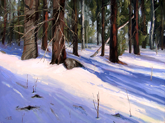
JULIA LAWING

Winter Folly by Julia Lawing 30x24" Oil

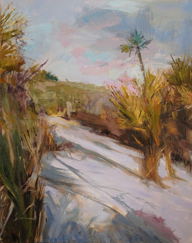
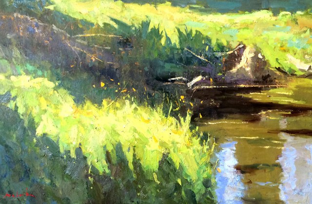
Winter Folly by Julia Lawing  30×24″  Oil

Julia Lawing  (JuliaLawing.com), Julia has a nice website and some nice paintings, nice shadows in this one above!… Check out her website!

Read a bit about Julia, from her website, to read in entirety, visit website!

Julia Chandler Lawing resides in Concord, North Carolina, with her husband Bruce and their four daughters. Born in Atlanta, her family relocated to St. Simons Island, Georgia, when she was 12. The beauty of the Golden Isles’ mossy oaks, tides and marshes, wildlife and coastline continues to influence her art today. Julia graduated from the journalism school at The University of North Carolina at Chapel Hill, advertising sequence, with a concentration in drawing.

Post college, Julia experimented with various mediums including stained glass, ceramics, watercolor and photography. Past work experience includes undergraduate admissions recruiter at the Savannah College of Art and Design, advertising copywriter at The Charlotte Observer, grammar school art teacher, and volunteer docent at the Cabarrus Arts Council… (more)
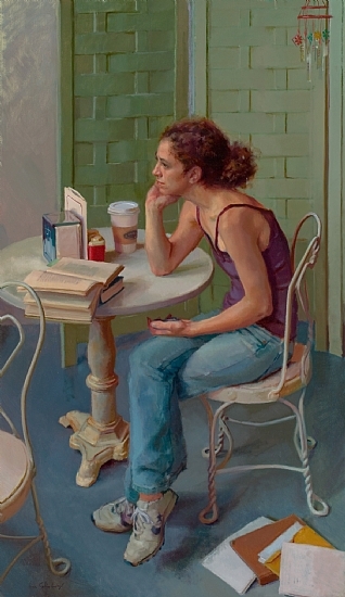
GREG MARQUEZ

One Buffalo by Greg Marquez 24x36 Acrylic

One Buffalo by Greg Marquez  24×36″  Acrylic

Greg Marquez (Artquez.com), Greg has watercolor, acrylic and sculpture. Talk about well rounded! A very cool buffalo indeed! Also be sure to check out Greg’s blog while you’re on his website!

Greg Marquez is a native of Colorado and grew up in that mythical place called The West. Having spent most of his life exploring the western United States by foot, horse, bicycle and  car he finds that his artwork is imbued with the color and light so unique to this part of the world. Primarily thought of as a Watercolorist, Mr. Marquez also paints with Acrylics on canvas and is an accomplished sculptor. 

His work has been included in many prominent shows and has won accolades and awards. Mr. Marquez has also been awarded two commissions for Veneco Oil in Denver. The first was assigned based on the quality of his paintings on canvas and illustrates on two large, 5×9′, canvasses the natural life above and below an oil-rig near Santa Barbara, California.  The other commission was seated on a large, 4×8′  panel and details some of the wildlife found in the Sacramento Basin area by smaller panels affixed to the larger piece which in turn shows a landscape typical of the area.
Mr. Marquez also teaches painting and drawing and has volunteered many hours in the Denver Public Schools.
Most recently Greg Marquez was invited to participate in the Biennial of the Americas in Denver, CO.

YISRA PREVAIL

Broken Angel by Yisra Prevail 36x24" Acrylic

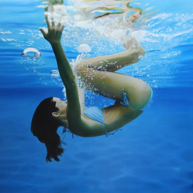
Broken Angel by Yisra Prevail  36×24″ Acrylic

Yisra Prevail (YisraPrevail.com), her paintings show strength. She has quite a story, be sure to read about her (and click the link to finish reading) and check out her website!

A childhood spent in civil-war torn Guatemala , … subsequently well-travelled, … a relatively new immigrant to Canada, … Prevail wishes to identify her present-day self through a spontaneous exercise/exorcism of paint to canvas. Early Canadian career-achievements in fashion illustration / design / modeling, and public relations eventually led Prevail to a wish for a more personal freedom of purpose—finally to emerge herself in a fine arts studio practice—to paint independently.

Glancing at Prevail’s Alfa series there can be no avoidance of an art historical reference … a flashback in time and place to modern, 1911-13, Germany,—consider an emerging ‘Expressionist’ movement struggling with the critical acceptance of the bridge between representational and non-objective imagery – the beginnings of communication of emotion through the purely ‘visual’ elements of colour and form in painting (witness: Jugendstil, Der Blaue Reiter group, … ).  

Artists are always limited in their choice of influences by taste and tenor of their own time. Where first generation Expressionists explored the metaphysical through orchestrated and articulate critical debate, art theory publication, artist associations, and theme-oriented group exhibitions, … ‘this’ generation expressionist Prevail has chosen to embark upon a personal, contemplative path (stream of consciousness) hoping —paint to canvas—to whisper —an essence of the divine power of creation— “a universal beauty held in heart, soul and spirit”. (…finish reading...)

All images via artist’s websites, used with permission…

Images are not for reproduction, they are property of the artist.

Catch you back here tomorrow!

Featured Artist: Larry Seiler!

View from Sunset Point - Marquette, MI by Larry Seiler 8x8%22 Oil

View from Sunset Point – Marquette, MI by Larry Seiler  8×8″ Oil

Larry Seiler. A fabulous and versatile artist. This is a great little painting, those clouds are moody and wonderful! I love everything about it. This is a painting that would look great in a floater frame. I’m big on those right now!

I love how Larry adds a little info about the painting! Larry’s words:

Every year requires my wife and I to visit Presque Isle park of Marquette, MI…not far from our cabin in Michigan’s Upper Peninsula. The bluffs and rocks are most inviting to spend time on, and the mood of Lake Superior is ever changing.

This is a most popular location for photographers to settle in for the end of day, witnessing often the most spectacular sunsets, and thus…its name. 

Walden Road In-Country by Larry Seiler

Walden Road In-Country by Larry Seiler  8×10  Oil

This is one fabulous winter scene. Look at the wonderful colors in the snow, the trees (love!) and the trees in the distance, top that off with those wonderful clouds and you have one heck of a painting – I love Larry’s description:

Familiar ground for my son and I, we made a day wanting to backpack in…see where deer travel was, other sign of wildlife, and I hoped to catch a good spot to set up and paint.  Was a lovely day…but neglected to bring my snowshoes.  Had nearly a mile of knee deep snow breaking trail.  This is looking back at trails we made walking in…and a lovely sun-filled day.

Larry has many DEMOS on his website and they are FABULOUS! He shows step by step and explains what he is doing. I could watch these all day! I love his process! How generous to share his information – THANK YOU LARRY! Be sure to check out Larry’s book and DVD’s – in addition to painting, Larry is also a musician! Check him out!

Read a bit about Larry from his website, and more from his blog:

Enculturation imbued with print media & tv means we live in a 2nd reality, one the lens sees. Lifeless shadows, static detail rank accurate to life. My renaissance from 20 years in studio came after taking my paints outdoors. Several things happened- I saw color as only an artist can see, (painting being the deeper way of seeing); I was overwhelmed with all to be worked out in short order; thirdly, that taunt of a feeling I knew nothing of painting! Such would send many back to the pretense of the familiar, but I’m not good hiding from myself that which I’m not able to succeed. By right…I should be able to paint outdoors, and was going to do this were it to kill me. Kill me it did! So complete was that death, I could no longer aspire to paint as artists I had admired. Their works now lifeless, labored, detailed, realistic, yes…but no sense of REAL’ness. I wish I had started nature’s schooling much younger, but lives are like books. Not one chapter stuck to one narrative. Life can be filled with many chapters. It can have interesting twists and new directions, and I say go for it! *See my book on landscape painting, and new DVDs available thru “Books & Videos” at larryseiler.com

All images via LarrySeiler.com, used with permission…

Images are not for reproduction, they are property of the artist.

Catch you back here tomorrow!

Featured Artist: Kimberly Santini!

Beamer by Kimberly Kelly Santini

Beamer by Kimberly Kelly Santini  6×6″ Acrylic

Kimberly Kelly Santini. Her paintings capture the life wiggling inside these furry little animals. This painting exudes sweetness. Just look at those eyes and that fabulous fur! I would like to meet this dog… it reminds me of Charlie, especially the wisps of hair in front of the eyes. Great colors in this painting.

24k Bun by Kimberly Kely Santini

24K Bun by Kimberly Kelly Santini  8×10″ Acrylic with Gold Leaf

This painting caught my eye. It makes me smile. Very unique. I like the addition of gold leaf. The colors in this painting are wonderful, it’s painted very loosely and is just perfect. THOSE EYES! The eyes make this painting! I think that’s true for most paintings of animals. If the eyes aren’t right then it doesn’t really capture the animal fully. LOVE the tiny bit of light hitting the eyelashes on the left side. Wonderful!

This is one watermark I don’t mind…

Read a bit about Kimberly, from her website:

First and foremost, I am a Mom. This means I have eyes in the back of my head, spot on intuition, the patience of a saint, killer multi-tasking skills, and mountains of compassion. 

Conveniently, these are also all prerequisites for being an artist.

I see details, study body language, filter and sift through the flood of ensuing ideas, get the kids on the bus, and THEN pick up the brushes and paint.

Painting is my livelihood. It is how I support my family. It is a passion I gratefully share with my students. It is how I give back to my community. It is an example to my kids (and others) to follow their dreams. It is also how I maintain my sanity (ok, in the interest of full disclosure, that last point about my sanity has been questioned).

I’ve got college degrees in art and art history, an extensive professional background in many different art arenas and some odder life experiences (like writing automobile owners manuals) that add up to who I am today. My work is widely and enthusiastically collected, sitting in corporate collections and homes around the world, and has been honored with a variety of wonderful awards (hello 2015 Kentucky Derby!!).

I’ve only just begun. I want to paint the world, to show you how I see light and color. I want us to share a moment where you reach into my paintings with your heart.

It’s the best sort of connection to build a new friendship upon.

Tell me what you think. Sign up to follow my daily pieces, stay in touch via social media, browse my portfolio, or visit my work in person. Then shoot me an email and share your thoughts.

I sincerely thank you for your time, your ideas, your business and your referrals.

Images are watermarked at request of the artist.

All images via KimberlyKellySantini.com, used with permission…

IMAGES ARE NOT FOR REPRODUCTION, THEY ARE PROPERTY OF THE ARTIST.

Catch you back here tomorrow!

Regular frame vs. floater frame and how to…

Regular frame

Painting by Ken DeWaard

A regular frame or a floater frame? Ah, the dilemma!

Above is a painting with a regular frame, which is fine, but when you have many paintings the frames start to compete for the attention, especially when they’re hung in close proximity to each other – I think the painting (rather than the frame) should be the star!

We have four paintings that we wanted to redo the frames on, two by Ken DeWaard and two by Tim Bell, all painted on canvas panels. We had them in regular frames, but with all our other frames it just got too much. So we ordered some floater frames from Franken Frames. Great company. We had a good experience and I would not hesitate to order from them again, they were wonderful!

DSCN4152

See how more of your attention is on the painting rather than the frame? I really like these! It looks even better on the wall! But this gives you an idea.

This is how we put the painting in the frame. We didn’t want to use glue because we tend to change frames out, so we opted for Velcro. We placed Velcro dots on each corner of the back of the riser (photo shows back of frame how we received it from Franken Frames). Then we marked the center of each Velcro piece with red marker and quickly placed the panel, lined up how we wanted it, on top of the back of the frame (back to back). You can then (faintly) see the red dots, so you know where to put the other piece of Velcro. After that simply place it, lined up, into the frame. Tada!

Painting by Tim Bell

Frankenframes. Woohoo!

Catch you back here tomorrow!

Featured Artist: Michael Clark!

Along the Lake by Michael Clark

Along the Lake by Michael Clark  16×24″  Oil

A fantastic use of color that really makes the light shine! (LOVE that green!) I think the abstractness of the grass is nice against the shapes in the water. The reflections are beautiful!

Ranch Near Fruita by Michael Clark

Ranch Near Fruita by Michael Clark  16X20″  Oil

Wonderful shapes, colors, distance, clouds – very nice!

Read a bit about Michael, from his website! If you have a minute read through Michael’s bio. I love it when an artist mentions mentors, fellow artists, who they’ve taken workshops from, etc. It helps you to relate to their work as an artist.

Michael Clark is a painter focused on capturing the world around him. From summer afternoons by the beach to evening sunsets in the mountains, Michael travels all over to capture these effects on canvas. 

Raised in Michigan, Michael moved to Texas after receiving his BFA from Kendall College of Art Design. While in Texas Michael continued with his focus on landscape painting exhibiting his work in several galleries in Michigan and Texas. He also traveled extensively through the U.S. painting en plein air. In the summer of 2010 he took an extended trip through the western states spending a month residing and painting in  Hood River, Oregon. That trip resulted in over 50 plein air works painted in states from  Washington to Colorado. 

After the passing of his father Michael decided it was time to take his passion to another level and set off on a journey to study with some of the best artists in the country. That journey led him to Chicago for a summer at the prestigious Palette and Chisel Academy of Fine Art.  After  the intense study in Chicago (painting a minimum of two head studies a day) he decided to move to  Denver, Colorado. He chose Denver for its closeness to nature and the access to study with some of the finest painters in the country. 

Michael currently is a class monitor for master painter, Joshua Fallik, at the Art Students League of Denver where he continues his studies in painting and drawing. He is inspired by artists such as John Singer Sargent, Joaquin Sorolla, Rembrandt, Nicolai Fechin and the many of the Russian Impressionist.  He also is influenced by many contemporary painters like Richard Schmid, Skip Whitcomb, David Leffel, Clayton Beck III, Dan McCaw and Quang Ho. 

 Michael is the back to back Best of Show winner at the Paint the Town competition in Marble Falls, Texas and has won several other awards and honorable mentions. He is an associate member of the Oil Painters of America and a member of the American Impressionist Society. 

All images via MichaelClarkFineArt.com, used with permission…

Images are not for reproduction, they are property of the artist.

Catch you back here tomorrow!

Featured Artist: Matt Story – Show at Robert Lange Studios!

Blue Roll Reach by Matt Story 48x48" Oil

Blue Roll Reach by Matt Story  48×48″  Oil  |  Robert Lange Studios

Robert Lange Studios is a gallery in Charleston, SC that is not to be missed. They are cutting edge and display the most amazing, jaw-dropping artists. Matt Story is no exception. They are featuring a show that runs through February 26, 2016 for him, and it’s going to be fabulous! Matt is one talented guy. His paintings are stunning. His perspective is wonderful. Colors are dramatic and make you not want to look away. How??? Wow!

This painting Blue Roll Reach hit me. Those colors! The bubbles, reflections, and movement is amazing. I cannot imagine the amount of  difficulty involved just drawing a figure in that position!

Pink Top Swim To by Matt Story 36x36" Oil/Robert Lange Studios

Pink Top Swim To by Matt Story  36×36″  Oil  | Robert Lange Studios

These reflections are mind boggling! Read Matt’s blog to see the process of photographing, etc. Fascinating! I love reading about Matt, he loves painting, that much is for sure, it’s in his blood – and it shows!

If you’re in the Charleston, SC area, be sure to stop in to check out this show!

Info from Robert Lange Studios:

Robert Lange Studios upcoming exhibit, Water, features the work of the contemporary painter Matt Story. Water, as its title suggests, is an entertaining collection of underwater figurative paintings. The work will hang until February 26 and can be seen daily from 11-5pm.  
Story, currently located in New York, has become recognized for his large scale underwater paintings and his work is enthusiastically collected throughout the United States and Europe.  In the mid-2013 Story began visiting the Charleston area and now in 2016 Robert Lange Studios is excited to have his work return to the city.

Story says, “I try to paint contemporary life as to capture crystals of pristine memory that we all share but never describe to one another.  Each composition uses the gesture of figure or setting to evoke a platonic form, an archetypal notion, a distilled essence, that thing that lasts beyond the moment.”

Story’s realist, bordering on hyper-realist, style gives his figurative works a strong vibrancy but it is not the technique, as much as the subject matter, that sets Story apart. Each painting depicts casually beautiful women submerged beneath the surface.  It is evident that the steps needed to capturing these images are a large part of the artists process.

Read a bit about Matt from Robert Lange Studios website:

Matt Story studied art from an early age and demonstrated a unique skill for rendering verisimilitude, or hyper-realism.  “I was lauded for ‘photo-realistic’ technique, but I was never after that, really, after what a camera impartially sees, because there’s so much more there, captured only by the human filter of memory.  We all posses these invisible imprints, through experience and living, but often its only artists who can play it back for us, to remind us.  The paint surface needs to be a mirror for the viewer, reflecting back not his or her superficial self, but a deep shared humanness.  This is the essence of looking at a piece that’s totally unfamiliar to you and yet, being awed with a sense of recognition.   Your reactions, those memories and feelings are uniquely yours but you’re suddenly filled with a sense that, you share them, at least with the artist, but probably even with everyone else.  That of course is art at its best: the artist, sometimes doesn’t even know what he’s doing because he’s a conduit of his or her own collective awareness.”

Story worked as a technical illustrator and graphic artist from his early teens, and studied art in the United States and Western Europe.  After graduating from U.C.L.A. he worked extensively throughout North America in film and television production.  “The collaboration drove me crazy at some point.  Of course, the isolation in the studio can be challenging too, but it suits me far better.  In fact, I’m filled with a melancholy at the end of the day and I can hardly wait to rise early and launch into the studio (to the chagrin of my family).”
 
Story has worked for over twenty years from his studio in Los Angeles but in mid-2013 began traveling with his wife, first with a long hiatus on the Isle of Palms near Charleston, South Carolina, and recently a long stint near Santa Fe, New Mexico where he paints today, often twelve or more hours a day and seven days a week. His method of oil painting on canvas and panel closely resembles the classical method, used for centuries by masters such as Titian and Caravaggio, two of Story’s heroes, fastidiously building up thin glazes, painting “fat over lean” with traditional materials. His work is included in private and corporate collections in the United States, Europe and Asia.

Please visit www.robertlangestudios.com or call for more information 843.805.8052.

All images via RobertLangeStudios.com, used with permission…

Images are not for reproduction, they are property of the artist.

Catch you back here tomorrow!

Featured Artist: Tracy Yarbrough!

Life is Good Today by Tracy Yarbrough

Life is Good Today by Tracy Yarbrough

Tracy Yarbrough is an artist from the Nashville, TN area. She has some fun paintings that are sure to put a smile on your face. I like the abstract quality of this one, the “drips” which I think add to the painting and the wonderful happy colors. Check them out, she has a great website!

Read a bit about Tracy, from her website:

Creating art that is colorful and expressive, I hope to share some happiness with the viewer. I have fun painting and I want it that to come across in my artwork. 

Using acrylics and sometimes collage, I layer texture, color and line intuitively to create my paintings. I like to use color in an expressive way.  I often paint over old paintings to create something entirely new.  The layers of collage, texture and paint underneath my paintings are similar to ourselves, there are many layers and some secrets are hidden. 

My recent abstract landscapes are inspired by… the beach and the beauty of the where the land and sky meet. the joy of just being.  unplugging and enjoying nature.

Note: I have changed the way I feature artists that submit via the submission form on my website, instead of calling that post an “Artist to Watch”, I am keeping it as “Featured Artist” to lessen confusion. I will try to thank those who submitted. Most of my featured artist posts I run across are artists that I contact, whether it be word of mouth, Facebook, Instagram, a gallery or a slew of other ways. On occasion I will feature artists who submit to me – what a treat to find an artist I could have otherwise missed! Thank you  Tracy, for submitting your work!

All images via chick-pea-studio.com (Tracy’s website), used with permission…

Images are not for reproduction, they are property of the artist.

PS to those who receive this post via email: Yesterday I inadvertently mentioned a before and after photo. Oops! I had changed my thought process part way through the post and didn’t delete that line. If you ever see something that doesn’t make sense, please check my site (you can just click on the title in the email and it will take you there) – chances are corrections have been made. I despise mistakes, but they happen, ugh!

Catch you back here tomorrow!

Paintings… and frames!

Gallery wall

Artists: (From top left to right): Dan Corey, Alison Hill, Dan Corey (Middle row): Tim Bell, Tim Bell, Robert Abele, Tim Bell, Tim Bell, (Bottom row) Bjorn Runquist, David Kasman

We have got a lot of paintings. Wonderful paintings. We have so many that we have started to hang them gallery style on a few walls (it’s either that or store them, and we just cannot do that). The frames became too prominent. We wanted to see more of the paintings, less of the frames. So on four we switched to floaters… I know that those of you who are traditional might want to keep the frame, but for those of us who can go both traditional or a bit more modern we were all in for the switch.

This is an example of a lot of frames, too many for my eyes… we have since reconfigured this wall, and there is one large abstract 60×60″ painting by Carol Bass. Some of these paintings have come out of the frames entirely, and I like the look of them hanging with no frame. I like it a lot! Two on this wall have been put into floater frames (MORE ON THAT NEXT WEEK).

What do you think about floater frames? Is there ever a time when there is just too much frame for you? I know there have been problems getting frames off and on. We found some great floaters at Frankenframe!

Catch you back here tomorrow!